Got a tip for us?
Let us know
Become a MacRumors Supporter for $50/year with no ads, ability to filter front page stories, and private forums.
iOS 7.1 Beta 3 Tidbits: Revamped Keyboard, Darker Icons, New Phone Look, and More
- Thread starter MacRumors
- Start date
- Sort by reaction score
You are using an out of date browser. It may not display this or other websites correctly.
You should upgrade or use an alternative browser.
You should upgrade or use an alternative browser.
The "cancel" button on the "slide to power off" screenshot reminds me of the X from mavericks during the install process.
Subliminal advertising?
These changes are welcome. Though they seem minor, they're pulling iOS back to a more coherent look. At least Apple seems to be listening...
It only does it on my iPad Air to be fair (my iPhone 5 is fine). There are some very long threads about the issue.I have an iPhone 5 and have never had that problem. I've had maybe 15 tabs open max and never had a crash with Safari. I'm curious if you know what actually is happening.
I have actually just read a post from beta 3 tester who hasn't had a crash yet...
At least the overall design was thoughtfully put together like a finished product. And for the time, it was better than anything else on the market. This looks like a haphazard work in progress by a design student.
Your opinion.
Does 7.1 still light up my passcode when I type it, because that's freaking stupid.
"Just in case you're having a hard time following my thumb, let me flash the numbers in sequence to burn it into your visual cortex."
Umm, this is nothing new. The keypad numbers on earlier versions of iOS lit up too. It's meant to be a visual indication that you pressed the right button.
Huh? These changes are minor because this is an .1 update to iOS 7. There are not going to be any major changes until the next major upgrade, iOS 8. iOS releases are being released on an annual schedule, which is actually "a frequent manner".
Releasing more larger changes in a quick pace doesn't help anybody. Developers are still trying to adopt to the way iOS 7 work, pushing more releases hurt them and the apps in the short run.
This article is all about the changes we can see. iOS 7.1 does have major stability improvements, it's just not mentioned in the article.
Read my last answer here, these are just cosmetic changes everybody can see within seconds of testing beta 3.
Beta 2 has noticeably improved the stability and memory management that will blow iOS 7.0.4 away. It's too early to confirm anything about beta 3, it's going to take a few days of stress-testing to figure out if they made any improvements.
Apple generally DO NOT list such changes in their changelog.
Wait until iOS 7.1 is publicly released before making comments like that.
Don't worry, iOS 7.1 is a major improvement for the iPad, a lot of stability changes and Safari rarely crashes. This has been confirmed by a lot of testers here.
Did you wipe out all of your scanned fingerprints, reset, and add only one finger per slot? Nobody in my family have issues with TouchID. Still works great here.
As for crashes, it'll be improved in iOS 7.1, not to worry. These reported changes are just something everybody can see quickly within seconds of testing b3. Stability often takes days-weeks to confirm. Considering how long b2 was out, they did made improve it.
GM seeds do not subscribe to beta updates. You must install beta 1 via iTunes in order to receive further OTA beta updates.
OMG, the patience you have for all the children in this thread is amazing - seriously, how do you do it? You need a medal, or a big stick to do the job properly.<wry grin>
Your opinion.
He is right. It looks like an unfinished product. and I hope it is unfinished. It's a beta at the end.
I love all the small changes but the bigger ones like circular dial buttons are ugly!
at least it's all understandable but apple should make sure they hit the apps that are failing.
Calendar, horrid needs to be changed totally to work how you brain wants to see it not how it slides around with confusing colours that don't highlight anything important.
reminders, this is totally ruined currently you can get stuck in a reminder and have to swipe down with no indication that you should, colours are horrid again.
notes, pointless now and needs to be merged with reminders app or something.
Photos app, goes from white to black when doing a slideshow and icons cover 50% of the photos. The sections camera roll, galleries, iCloud, photo stream make zero sense. They need to just organise the parts better a sort of iPhoto layout might be better.
The small changes to toning down the colours and making whites off white are very welcome.
The colour palette was a mistake i think after getting a print team to design computer graphics. There must have been a RGB vs CMYK battle and they got it wrong IMHO.
You can argue the color palette all you want, I think it looks decent. Calendar in 7.1 is a lot better. It's a lot less sliding around.
I agree with notes and reminders. They should just combine them and make the UI more like notes but with more features.
I don't understand the Photos app problem you are having. The screen is not full of icons, tap the screen and the UI disappears. There are no icons during a slideshow. The 3 tabs on my phone are Photos, Shared and Albums. Seems easy enough for me. One with all my photos organized into moments, collections etc and the other my Shared photos in iCloud with my family and the other with my albums and the preset ones like Camera Roll, Videos and Panorama.
If I were to change one thing in iOS 7 is that the gaussian blur that they have shouldn't exist EVERYWHERE it could possibly be. Sometimes a plain white background or UI looks good. And also, if you're going to gaussian blur, make it for the entire screen and just section the view of it because the blur seems to jump sometimes and it's kinda killing my OCD.
Everything look just terrible! All the design changes are much worse than before. I cant tell if they are jocking with the dialer or not lol
Agree 2000 %
I feel there are two things wrong with that statement.
1. Android in it's current state is a huge improvement over previous versions and at this point Google Maps is way ahead of the Apple Maps App. So is Google Voice..... Notification center and so on.
2. Right now it looks to me that IOS is in need of substantial improvements for iPads. It's no longer true that it is optimized for tablets in fact it feels a little clumsy. I'm not talking about third party apps, we all know that there is top quality stuff out there....
Android has a long, LONG way to go to catch up to iOS right now. Android hasn't changed much in 3 years and has grown quite stale because from 4 to 4.4 was an absolute pathetic release. My guess is that they're putting all of their focus on ChromeOS because Android seems to be an afterthought these days. Heck, they barely even mention Android in their quarterly reports. No wonder Andy Rubin was kicked out and the big Chrome supporter, Sundar Pichai, replaced him.
Does 7.1 fix the home screen page markers? They have been off-center since the release of iOS 7.
Judging from this screenshot on 9to5Mac, the answer is yes.
Yet still no 'Up Next' feature for the Music app?
Apple can be so infuriating at times.
This isn't a major update... This is 7.1 beta, fixing all the glitches and stability issues found in 7.0.4. Wait for either 7.2- 8.
iOS 7.1
We've taken everything you've loved about iOS 7 and might it lighter. Made it brighter. This changes everything.
They're making it look more like iOS 6 so I like the changes. What they rolled out last year is embarrassing. I'm anxious to see the final UI.
Interesting - the keyboard has been unflattened and the shut down bar, skeuomorphised.
No.. The keyboard is still a solid grey. The shut down bar is still solid colors. Skeumorphism is when it mimics real life things.
----------
They're making it look more like iOS 6 so I like the changes. What they rolled out last year is embarrassing. I'm anxious to see the final UI.
Me too. Forget whether you like the circles or not. Over time we will get something that looks good. I'm more curious about iOS 8 than anything since I was fine with the GM.
power-off circle is horrid
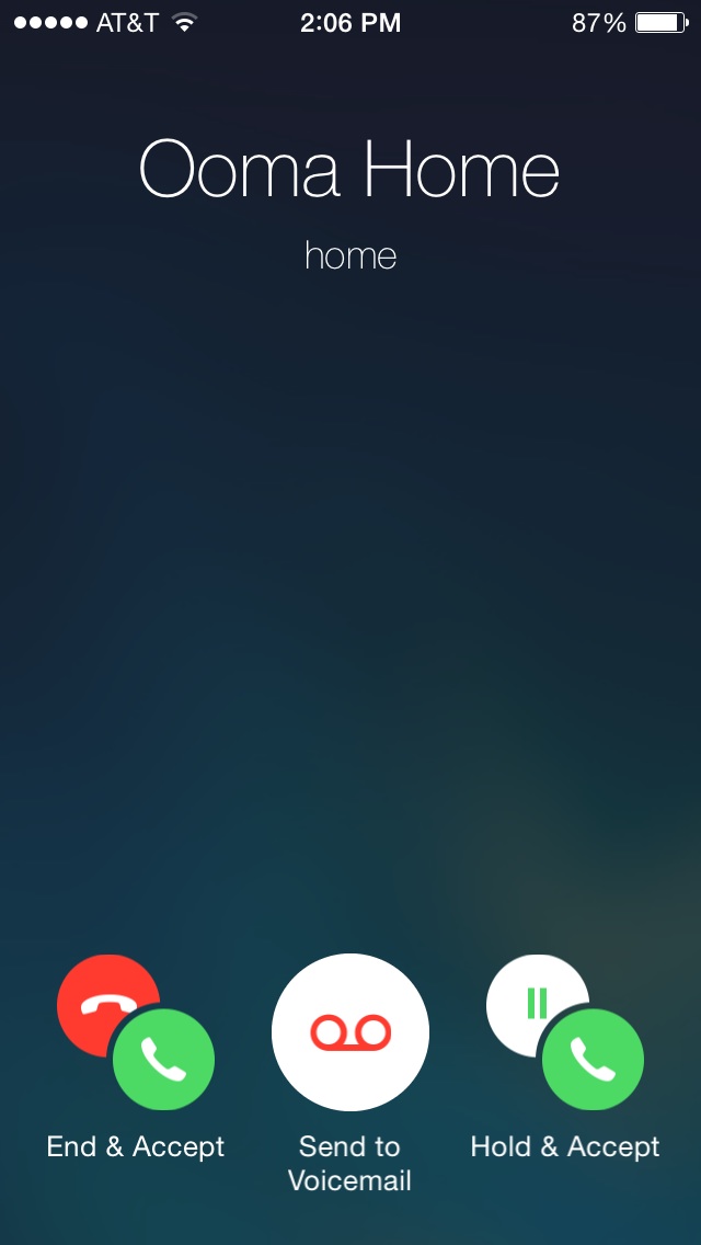
As well as "slide to answer". The worst apple has done in years.
IThat new shift key could prove rather confusing at first.
Yeah, my poor old eyes can't easily tell the difference between shift lock and not shift lock. Oh, well. There's an exciting new feature for a four month 7.2 beta.
But accidentally hitting the answer button and picking up a call from someone who you would rather go to voicemail would be a bummer. At least the slider prevented the dreaded "accidentally answered the phone while at the bar when I'm supposed to be picking up the kids" scenario.
It's still a slide.. lol The actions to activate a call hasn't changed.
----------
iOS 7.1 will be a useless cosmetic update
a new keyboard such as Swype would have a much a better improvement
Don't forget the drastic improvements they made to memory management and stability of the platform. It's a lot smoother since beta 2.
Yeah agree with you...these are joke changes..nobody really cares if the call button is rectangle or circle.wow !
and nobody thought apple could innovate!
seriously though these changes are so minor it's a joke.
Apple needs to take a cue from Google and push larger changes on a more frequent manner.
Yes, like faux leather, green felt and fake wood grain.
As compared to a faux power button and faux icon shading instead of gloss? potato / potahto.
iOS 7.1 Beta 3 Tidbits: Revamped Keyboard, Darker Icons, New Phone Look, and ...
Well, I see adding contrast as moving away from a complete flat design.
And as for the shut down bar, I was actually talking about its power button - it looks physically the exact same thing in real life.
Well, I see adding contrast as moving away from a complete flat design.
And as for the shut down bar, I was actually talking about its power button - it looks physically the exact same thing in real life.
No.. The keyboard is still a solid grey. The shut down bar is still solid colors. Skeumorphism is when it mimics real life things.
Register on MacRumors! This sidebar will go away, and you'll see fewer ads.