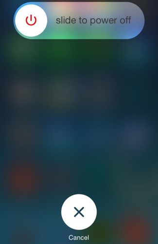
It's still a slider when the phone is locked, but it's now a button that you drag (kind of like in the earlier pre-iOS 7 days).
Thanks for confirming that. A simple button would have been a terrible choice for the lock screen.
It's still a slider when the phone is locked, but it's now a button that you drag (kind of like in the earlier pre-iOS 7 days).
hmm I preferred the more rectangular look of the buttons on the caller screen.
Let me get this straight.
We use our fingers to operate the iOS device and you would prefer rectangular buttons? I don't about you finger but for normal fingers circular buttons make sense. Period!

Perhaps part of the reason they did it is because more people were having issues accidentally tapping on the call button before they were done entering the number they were dialing, so the smaller button requires a more deliberate tap to activate it, decreasing the accidental misdials.There is more room for your finger to press the edge-to-edge button, therefore you can initiate/end a call eyes-free without having to play a point-and-shoot game.
Let's wait for the final product and then we'll talk. And even ignorants and arrogant people has the right to give their opinion. Look, u had ur own! So, yes, he is.
Would be interesting if the capital letters on the keys changed to lowercase letters when toggling the "Shift" key. Then people wouldn't have to check the mode of said Shift key.
Not really digging' the smaller 'call' button...
Everything else is ok though.
It's a point update, not a major release. Jeesh! And why is it important to have frequent updates like Google?
New shift key is confusing.
I'm starting to understand why people want lower-case letters on the keyboard now.
Does the slightly bolder fonts on the keyboard make the iOS keyboard any less ****** of a user experience compared to their competition?
But hey, I am still trying to find at least one thing different about Android 4.4 vs 4.3 and I have had the update installed for about 2 months, so at least Apple is doing something visually different between versions, as superfluous as they seem.


Well, I see adding contrast as moving away from a complete flat design.
And as for the shut down bar, I was actually talking about its power button - it looks physically the exact same thing in real life.