Become a MacRumors Supporter for $50/year with no ads, ability to filter front page stories, and private forums.
They do occasionally change visually. One change that comes to memory is the folder background in iOS 4.

Image

Some animations have changed during the beta process as well.

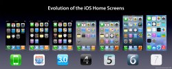
Well, that was only a background, a small tweak (it still a gray background), that's not a real change of what I was talking about, iOS hasn't change from the first iOS to iOS6 until iOS7, two or three icons have had some tweaks, so, if iOS's don't even change between X.0 it's not going to change between betas.

And animations fall under the performance category.
 

Attachments

  • iOS Evolution.jpg
    iOS Evolution.jpg
    460.7 KB · Views: 1,895
The older iOS icons don't all have gradients. Agreed, many have that strange arc of light across the top half but without that, the gradients are just as inconsistent (eg music app - without the arc of light at the top, the gradient is lightest in the bottom right corner, videos bottom left, messages bottom).

You'll have to be specific and show examples, because looking at past IOS icons, the Apple icons all use some version of a lit-from-above gradient.

As for third party apps, I have, among others YouTube, Pocket, Paper, Over and Shuffler.fm. These, to my eye show no gradient so unless you have a home page full of Apple apps, the direction in which the gradient runs is irrelevant.

Why bring up 3rd party apps when I specifically stated "Apple icons"? Of course 3rd parties will follow their own guidelines for logos and that's going to happen in IOS 7 as well. Including them in this discussion just muddies the water.

Same goes for the general design - music is a simple double quaver on an orange background, messages a single speech bubble on a green background. Then you have photos - a highly detailed picture of a sunflower that looks like something Samsung would put in Touch Wiz (why should that mean "photos" any more than a colour wheel?) and Photo Booth - a highly detailed image of a photo booth.

I never said previous IOS icons were perfect, just that they used gradients consistently so as to give the impression that light was hitting them from above.

The main idea of an icon is that the image tells you what the app does without needing a text label. Photos has always been a good example of a bad icon graphic. Sadly, with IOS 7 there are many more examples.

The notes and reminders icons are no more or less boring than before - I just think they look cleaner and smarter.

They look cleaner, but then so would an icon that was nothing but a rounded rectangle filled with white.

Actually, i think the designs Apple should use for all icons are Rorschach test images. Meaningless (except for the meaning you imagine in them) images with text labels.

And Safari has alway been a compass. I don't know why and I don't necessarily agree with it but that's just how it is and has been for all time. And a compass is, well, a compass so I guess it has to look like a compass.

Agreed. But it's an inconsistent and silly problem that they should fix before releasing IOS 7. Which is what we "fix the icons" people have been saying all along.
 
Please fix the horrid icons :(

&

Please fix the horrid aquarium like neon colors :(
 
Just curious, have you been using iOS 7? I agreed that they looked horrid at first, but most of the designs have grown on me (although some still look horrid... namely the voice memos one.)

No. I am pretty disappointed in the look of iOS 7. The features are great and the new API's are exciting, but apart from those things I'm just not feeling it this time. It'll be nice from a developer standpoint, but as a user I'll stay on iOS 6 for my personal (non-work) devices. I've been reading into the API and Apple documentation and there is lot of new, great stuff coming (under NDA, so I'll keep it there), though.
 
I'm curious to see when they redesign iBooks, I doubt it's gonna go live like it looks now. Also, iBooks is a terrible name, it sounds like one of those fake ones people guess at like iTV and iWatch.
 
You'll have to be specific and show examples, because looking at past IOS icons, the Apple icons all use some version of a lit-from-above gradient.


Why bring up 3rd party apps when I specifically stated "Apple icons"? Of course 3rd parties will follow their own guidelines for logos and that's going to happen in IOS 7 as well. Including them in this discussion just muddies the water.


I never said previous IOS icons were perfect, just that they used gradients consistently so as to give the impression that light was hitting them from above.

The main idea of an icon is that the image tells you what the app does without needing a text label. Photos has always been a good example of a bad icon graphic. Sadly, with IOS 7 there are many more examples.


They look cleaner, but then so would an icon that was nothing but a rounded rectangle filled with white.

Actually, i think the designs Apple should use for all icons are Rorschach test images. Meaningless (except for the meaning you imagine in them) images with text labels.


Agreed. But it's an inconsistent and silly problem that they should fix before releasing IOS 7. Which is what we "fix the icons" people have been saying all along.

I don't need to show examples - just look at your iOS device. Take the gloss off the icons (the semicircular shape of "light" that can be seen in the Verge link you posted) and the actual colour gradient on the phone app runs from light to dark on the phone app from bottom to top. On the music icon it runs from bottom right. In iOS 7 there is no gloss, just gradient. The gradient isn't used to imply the direction light is coming from. See here http://www.zdnet.com/first-purported-photo-of-apples-ios-7-home-screen-surfaces-7000016299/

My point about third party icons is that it is irrelevant which direction light "appears" to come from unless your home screen is exclusively populated with Apple icons. It's more inconsistent to have one set of icons following one law of virtual physics and other icons following different rules. Remove that fake source of light and you have a more consistent look.

I like the work of this guy: https://www.google.co.uk/search?q=a...UYqfAoSbPZn8gLAE&ved=0CDEQsAQ&biw=768&bih=928
Which I guess is why I like iOS 7.

If by Rorschach you mean something similar to Google's apps - Drive, Chrome, Currents etc, I agree to a point; for example when that app can't instantly been described by one simple, striking image - camera, weather, calendar can be but things like browser, photos, game centre, newsstand either need something as you suggested or something over-literal. And I don't really like "over-literal".

Back to safari/compass. I think they should ditch the compass for safari. I like the new icon but the very fact the icon has always been a compass bugged me from the moment I got my first MacBook. It has never once said "Internet" to me. I dislike most of the OSX app icons but that's for another discussion ;-)
 
As for the icons, I think this redesign mockup really nails it. Some depth, keeping the flat style, consistent, and beautiful. Apple should really hire some of these artists on dribbble instead of reaching out to their marketing team, which are good at.........marketing........to redesign app icons. It's like asking a waiter to cook a meal like a professional chef should. They'll probably make it, but it will never be the same thing.
 
As for the icons, I think this redesign mockup really nails it. Some depth, keeping the flat style, consistent, and beautiful. Apple should really hire some of these artists on dribbble instead of reaching out to their marketing team, which are good at.........marketing........to redesign app icons. It's like asking a waiter to cook a meal like a professional chef should. They'll probably make it, but it will never be the same thing.

I love those
 
Actually I played a lot with Android, but now I'm tired, as I was with the iPhone until the 4S (I had all previous models).

At the moment I think that the iPhone is more robust and works better than Samsung's phones, mainly because there's no real pure Android for the Note 2... CM10.1 is as always very buggy and I got a little tired of updates taking forever to come, be it from Google or Samsung. Also, the update process is a complete mess, with bugs that are never fixed. I think an Android tablet is better than an iPad, but for a phone, I rather stay with the iPhone at the moment. ;)

Hmmm I've never really cared about having a tablet but at the price an android tablet might be a fun toy. Which do you have?

Interesting you went from an iphone to a note 2 back to an iphone. Big size difference! The notes are too big for my pockets. They have pure google versions of the S4 and HTC One which would probably be nice but they aren't exactly giving them away.
 
and please make an Apple app to make trolls disappear.

It seems to me there are a number of people who are new to MacRumors banding together with those who have been members for years but are still under 50 posts to decry the icons, as if that is *the most important* feature Apple got wrong in iOS 7. I'm not saying that's everyone who is on this ridiculous bandwagon, but it appears to be the largest contingent.

I suppose Apple is feeling pretty damned good about iOS 7 if the biggest thing its detractors can come up with are icons, then it's done a damn fine job overall with the new OS, and that ignores completely the utter ignorance of anyone who doesn't understand what Apple is doing with icons and the new direction of its UI elements related to icons.

Another beta drop, another version closer to getting into my eager hands - can't wait!
 
Don't suppose it would be too much to ask that the Mail app badge updates when you read the email on your Mac?

D.
It has done it from the very beginning.

Jesus, it is amazing the low level of some comments.

Everyday one has to read comments by girly teenagers (change the icons!), the "I'm off to android threat" (please go) and today finally the one who doesn't know how to use mail.
 
Hmmm I've never really cared about having a tablet but at the price an android tablet might be a fun toy. Which do you have?

Interesting you went from an iphone to a note 2 back to an iphone. Big size difference! The notes are too big for my pockets. They have pure google versions of the S4 and HTC One which would probably be nice but they aren't exactly giving them away.

I don't have a tablet either :) but if I had one it would be an Android because of openess and connectivity like I had on the Note 2. You can use sdcards and even connect Canon DSLRs to it! File management is solid too.

I changed sizes because I noticed that when you hold the iPhone close to your face, the size doesn't matter at all but it does matter in your pocket.
 
I was really hoping they would include the weather, calculator and stocks app for the ipad version but apparently apple still thinks people don't check the weather or stocks on iPads for some bizarre reason.

Other than that, I think they will want to tweak the UI a bit more before final release because the stark white and black contrast and thin typeface might look really nice on the retina displays, but I've noticed the new look makes the non retina ipad mini screen look a bit more pixelated than it did previously (I never thought it was a bad screen, just saying the UI doesn't do a good job hiding the lower resolution of the mini)

Also don't like the extreme minimalism in the Music app. It makes navigation a lot slower because there isn't enough visual separation between artist, album, track etc. plus I don't understand why they hyped up iTunes 11 during the iPhone5 campaign, and then completely dropped the new interface for the ipad which actually already had a pretty similar album view to iTunes 11 in ios6.
 
Get life...
Btw; Icons will STAY THE SAME, get it?!
Don't like it, don't use it, easy as that...

Exactly, people have got to stop complaining, I don't like Android and trust me, I don't go to Android forums talking trash.

But well, I really like the new white theme of iOS7, look so fresh and clean, I came across this third party apps mock ups, these are pretty good and give a feels of how 3rd party apps might look like.

http://www.cultofmac.com/233628/her...-look-like-when-redesigned-for-ios-7-gallery/
 
As for the icons, I think this redesign mockup really nails it. Some depth, keeping the flat style, consistent, and beautiful. Apple should really hire some of these artists on dribbble instead of reaching out to their marketing team, which are good at.........marketing........to redesign app icons. It's like asking a waiter to cook a meal like a professional chef should. They'll probably make it, but it will never be the same thing.

I prefer the larger icons in iOS 7 (bigger A in the Apps store app for example), and no drop shadows. Other than that ship it?
 
Register on MacRumors! This sidebar will go away, and you'll see fewer ads.