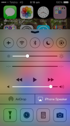
I also noticed the term "LTE" had vanished too which is a good thing for most people, because unless people work in the industry like I have, most wouldn't have a clue what "LTE" is short for. For everyone else its "Long Term Evolution". Simplifying it to 4G or 3G makes it a lot more straightforward, no more ambiguous terms for the non-technical.
I noticed the bug I logged regarding killing off a separate app and going back to home screen, resulting in a black background has not been resolved.
I noticed the bug I logged regarding killing off a separate app and going back to home screen, resulting in a black background has not been resolved.