[url=http://cdn.macrumors.com/im/macrumorsthreadlogodarkd.png]Image[/url]
Apple today
released the third beta of iOS 7, which brings a number of improvements and bug fixes to the operating system. According to the release notes, double notifications have been resolved and AirPlay issues have also been fixed.
Several other minor enhancements have been bundled into the release, as noted by our forum members:
Redesigned Fonts - Fonts across a number of apps appear to have been
tweaked to be thicker, using Helvetica Neue Regular instead of Ultra Light. This is most noticeable in the Messages app, where text appears to be bolded, but it can also be seen in the Weather app, the Notification Center, and the Settings menu. Panic co-founder
@cabel has
provided a GIF that demonstrates the differences.
Safari - Safari has had the .com button
removed and replaced with a simple period button. The .com, .net, and .org domain extensions can be accessed by holding down on the button.
Status Bar - The Status Bar, which provides information on cellular connection strength, Wi-Fi, Bluetooth, and battery life has had its size slightly increased for better readability on the lock screen.
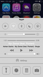
Lock Screen - When playing music, the lock screen will now
display the time.
Music App - The Music app has seen a
slight redesign with new icons and rearranged controls. Ratings have also been re-added.
Podcasts - Apple's
Podcasts app is now functional.
Calendar - In the monthly view, the Calendar app has been
updated to display small gray dots on days where events are scheduled.
Siri - A number of
MacRumors forum members have
noted that Siri's voice now sounds more natural.
New App Download Animation - When installing an app, iOS 7 users will see a new animation that does away with download bars in favor of a more organic circular download timer.
Control Center - The clock located in the Control Center has seen yet another redesign, this time appearing in the original dark format that was removed during beta 2 in favor of a thinly outlined version.
Additional features in iOS 7 beta 3 will be added here as they are discovered. Apple is likely to continue pushing regular updates for iOS 7, bringing minor performance boosts and changes ahead of the operating system's public release, which is expected to come in the fall.
Article Link:
iOS 7 Beta 3 Tidbits: New App Download Animation, Thicker Fonts, Safari Improvements
")