Got a tip for us?
Let us know
Become a MacRumors Supporter for $50/year with no ads, ability to filter front page stories, and private forums.
iOS 7 Beta 5 Tidbits: Icon Settings Redesign, New Control Center Options
- Thread starter MacRumors
- Start date
- Sort by reaction score
You are using an out of date browser. It may not display this or other websites correctly.
You should upgrade or use an alternative browser.
You should upgrade or use an alternative browser.
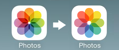
And still no changes to the Photos icon?! 🙁 C'mon, Apple, people seem to prefer it:


Last edited:
ct2k7
macrumors G3
Does anyone know If the post to twitter button is back in notification center?
It's not there.
ValSalva
macrumors 68040
Nice WiFi name on the right.
I named my network "Virus Tester". Hopefully it keeps the riff raff from trying to hack it 😉
BlockEight88
macrumors regular
Does it drive anyone else nuts that they got rid of the bars displayed in the status bar for the signal? I can't stand looking at these dots.
mvdw84
macrumors member
I may be mistaken but the "Settings" icon looks different.
Font in Messages looks different as well, not as bold as before
Keyboard could arguably be a bit different, but likely from font
At the top of a conversation in Messages no longer says "John K" rather only "John" now
Unlock and Sleep to Wake much more responsive
Font in Messages looks different as well, not as bold as before
Keyboard could arguably be a bit different, but likely from font
At the top of a conversation in Messages no longer says "John K" rather only "John" now
Unlock and Sleep to Wake much more responsive
would such a subtle change, really make you that much happier?.. if so kinda feel bad.And still no changes to the Settings icon itself?! 😡 C'mon, Apple, I submitted this a while ago:
Image
robots3humans0
macrumors 6502
You can now tap icons way earlier in the unlock animation sequence than you ever could. The app doesn't actually launch, however. It just shows the icon selection shadow and then waits until the animation is complete before launching. Previously, it would look like the taps weren't being registered at all.
KieranDotW
macrumors 6502a
Does it drive anyone else nuts that they got rid of the bars displayed in the status bar for the signal? I can't stand looking at these dots.
if that is a problem for you, go to a psychologist. Macrumors can't help.
ghostface147
macrumors 601
ghostface147
macrumors 601
Does anyone know If the post to twitter button is back in notification center?
It's not. At this point, I am pretty sure features are locked in. Now it's just refining what's there and bug fixes.
Rogifan
macrumors Penryn
I'm not sure how, but Apple took the iOS personality and snuffed it. The UI is ultra-boring, just like bauhaus architecture: it looks great, but you wouldn't want to live in it.
The UI has moved from delightful to cool. Using it makes me want to throw my phone away. It's like Apple has sucked all the joy out of the UI and replaced it with futura.
Lucky for you you still have iOS 6 with green felt, faux leather and linen in all its glory. 😀
leeraymond78
macrumors newbie
zed1291
macrumors regular
Cellular settings now displays data used by apps that have been uninstalled.
Was there in Beta4
Register on MacRumors! This sidebar will go away, and you'll see fewer ads.


