Become a MacRumors Supporter for $50/year with no ads, ability to filter front page stories, and private forums.
Now I am getting excited. My one problem with iOS 7 was that there were no borders on so many of the buttons. It would seem that Apple is slowly adding thin borders or background fields to buttons to establish where the touch target is.

If they add thin borders around the buttons in the Messaging app, then I will totally love just about every aspect of the new design.

No need for bezels or shadows or gloss. Just give a thin border around the button like they did with the icons in the phone app. I'm a believer in touch targets clearly marking their boundaries -- I think the other way makes iOS look way too much like a webpage full of links.

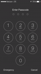
EDIT: My other problem was the lock screen, but they fixed those problems in the last beta.
 
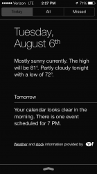
I'm pretty sure "Weather and stock information provided by [Yahoo Symbol]" is new 2013-08-06 14.27.32.png
 
They've changed the name displayed in messages to just the first name of the conversation participant now. I liked it better the beta 1,2,3 way. It's easier to know who you're talking too.
 
The oversimplification that has been done with the icons was ridiculous. I find myself spending more time reading the text than choosing the icon.

Finally, DO NOT punish your users by removing things that have become natural to them. Going left on the home screen MUST, send you to "spotlight"/search iPhone. Why make everyone angry about something that is useful and everyone is used to?
There is no innovation in sliding from the top, it is just someone's fit out of lack of innovation. Wake up!

Really? I LOVE the swipe down to the spotlight. Now when im ANYWHERE on my homescreen i can search for something.

You just live in the past. Nothing wrong with it. Just people like you hate change.or you say you love change but then hate it when it changes.
 
They've changed the name displayed in messages to just the first name of the conversation participant now. I liked it better the beta 1,2,3 way. It's easier to know who you're talking too.

If you have one person in your phone with that name it will not show the last initial which I like. If you have two people with the same name, it will show last initial.
 
They've changed the name displayed in messages to just the first name of the conversation participant now. I liked it better the beta 1,2,3 way. It's easier to know who you're talking too.

Go to settings < mail,calendars, and contacts < Short name
 
Calendar notifications

If you get a calendar alarm middle of the screen you now get two boxes underneath "Options" or "Cancel".

Hitting "Options" give you "Snooze", "View Event" or "Close"
 
I have no doubt that iOS 7 is going to save the iPhone.

I mean, not that it needed saving … but now the software finally is on par with the quality of the hardware.

Simply incredible what they've created.

I need the buy the rose coloured glasses you own.
 
I'm not sure how, but Apple took the iOS personality and snuffed it. The UI is ultra-boring, just like bauhaus architecture: it looks great, but you wouldn't want to live in it.

The UI has moved from delightful to cool. Using it makes me want to throw my phone away. It's like Apple has sucked all the joy out of the UI and replaced it with futura.
I live in bauhaus building and it's awesome!

I prefer the almost colorless view. I love the previous Settings much more.
 
OK, agreed. But I, and would assume, most people, tend to have the most used apps on the 1st screen. That's where we spend most of the time. On top of that you can push the home button to go to the 1st page...
I tried to keep everything in three screens with the least often used ones in the third, but I recently relented for a fourth screen. My Travel folder cannot hold any more apps. :)
 
Helvetica

Futura is the Bauhaus font, hence why he mentioned it in his comparison.

It seems to me that the OS is becoming a bit more inconsistent at the moment, especially with the call screen and system preferences. There is a lack of uniformity and clearly defined UI elements.
 
I find it funny that both the Twitter and Facebook logos have been slightly tweaked with gradients(the actual logos are solid colors) and both the Facebook and Twitter's terms of use on their logos say they may not be modified in any way besides turning them to black and white for non-color uses(print, b&w screens, etc).
 
Ugh... don't like he article title...
Big difference between "Icon Settings Redesign" and redesigned settings icons.
It led me to think they had settings to customize use of icons.
 
Messages app only shows the first name at the top (i.e. "John Doe" is now "John" instead of "John D").
 
Register on MacRumors! This sidebar will go away, and you'll see fewer ads.