Become a MacRumors Supporter for $50/year with no ads, ability to filter front page stories, and private forums.
And "Asian" countries don't mean "Asian" as a race... India is an Asian country.

Have you been dropped on your head as a child?

There are around 50 countries in Asia and to suggest that there's some kind of consensus over the colors they prefer, as compared to other countries, is pretty ludicrous.
 
From what I'm seeing of iOS7, it looks horrid, much like my favorite code editor before I discovered it had themes: I sure as hell hope they offer a 'dark' option.
 

Attachments

  • screens.jpg
    screens.jpg
    518.1 KB · Views: 168
No android wouldn't. Its lag, fragmentation, different version, bloat, and cheap material take it out of iPhone league. No matter what naysayers argue it always involves the look of the os and nothing else. Its obvious these people aren't beta testers, just armchair quarterbacks, backseat drivers.

So according to you those who dares to question Apple are just "armchair quarterbacks, backseat drivers"? and, gasp!, are not even beta testers, OMFG!!!!!

We are all entitled to our opinions. You love the new design in iOS7? great, I won't call you a fanboy just because you do, I respect your opinion. But some of us don't love it and that should be OK too without devolving the conversation into denigrating each other or questioning each other motives.
 
There are around 50 countries in Asia and to suggest that there's some kind of consensus over the colors they prefer, as compared to other countries, is pretty ludicrous.
I've been in design and marketing for over 20 years.

Here's a resource on the color preferences of people residing in Asian countries; it goes into depth on how western countries prefer darker, solid colors, and Asians prefer brighter, pastel colors & white:

http://onlinelibrary.wiley.com/doi/...ionid=17E179DC7C4044153E24C90D2BE6A049.d04t03

Any resources proving otherwise? Or are you just going to keep calling it ludicrous?

Did you even read your link?
Three studies conducted in Japan and Korea.
 
This graph express what I feel about iOS 7 design.

8jgoy.jpg


I have used beta 1 and 2 and I switched back twice to iOS 6. Those white interfaces mixed with orange are just hard to look at. The narrow fonts are hard to read and the whole system feels so heavy with all the new animations, transparencies.. Etc.

I don't say iOS6 is the way to go forward, but at least it is pleasent to work with it and FUNTIONAL.
 
Last edited:
iOS 6 and below looks like something from 1995 compared to this.

None of the elements in iOS 7 looks like they're from 1995 what are you going on about?

It looks like all the plain websites from 1995, or as I wrote earlier it reminds me of craigslist. Some fine craigslist simplistic and elegant, others find it plain and boring.
 
There are around 50 countries in Asia and to suggest that there's some kind of consensus over the colors they prefer, as compared to other countries, is pretty ludicrous.

I agree, I am not asian and I like the colors.

----------

So according to you those who dares to question Apple are just "armchair quarterbacks, backseat drivers"? and, gasp!, are not even beta testers, OMFG!!!!!

We are all entitled to our opinions. You love the new design in iOS7? great, I won't call you a fanboy just because you do, I respect your opinion. But some of us don't love it and that should be OK too without devolving the conversation into denigrating each other or questioning each other motives.

I am a fan of technology and call it how I see it. I am not a 12 year old girl who needs my phone to match my earrings. I am more interested in the function and potential. The white background of an app matching the top bar isn't an issue. Its actually a pretty cool design.

----------

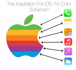
From Reddit: the inspiration for iOS 7’s color scheme https://twitter.com/viticci/status/350264840541044738

It reminds me of apple's early technology. I think its really cool.
 
Image

Skinny fonts... simplistic icons... white white white...

iOS 7 looks closer to this than iOS 6 does.

It looks like all the plain websites from 1995, or as I wrote earlier it reminds me of craigslist. Some fine craigslist simplistic and elegant, others find it plain and boring.

Okay, now you have to be trolling me...:rolleyes:

Applelurker, if you want to be extremely vague like that, then go ahead, but Windows 8 has skinny fonts, simplistic icons, and a lot of white. Android has skinny fonts, simplistic icons, and a lot of white. YouTube, Facebook, and Twitter all have simplistic icons, skinny fonts, and a lot of white. Hell, my MacBook box has skinny fonts, simplistic icons, and a lot of white. If you're going to by your generalization, then you're saying basically every UI today looks like it's from 1995? What's your idea of a modern UI then? :rolleyes:

azentropy, you're really telling me you think a text-based site looks like a fully layered OS? :rolleyes:
 
Okay, now you have to be trolling me...:rolleyes:

Applelurker, if you want to be extremely vague like that, then go ahead, but Windows 8 has skinny fonts, simplistic icons, and a lot of white. Android has skinny fonts, simplistic icons, and a lot of white. YouTube, Facebook, and Twitter all have simplistic icons, skinny fonts, and a lot of white. Hell, my MacBook box has skinny fonts, simplistic icons, and a lot of white. If you're going to by your generalization, then you're saying basically every UI today looks like it's from 1995? What's your idea of a modern UI then? :rolleyes:

Not to mention that Windows 95 didn't have skinny system fonts or any more white than a modern OS.
 
This is what iOS reminds me of. Its simplistic, modern, useable. If you want complicated, overdone, and clunky go android. Going simple is a welcome addition to iOS when its adding more function.
 

Attachments

  • marcelgermain.jpg
    marcelgermain.jpg
    38.8 KB · Views: 122
  • alicepopkorn_flickr_640.jpg
    alicepopkorn_flickr_640.jpg
    75.7 KB · Views: 110
...
I am a fan of technology and call it how I see it. I am not a 12 year old girl who needs my phone to match my earrings....
That's too bad because iOS7 looks exactly like it matches a 12 year old's earrings.

I won't argue your stance, though, because it's obvious (and amusing) from your responses all over this thread that you'll stop at nothing to argue with each and every point of dissension over anything Apple does. Everyone's gotta worship something, I suppose.

I don't like everything apple does. I despised the iPhone 4/s and I thought iOS 6 was boring and on its way out. There is nothing wrong with a 12 year old girls earrings. What is the alternative? Trench coat mafia style?
 
There is in the professional design community. Im not saying everyone hates every aspect. But yes there is significant back-lash in terms of color choices and icon design which directly translates to a lot of the app design.

We've already been told the initial icons were done by the marketing department, so, no, actually, they don't have a direct translation to a lot of the app design. Perhaps the other way around in some cases, though.
 
azentropy, you're really telling me you think a text-based site looks like a fully layered OS? :rolleyes:

Yes, sure it is a bit more modern since resolution of fonts/screens have increased. But looking at many of the apps, like mail, it is just plain text, bolded text, and links/buttons are now just blue text. So again - yep pretty similar to craigslist!
 
Shoes people in this thread want on the left vs. the shoes we got on the right. Its an easy choice for me. Ill take the ones designed by a designer and not someone infatuated with their toes.
 

Attachments

  • barefoot-running-shoes.jpg
    barefoot-running-shoes.jpg
    29.4 KB · Views: 105
  • Dolce-Gabbana-Shoes-Mens-Leather-Running-Shoes-White-2012.jpg
    Dolce-Gabbana-Shoes-Mens-Leather-Running-Shoes-White-2012.jpg
    79.8 KB · Views: 107
I have beed using the iOS 7 beta since day one and after updating to beta 2 I now really have my own opinion about it. The first thing that strikes you when you install it are the icons, they really scream feminine. A few friends who know that I jailbreak and tweak my phone a lot have actually told me that this theme looks bad. As we joke around a friend told me to not go gay with my phone. I too really dislike them but its not that big of a problem because I spend my time in the apps anyway. The white theme is not that bad but I cant imagine my mom using her iPad like this and isn't iOS about that? Simple for everyone. It is simple because it reassembles actual real life objects, buttons - this so called skeuomorphism.

Using it on my 4S it was really laggy and the animation were really slow. I give that to the beta and I really hope it is fixed it the GM. And two and a half weeks later I gave up. I saw one girl with her iPhone 5 flying from Safari to Messages and back and I was so jelous of all that "flying" feeling that I got home, got into DFU and installed back iOS 6. It really made me appreciate it again, it made me love it and it gave me back my iPhone feeling. I think the animations play the biggest role here - the iOS 7 ones (put aside that they are slow) are really different and that layering thing is deffinately not working for me.

So here am I back with iOS 6, for a second day, and I'm actually having the best experience I've ever had with my phone since I bought it. For me iOS 7 is a complete disaster, in beta or not, things will not drastically change and I know a lot of people have been touting this but I am really looking forward to buying a Nexus phone or one of these "Nexused" HTC Ones.

So finally what I am saying is, nobody I know likes iOS 7, I think it looks too girly and really makes up for a worse experience with my great-looking phone than before.
 
Yes, sure it is a bit more modern since resolution of fonts/screens have increased. But looking at many of the apps, like mail, it is just plain text, bolded text, and links/buttons are now just blue text. So again - yep pretty similar to craigslist!

So you're telling me that this:

BNyJhdpCQAAqIeF.jpg-large.jpeg


Looks like this:

Screen%20Shot%202013-06-27%20at%201.36.39%20PM.png


:rolleyes:
 
And now we are trolls from android forums? You are funny.

BTW, I'll continue giving my opinion on iOS7, I don't need your approval and you can continue throwing a temper tantrum because we are all not playing by your rules .

1) Nowhere in his post did he say you were "trolls from android forums

2) Nowhere has he thrown a temper tantrum. He has simply explained himself (and also pointed out there are millions of threads, some decent and some just "hurrdur ios 7 is dum" that discuss this).

3) Just as falconeight put it, "You don't like iOS7 then don't use it."

4) Hey guess what? You're on a forum dedicated to Apple which is visited by people who love Apple. What are you expecting when you post a negative opinion (and an over-exaggerated, drawn out one at that)? You're going to be met with criticism. If you're going to be unable to handle it, then don't post here in the first place.

5) If we are going to call people 12 year olds, I know who I'd call one...:rolleyes:
 
Shoes people in this thread want on the left vs. the shoes we got on the right. Its an easy choice for me. Ill take the ones designed by a designer and not someone infatuated with their toes.

I see your point, but the comparison isnt the greatest.

The shoes on the left are actually better for your feet.
 
Register on MacRumors! This sidebar will go away, and you'll see fewer ads.