Become a MacRumors Supporter for $50/year with no ads, ability to filter front page stories, and private forums.
I miss the times when Apple users where open to new stuff.
Now all I read is " I want the old style back", "too much white", blahblahblah.

New does not always mean better. And seriously what harm is there for Apple to allow users to pick a 'style'? Oh yeah, we should all be forced into using what you think is best.
 
(Whisper it)
It's not very good is it?

A bit naff, garish and ugly....shhh! Hang on. Somebody's coming....

Yeah. IOS 7.0. Great update, man!

Way to go...yeah!

It's ok. They've gone.

Don't talk loudly ...but it looks a bit Fisher Price and ... Oops..they've just walked back in ...

Hey yeah...look at those flat icons. Cool! Multiple screen swipes that do ... Things ...when you've sussed out the method and ... That. Yeah. Totally intuitive.

(Oh dear. Can I rollback the OS, somebody?)

What? Yeah! Way to go IOS 7.0. Lovin' it! :(
 
I personally think that the new design is very pleasing to the eye, it's sleek, modern, etc., so generally I like it very much, and I'm also beginning to find the old interface kinda obsolete. BUT... there's one thing that really annoys me. :(

In the old iOS it could NEVER happen - no matter how you changed your home/lockscreen wallpapers - that it went to the expense of readibility. The on-screen elemenets were so well designed that you could set any stupid picture as your wallpaper, the icon names, the statusbar, the time, everything on the lockscreen, they remained perfectly readable. But now, just try to set any bright picture as your wallpaper (there are plenty of them even among the default ones!!!), it's CHAOS, it's pain to the eye, you can hardly read the time on the lockscreen, let alone the statusbar... :mad: Why did they have to do this?? Why was the prettiness in this scenario more important for Apple than the functionality?? Why haven't they used some foggy layer underneath, or anything, whatever, why haven't they thought about this... Honestly, that is my only serious concern about iOS 7, and maybe the somewhat hard-to-use calendar (confession: I actually find the old iOS calendar to be more usable :( ).
 
*Not sure if it was mentioned... but newsstand can finally be put in a folder, for those that don't use it this is awesome...

Anyone know a guesture to go from 'in a folder' to the homescreen? I don't like to use my home buttons this much...I hear too much talk about them breaking...

press anywhere below the open folder.
 
Android

I know it's not popular to say on this board, but iOS7 really is an Android clone. I'm not saying it's good or bad, it just is. Now if only I can get a bigger sized iPhone, i'd be happy. I'm leaning towards switching because one you play with a larger phone like a HTC One or SIII it really is painful going back to the smaller, boring iPhone. However, I do like the stability of iOS more than Android. Haven't used 7 enough to form an opinion other than it really is Android.
 
New does not always mean better. And seriously what harm is there for Apple to allow users to pick a 'style'? Oh yeah, we should all be forced into using what you think is best.

We you suggesting this pre iOS 7? Because we were all forced with a certain style for 6 years. But I guess when Steve was around nobody cared because Steve know best. ;)
 
Some of the functionality improvements are welcome (some of them), but these spider-thin lines and metaphor-less icons are just - terrible! I feel as if I'm not sure where I am, what's going on, what I'm looking at. I feel that they'll have to change, or people will change away. For the first time, I'm thinking of seeing what other mobile OSs look like (and I thought Apple *was* GUI). Also I think more should be more done for core demands such as battery life and reception instead of "fancy" but poorly designed eye candy.
 
It's way too white and animations sucks on 4S ! Try to rotate to landscape mode and you will see how slow it is.

There is no full screen mode inside Siri. Now I need to wait till the phone automatically remove the bars :/
 
Parallax? What Parallax?

So one of the coolest new aesthetic features to was these new motion backgrounds.

I have an iPhone 4S and a 3rd Gen iPad and I don't get them on either. If you really aggressively shake the device you notice a tiny amount of motion but nothing like they made it out to be in the videos.

Am I missing something or is this feature only for the latest models.
 
"Give me some fries with that order." Get used to hearing that. You obviously don't have a snowflake's chance in h*ll of entering into mobile OS development.

Uh, no. Nice try though. iOS 7 is a good first start, like early versions of OS X. Remember how bad 10.0, 10.1, and 10.2 looked? The only difference is here they are not starting over and in many, many ways this is a regression.

I'm all for great design. iOS 7 is not good design. There are far too many inconsistencies and things that are just poor decisions to make it great. A good start, maybe but great, heck no.

Even the icons are messed up. 2 that come to mind immediately are Photos and Game Center. Neither have any meaning to their function. 2 similar blobs of color that look nothing like their functions.

Then there's the camera app. Where is the visual cue that to switch between Video, Photo, Square, etc that you must slide? They look like something you click on. You do that and... nothing... Again, need better visual feedback.

Icon readability can be very tough on certain backgrounds because there is no black shadow. Same with closing notifications in Notification Center. Use a black background and the X is near impossible to see.

It's these little things that are very un-Apple like and should have been fixed before release.

I love Apple as much as the next guy but this just seems 1/2 baked at best.
 
Last edited:
I know it's not popular to say on this board, but iOS7 really is an Android clone. I'm not saying it's good or bad, it just is. Now if only I can get a bigger sized iPhone, i'd be happy. I'm leaning towards switching because one you play with a larger phone like a HTC One or SIII it really is painful going back to the smaller, boring iPhone. However, I do like the stability of iOS more than Android. Haven't used 7 enough to form an opinion other than it really is Android.

I have the luxury of using an S4 and an iPhone 5 for work. Android is very much a control freak's OS - you can twiddle and fiddle to your heart's content and change a seemingly endless array of settings, if that's your thing. There may be some superficial aspects of the "look" that are similar between the two OSs but the feel is most assuredly not, at least to me. The design philosophy is quite different in focus. One OS is designed by engineers with a focus on control, the other is designed by, well, designers (in partnership with engineers, obviously), focused on the balance among look, usability and control. It depends on your focus as a user which appeals to you more.

Notifications and the user interactions with them are different, multi-tasking is different, theming is different, one (iOS) is designed to work very well as part of a larger coherent ecosystem, the other can operate passably well in a variety of environments. I could go on. Bottom line: They're very different.

Personally, I prefer the iPhone as my daily phone. I don't have to constantly answer the question: Is that a phone in your pocket? :D
 
One "Androidism" I've noticed in iOS 7 is that we finally got ellipsis on the home screen. In the German translation, you only have to set the font to bold and Newsstand is truncated from "Zeitungskiosk" to "Zeitungski…".

Same happened to one of my folders even with the default iOS 7 settings (its name used to fit, on iOS 6). And the blue 'update' bubbles cause many app names to be truncated too.

But at least it's Helvetica!
 
Last edited:
Ios7 on my iPhone is flawless with only minor bugs, folders with 3x3 is crap though, that's going straight in my book as worst apple design flaw ever.

But holy god, ios7 on the ipad is like bug glitch **** up hell! Picking a wallpaper is just broken, animations are dreadful pixelated glitchy etc etc etc.

It's lagging freezes and should have been kept in beta.

Also one more ios7 general complaint is the fade oh the fade! Please apple why did you put a fade in on the lock screen I have to wait for the animation to fade up before I can unlock, just no just no no no!

Also five finger close is slow and doesn't work like it used to now the app has to load before the gesture will work please apple change this behaviour back it's essential if you tap the wrong app to be able to close out without the time waiting to load content. It's a huge redesign so I'm not fussed about it being a cock up right off the bat but these things are rookie mistakes that even I would never make and I'm a punter not a coding and ui wiz kid like the ones apple employes

I almost wish they would just employ someone like me to be fussy about the junk that has made irs way in!!!!!!
 
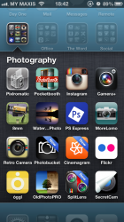
That's all well and good. Before I used to see 12 and if you had, say, 10 apps you could see them all. Now you get 9, have to scroll, all with tons of white space. It's that inconsistency that makes this upgrade nasty from a usability standpoint.

I know it's a minor point but for the sake of accuracy: a few people have been misremembering the number of icons one can get in folders in iOS 6. It's actually 16, not 12. That's a good, useful number, for me anyway. :)
 

Attachments

  • IMG_2521.PNG
    IMG_2521.PNG
    935 KB · Views: 75
Is it no longer possible to search wikipedia through the spotlight search tool?

Is it possible without jailbreaking to get rid of the ESPN, YAHOO, DISNEY, APPLE icons that appear when using the address bar in safari?
 
remove list of recently updated apps

is it possible to clear the list of recently updated apps in the "Updates tab" of the App Store?


Don't like having a list of so many apps that I have updated over the past few days.

In ios6 it would dispear once you updated new apps and refreshed the page
 
Register on MacRumors! This sidebar will go away, and you'll see fewer ads.