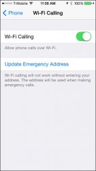
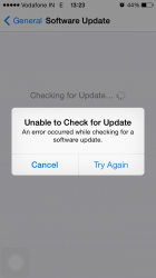
The updated interface is on the LEFT.
That is the one that is harder to read.
----------
You really think so? We're talking about the weather app? The new interface is on the left. I find it easier to read. They centered the data so that Precipitation and its value are close together instead of on opposite sides of the screen; it may not be symmetrical but I can more clearly and easily read the information I'm interested in.
I'm referring to white text on white background.


