Become a MacRumors Supporter for $50/year with no ads, ability to filter front page stories, and private forums.

jmack549

macrumors 6502
Original poster
Mar 8, 2007
326
0
I'm an avid iPhone user, but this baffles me. I really really wish they had done something more like webOS. One of the big complaints I hear is that webOS notifications take up screen real estate. And iOS notifications don't? One thing I really dislike is how you can't quickly swipe away an iOS notification, and it doesn't push the screen down like webOS, meaning it covers up parts of the screen. For instance, if I'm in an app and I'm reaching up to tap the back button and get an email, I have to patiently sit there and wait for it to go away until I can press back. I've accidently opened apps several times because I went to press back and hit the notifications. Here's what I mean:

ios.png


Whereas webOS will push up the UI elements allowing you to continue working normally as you get notifications.

webos.png


I love iOS, but this is already bothering me after only a week. The whole point of this notification overhaul was so that it wouldn't interrupt you when you get them, and that's exactly what it's still doing.
 
I agree. Push the screen down or make the notification only as thick as the title bar.
 
The whiners on this board wouldn't be half as annoying if I actually thought they were giving Apple any direct feedback on their complaints.
 
The whiners on this board wouldn't be half as annoying if I actually thought they were giving Apple any direct feedback on their complaints.

I submitted it as an idea, and I'm not the only one complaining about it. If no one expressed their thoughts, this board wouldn't exist. Don't open threads that you don't feel like reading, or stop whining about whiners.
 
I submitted it as an idea, and I'm not the only one complaining about it. If no one expressed their thoughts, this board wouldn't exist. Don't open threads that you don't feel like reading, or stop whining about whiners.

Good response. Isn't the whole point of this forum to discuss these kinds of issues??
 
For instance, if I'm in an app and I'm reaching up to tap the back button and get an email, I have to patiently sit there and wait for it to go away until I can press back.
If the UI is pushed up, wouldn't the Back button have been moved off the screen so you still couldn't access it?
 
Likely will be fixed before iOS 5 is officially released. I can't see Apple glossing over something when it comes to visual perfection.

But like others have said, submit it as a bug.
 
If the UI is pushed up, wouldn't the Back button have been moved off the screen so you still couldn't access it?

Well I just used the term "pushed up" because webOS notifications come in from the bottom, so they push the UI up. In the case of iOS, the notification would push the UI down. Thanks for the clarification.
 
Good response. Isn't the whole point of this forum to discuss these kinds of issues??

Generally yeah, but during beta testing forums like this do more harm than good, I think. People are placated by their posts here and are less likely to mention it directly to Apple.

I've never really taken notice but I'm guessing the glowing bar during calls pushes the UI down rather than covering it. They could use that functionality.
 
Maybe rather than pushing up or down it could just shrink the rest of the screen, or change the aspect ratio temporarily while the banner is showing. The only way I can think of that would be totally out of the way would be for the banner to be the same size as the title bar.
 
Generally yeah, but during beta testing forums like this do more harm than good, I think. People are placated by their posts here and are less likely to mention it directly to Apple.

Agreed.. i've seen countless posts saying "i HATE Apple, I can't believe how crappy iOS5 is. my iphone won't sync with iTunes 10.5! iCloud isn't working.".
BETA anybody?!?!
 
Well I just used the term "pushed up" because webOS notifications come in from the bottom, so they push the UI up. In the case of iOS, the notification would push the UI down. Thanks for the clarification.
Ah, I see what you mean. Thank you for the clarification.

Although, if the UI is now "pushed down", we might lose UI elements at the bottom we might want to access. Hmm, guess this is tricky with no easy answers.
 
If the UI is pushed up, wouldn't the Back button have been moved off the screen so you still couldn't access it?

Or if it's the other way around, wouldn't something at the bottom get pushed off screen?

Otherwise there's going to have to be some sort of definable "pushing" area so only that area moves and the rest of it stays. But then that gets complicated.

I think the best solution is to just have a "swipe to remove" action instead of pushing the screen any which way.
 
They already do what's being suggested, so there has to be a reason they didn't implement it like this.

Actually, now that I think of it I've never seen these bars during full screen events like videos or games. How do they show up?
 

Attachments

  • 4815570884_39abc1ecbf.jpg
    4815570884_39abc1ecbf.jpg
    50.6 KB · Views: 149
If the UI is pushed up, wouldn't the Back button have been moved off the screen so you still couldn't access it?

Right, he meant the iOS UI should be pushed down from the top.

(The UI is pushed _up_ on WebOS because the notifications pop up from the bottom.)

Some of Apple's additions in the past year seem quickly tacked on top of the old UI. Hopefully, this is just a way of playing for time, until they can do a decent redesign.
 
I submitted it as an idea, and I'm not the only one complaining about it. If no one expressed their thoughts, this board wouldn't exist. Don't open threads that you don't feel like reading, or stop whining about whiners.

Well said. I don't understand members who willfully enter threads they have no interest in, then willfully spend the energy to comment on how they dislike the thread. It is an open forum, and you're free to go in and out of whatever interests you; not every thread will pertain to you.

Anyway, great point about iOS 5 notifications. Hopefully Apple will heed the suggestions in the feedback.
 
They already do what's being suggested, so there has to be a reason they didn't implement it like this.

Actually, now that I think of it I've never seen these bars during full screen events like videos or games. How do they show up?

Same thing, it will cover up part of the screen.

ios2.png
 
No I mean the glowing bar. If that doesn't work well with fullscreen apps then that might explain why Apple chose not to push the IU down everytime.
 
Same thing, it will cover up part of the screen.
I think the other person is wondering how a phone call shows on screen while playing a game. If the contents is compressed, why didn't they do that with notifications as well.
 
No I mean the glowing bar. If that doesn't work well with fullscreen apps then that might explain why Apple chose not to push the IU down everytime.

Ah I see what you mean. I just tested it, the glowing bar doesn't appear to show at all. So the notification would be useless.
 
Same thing, it will cover up part of the screen.

Image

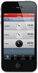
I think they question was directed to the Active Call lines (or Skype) that show up when you move form the Phone app to a different app. I just looked at it, and content does indeed get pushed down, without affecting the dock or bottom bar.
I believe the same thing can happen with Notifications in ios5... Maybe next beta?

No I mean the glowing bar. If that doesn't work well with fullscreen apps then that might explain why Apple chose not to push the IU down everytime.

Interesting.. works fine with other apps, but doesn't show up in games. That makes sense...
 
Last edited by a moderator:
The whiners on this board wouldn't be half as annoying if I actually thought they were giving Apple any direct feedback on their complaints.

well it has to be assumed Apple does tend to look around these boards and others and if they see the same complaint coming up time and time again they might move on it.
Hell look back at the complaints about MMS and it took them 2 years to put a basic feature in the phone. Notifications sadly took them 4 years to get up to what I call dumb phone standards and I have to agree with the OP that is still has huge issues. big improvement over the crap they did have but still far from perfect.

I have to agree I am surprised Apple did not leave some type of icon on the screen afterwards like along the bottom. From what I have seen Apple notification system is a poor copy of Android.
Android a new notifications comes in the top bar were things like battery and notification icons are displayed puts all the information there and covers up the battery after a min it goes down to just an icon.
'
I think they question was directed to the Active Call lines (or Skype) that show up when you move form the Phone app to a different app. I just looked at it, and content does indeed get pushed down, without affecting the dock or bottom bar.
I believe the same thing can happen with Notifications in ios5... Maybe next beta?

.
why do people keep expecting the UI to change with the next beta release. it is safe to say that iOS5 is featured locked and they are not going to change anything but instead just flush out bugs.
 
Register on MacRumors! This sidebar will go away, and you'll see fewer ads.