Become a MacRumors Supporter for $50/year with no ads, ability to filter front page stories, and private forums.
I'm sure they looked at doing it. The UI bouncing up and down as notifications came in could have been really annoying for internal testers. People need to "trust" the button placement on touchscreens so moving it constantly would screw that up. And you'd also have people complaining that just when they are about to hit Back a notification comes in and the button moves.

I think the current implementation is the lesser of two evils.
 
I agree. Push the screen down or make the notification only as thick as the title bar.

Agreed! It looks so ugly otherwise. Like on the home screen, it cuts through a third of the icons on the top row when notifications drop down. Very unpolished.
 
I think Apple did a much better implementation (although not perfect) than Android... I agree with this article.

http://www.bgr.com/2011/06/13/how-apple-stole-notifications-from-android-and-beat-them-with-ios-5/

well it has to be assumed Apple does tend to look around these boards and others and if they see the same complaint coming up time and time again they might move on it.
Hell look back at the complaints about MMS and it took them 2 years to put a basic feature in the phone. Notifications sadly took them 4 years to get up to what I call dumb phone standards and I have to agree with the OP that is still has huge issues. big improvement over the crap they did have but still far from perfect.

I have to agree I am surprised Apple did not leave some type of icon on the screen afterwards like along the bottom. From what I have seen Apple notification system is a poor copy of Android.
Android a new notifications comes in the top bar were things like battery and notification icons are displayed puts all the information there and covers up the battery after a min it goes down to just an icon.
'

why do people keep expecting the UI to change with the next beta release. it is safe to say that iOS5 is featured locked and they are not going to change anything but instead just flush out bugs.
 
Agreed! It looks so ugly otherwise. Like on the home screen, it cuts through a third of the icons on the top row when notifications drop down. Very unpolished.

Would the same thickness as the title bar too small? Maybe shrinking the screen is the way to go. Or whatever happens when you're on a call and you hit the home button. The "touch to return to call" message doesn't cover anything on the screen.
 
Ah, I see what you mean. Thank you for the clarification.

Although, if the UI is now "pushed down", we might lose UI elements at the bottom we might want to access. Hmm, guess this is tricky with no easy answers.

what if it changed for the app you were in. for example if you were in messages, it would be pushed down. but the area where the keyboard and type field is stays the same. so the message field would get smaller (pushed into type field and keyboard). kind of confusing to explain, sorry. if say you were in the phone app under recents, everything except the bar at the bottom would go down (everything gets pushed into bottom bar. apple could execute this for their apps and then it would up to developers to add it into their apps if it needed it. would this work?
 
I think Apple did a much better implementation (although not perfect) than Android... I agree with this article.

http://www.bgr.com/2011/06/13/how-apple-stole-notifications-from-android-and-beat-them-with-ios-5/

Things like the clearing stuff for Android with out having to launch the App some of the launchers (and I know the newest Motoblur) already lets you clear items from the list with out launching the App itself and with out clearing them all.

Between the 2 choices I like Android set up more than iOS. The lack of icons at either the top or bottom is annoying.
 
Would the same thickness as the title bar too small? Maybe shrinking the screen is the way to go. Or whatever happens when you're on a call and you hit the home button. The "touch to return to call" message doesn't cover anything on the screen.
The "touch to return to call" message bar is only 20 px high. I kinda doubt many people would be satisfied with 20 px high notifications.
 
I think Apple did a much better implementation (although not perfect) than Android... I agree with this article.

http://www.bgr.com/2011/06/13/how-apple-stole-notifications-from-android-and-beat-them-with-ios-5/

I'm very pleased with what Apple has done, but I disagree about it being better than Android. I use a Nexus S and iPhone 4 day to day and felt like I was waiting so long for something like this in iOS.

What I like better about Android's notifications is that text can scroll across the status bar only and not block any part of the app/screen that you're in. And if you've missed incoming notifications while doing something there's always a summary of them in the statusbar bar with an icon for each. Without touching or doing anything at the home screen I can see what I've missed (sms, email, facebook, twitter, calendar, etc..)

One thing I really hope Apple adds is a quick clear button/area to tap on a live notification, instead of having to wait for it to clear on its own.
 
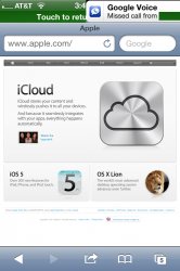
While I can't say that Apple will fix this or what their intention is. It is interesting at the least that the notification bar is the same size as the double bar when you are in the call. The double bar pushes the current app down making room for the double bar to continue to be present at all times.

IMG_0016.jpg


But remember, the double bar currently does not show up on fullscreen apps. I don't see any way around fullscreen apps. As developers would have to design their applications around being compressed.
 
The "touch to return to call" message bar is only 20 px high. I kinda doubt many people would be satisfied with 20 px high notifications.

Actually the notification bar is the same height as the "Touch to return to call" (we need a better name for that bar lol).

I just tried it, turned on tethering to cause the double height status bar, and then got an incoming notification, it took up exactly that space.

Also, 20px I'm assuming is for non-retina? Edit: Yeah, just checked and its 80px on iPhone 4 display.
 
Last edited:
Actually the notification bar is the same height as the "Touch to return to call" (we need a better name for that bar lol).

I just tried it, turned on tethering to cause the double height status bar, and then got an incoming notification, it took up exactly that space.
To clarify, by "touch to return to call" bar, I mean the additional piece that appears under the status bar. If we want to call the whole thing (status bar + extra piece) the "double height status bar", fine.

Also, 20px I'm assuming is for non-retina?
Correct.
 
To clarify, by "touch to return to call" bar, I mean the additional piece that appears under the status bar. If we want to call the whole thing (status bar + extra piece) the "double height status bar", fine.


Correct.

Ahhh, I see what you meant. Thanks
 
I submitted a comment about it at apple.com/feedback. I think if enough ppl do this Apple will change this before the final release because I know they want this notification system to be perfect for their users.
 
I think Apple did a much better implementation (although not perfect) than Android... I agree with this article.

http://www.bgr.com/2011/06/13/how-apple-stole-notifications-from-android-and-beat-them-with-ios-5/

The article mistakenly relies on the assumption that Apple "copied" (as they put it) only stock Android. Apple actually took bits and pieces from all over. (Which is smart.)

-The individual notification deletions are a feature of WebOS.

-The layout is from various notification screens on several OSes.

-The lockscreen sliders were taken from third party Windows Mobile and Android lockscreens.

What the article should've added, was that it's too bad that Apple didn't also borrow from HTC and Samsung and SBSettings, and put commonly used settings controls on there.
 
I submitted a comment about it at apple.com/feedback. I think if enough ppl do this Apple will change this before the final release because I know they want this notification system to be perfect for their users.

That's the BEST thing to do! I don't think enough people are realizing that this is the whole point of testing a BETA!
 
For instance, if I'm in an app and I'm reaching up to tap the back button and get an email, I have to patiently sit there and wait for it to go away until I can press back. I've accidently opened apps several times because I went to press back and hit the notifications.

I've not had the problem in the last week, i manage to hit back buttons fine, maybe just my luck.
 
I think the article started from the premise that Apple copied the Notifications from Android, which has been highly touted on the internet.

In regards to the Settings, I don't think Apple is finished with the Widgets. There is no reason why they won't be able to allow a widget for the settings jsut like they did for Weather and Stocks.

Apple always saves some goodies for the actual public release (some people are predicting Nuance Voice Recognition, etc), so I don't think they are done with making changes to the OS. It is in fact still a BETA.

The article mistakenly relies on the assumption that Apple "copied" (as they put it) only stock Android. Apple actually took bits and pieces from all over. (Which is smart.)

-The individual notification deletions are a feature of WebOS.

-The layout is from various notification screens on several OSes.

-The lockscreen sliders were taken from third party Windows Mobile and Android lockscreens.

What the article should've added, was that it's too bad that Apple didn't also borrow from HTC and Samsung and SBSettings, and put commonly used settings controls on there.
 
I've not had the problem in the last week, i manage to hit back buttons fine, maybe just my luck.

I can still hit them fine most of the time, but I have to really make sure I'm hitting it on the bottom half of the button. Regardless, I shouldn't have to do this. Also, the few times I've gone to hit back at the same exact time a notification comes in has taken me into the new app which is very frustrating.
 
That's the BEST thing to do! I don't think enough people are realizing that this is the whole point of testing a BETA!


Yes it's pretty annoying. Some forums think that these features are set in stone while others think the beta process is only for fixing bugs. A beta is for all of the above. Features can be tweaked or taken out all together at the last minute. It's up to Apple whether it sticks with what it has or changes it. If this is seriously a problem the consumers who've seen then videos of the beta and the developers alike need to give feedback to Apple because they will listen to us. Sometimes it takes longer than we would like but since this is a beta this is the best time to help them with improvements before the final release. Okay now I'm done. Lol
 
If the UI is pushed up, wouldn't the Back button have been moved off the screen so you still couldn't access it?

the UI is pushed up in WebOS, which is organized differently, so that isn't an issue

with iOS, the UI would be pushed down (if done how the OP says it). I personally prefer how windows phone does it, which is an alert up on the top, which can be swiped away if you want to dismiss it, or tapped if you want to go to it, and goes away on its own after a while as well
 
Another change they need to make it have the preview scroll across after a few seconds so you can read the whole thing. I end up having to pull down the notification center to read the message. Also the ability to hide the notifications in the notification center without deleting them.
 
Would the same thickness as the title bar too small? Maybe shrinking the screen is the way to go. Or whatever happens when you're on a call and you hit the home button. The "touch to return to call" message doesn't cover anything on the screen.

I was really hoping they'd use the same UI as for active calls...the status bar gets doubled in width, and the UI gets slightly shifted (on the homescreen at least, I don't remember about in apps, as I haven't seen it in a while)...it shifts just enough to not be annoying
 
I think Apple did a much better implementation (although not perfect) than Android... I agree with this article.

http://www.bgr.com/2011/06/13/how-apple-stole-notifications-from-android-and-beat-them-with-ios-5/

I have to disagree. While it is decent, I think there is a lot of room for improvement. The notification system is still intrusive, which was one of the biggest flaws of the current system. While it isn't as intrusive as the current system, the fact remains it is intrusive. Also the fact that you don't get a constant icon to remind you that you have notifications to tend to is a problem. That makes for a potential unwanted delay in responding to things you may have not been aware you had such as text messages, emails, etc.. Also I don't like the way the notifications can get so crowded. I know you can limit the number of notifications an app will show, but I think the fact that you have to go in and manually change that is rather tedious. It would make more sense if it grouped notifications on it's own to keep from having it get so crowded and jumbled. Then there's the issue that this post addresses, it is very inconvenient to have a notification overlay over any part of your screen. Apple definitely needs to address that.
 
Register on MacRumors! This sidebar will go away, and you'll see fewer ads.