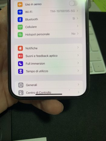
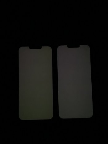
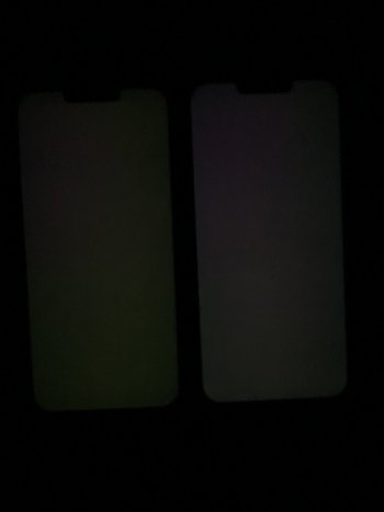
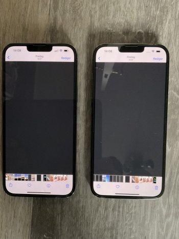
It's acceptable to me, the one before was worst, could see it blatantly on white backgrounds when reading. But I think these show the areas of concern. I even took one at a slight off axis angle to show that it's not merely off axis color shift.My 13pm looks almost identical in 0-20% brightness!
Got a tip for us?
Let us know
Become a MacRumors Supporter for $50/year with no ads, ability to filter front page stories, and private forums.
iPhone 13 Pro iPhone 13 Pro screen uniformity issue
- Thread starter Prepay16
- Start date
- Sort by reaction score
You are using an out of date browser. It may not display this or other websites correctly.
You should upgrade or use an alternative browser.
You should upgrade or use an alternative browser.
plus you need to view that white screenshot at least 5 secondsMy 13 Pro Max has an off-axis blue color shift. I just tried switching from a white background to the set alarm. There was no brightness change for me, the brightness slayed at 0%.
Feedback? It's like me asking if the sun sets from east and rises from the west. Or is it the other way around 🤣?
ehm, i'm sorry but i didn't get the joke 😀
This is a screenshot I believe? It won’t show any defects. Take a photo of your screen and not a screenshot bud.
I think he’s aware it’s a screen shot. But was asking if the areas with arrows have different tints on folks devices.
Yes, i'm aware it's a screenshot. I took it to show the areas where i see the uneveness.
Did you notice it on your previous device with Nightshift turned off?It's acceptable to me, the one before was worst, could see it blatantly on white backgrounds when reading. But I think these show the areas of concern. I even took one at a slight off axis angle to show that it's not merely off axis color shift.
plus you need to view that white screenshot at least 5

The perfect wallpaper for the mobile phone
This is probably the most funny wallpaper on a cell. When it is locked, in the background is the picture of the young owner when sleeping. Unlocking, his eyes open.
Last edited:
I don't remember.Did you notice it on your previous device with Nightshift turned off?
The bottom half of the screen was red pink tint when reading text or viewing websites with white backgrounds. This one is slightly to the right top corner side so doesn't interfere with my reading as much.
Have you tried to see if it happens to you too?
The perfect wallpaper for the mobile phone
This is probably the most funny wallpaper on a cell. When it is locked, in the background is the picture of the young owner when sleeping. Unlocking, his eyes open.www.videoman.gr
iPhone 13 pro brightness variation
i have an iphone 13 pro but i noticed a strange thing. When I switch from a white screen saved in the gallery to the settings in black mode or to the app to set the alarm, I notice a slight adjustment in brightness. obviously to notice this you have to set the brightness to 0 in a completely...
Have you tried to see if it happens to you too?
Yes it appears almost like true tone is coming on and off. I don't need to wait 5 seconds. Switching between white image and settings screen shows it. It's adjusting / energizing the power probably.Have you tried to see if it happens to you too?
so it's not me who see ghosts hahaha but I don't understand why this doesn't happen with active energy saving.Yes it appears almost like true tone is coming on and off. I don't need to wait 5 seconds. Switching between white image and settings screen shows it. It's adjusting / energizing the power probably.
I got no idea what JuJu apple uses. But damn the battery life is amazing. 🤣so it's not me who see ghosts hahaha but I don't understand why this doesn't happen with active energy saving.
with energy saving is close to infinity hahaI got no idea what JuJu apple uses. But damn the battery life is amazing. 🤣
Yes, i'm aware it's a screenshot. I took it to show the areas where i see the uneveness.
Sorry to have jumped to conclusions. If it is a software related cause, almost all iPhones running iOS 15 would have seen the unevenness. Mine seems to be uniform and I don’t see the unevenness in yours too.
Sorry to have jumped to conclusions. If it is a software related cause, almost all iPhones running iOS 15 would have seen the unevenness. Mine seems to be uniform and I don’t see the unevenness in yours too.
don't worry 👍
In ambient / natural light it's barely noticeable, in a dim light ambient it's more evident.
Attachments
Is that with True Tone turned on?don't worry 👍
In ambient / natural light it's barely noticeable, in a dim light ambient it's more evident.
Is that with True Tone turned on?
Yes it is.
I tried to take a pic with TT off but it looks almost identical, while it's obviously whiter in real life.
When you turn True Tune off does your display turn cooler (bluer)? Mine turns a lot bluer.Yes it is.
I tried to take a pic with TT off but it looks almost identical, while it's obviously whiter in real life.
When you turn True Tune off does your display turn cooler (bluer)? Mine turns a lot bluer.
yes, sure. It happens indoor with dim light or warm light condition, when you're outsite teh true tone makes the screen more neutral in the whites.
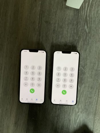
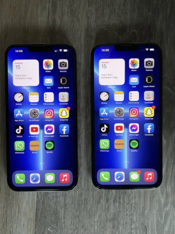
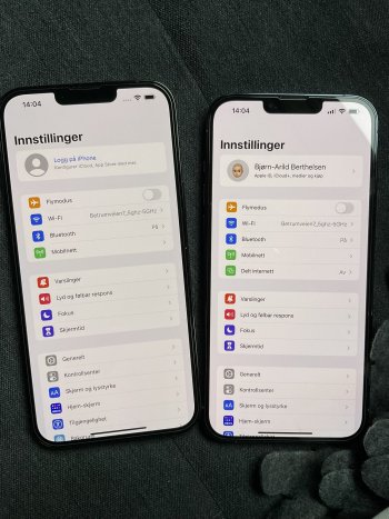
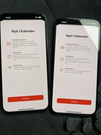
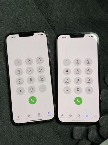
I have posted pictures earlier of my two iPhone 13 PMs in “extreme situations”, with low brightness, gray images, pitch dark room, etc… but here are some pictures of my phones under more “normal conditions”. I just can’t make up my mind if one of them is too red or if the other one is too yellow/green. What do you think?
The pictures doesn’t quite reflect what I see in real life, but it’s close. When I look at the phones in real life, the “red version” is a tad more red, and the “green” one is a little more green.
The pictures doesn’t quite reflect what I see in real life, but it’s close. When I look at the phones in real life, the “red version” is a tad more red, and the “green” one is a little more green.
Attachments
-
 8B2F828D-58DD-4344-8D15-F92D0B7E562E.jpeg486.1 KB · Views: 163
 -
 672E211D-4732-4AAC-9AA1-D563286D6EE1.jpeg485.5 KB · Views: 428
 -
 AC021D19-670B-4A19-818A-8937420299D2.jpeg432.5 KB · Views: 161
 -
 EF9856A4-A282-452D-AB91-1DB6E3471353.jpeg463.4 KB · Views: 168
 -
 0EB752CC-31AA-4487-B41C-447590DD2F5E.jpeg523.8 KB · Views: 173
 -
 866E57E7-B942-452F-9108-B32DC149B5F7.jpeg442.4 KB · Views: 165
 -
 A7D65742-9F0D-4F59-A896-3981E6CAD44E.jpeg462.6 KB · Views: 167
I think the one on the left is a tad better looking, with less red tint in most of the pictures.I have posted pictures earlier of my two iPhone 13 PMs in “extreme situations”, with low brightness, gray images, pitch dark room, etc… but here are some pictures of my phones under more “normal conditions”. I just can’t make up my mind if one of them is too red or if the other one is too yellow/green. What do you think?
The pictures doesn’t quite reflect what I see in real life, but it’s close. When I look at the phones in real life, the “red version” is a tad more red, and the “green” one is a little more green.
Last edited:
Yes, it has a lot less red tint - but I was wondering if it was too yellow/green and that the reddish tint was most “correct”… attached are a couple of pictures from the “extreme” situations…I think the on on the left is a tad better looking, with less red tint in most of the pictures.
Attachments
Is it the case that the screen looks that red in real life or is it just the camera making it look that red?Tried real hard to make the photos looks terrible . And was successful. 🤣
Test card used and brightness level used attached.
I see what you mean. The one on the left is definitely very green. In normal viewing situations, which one looks less horrible? 😂 Which one bothers you the least? That is the one I would keep.Yes, it has a lot less red tint - but I was wondering if it was too yellow/green and that the reddish tint was most “correct”… attached are a couple of pictures from the “extreme” situations…
It’s as red as seen in the first pictures.. it’s also noticeable on the keyboard, as the letters on the keys have an almost pink/red look to them…
I guess the red one bothers me the least, as I think it has better contrast, and the blacks look more “true black”, the green one makes a lot of pictures looks more “washed out” and less saturated.I see what you mean. The one on the left is definitely very green. In normal viewing situations, which one looks less horrible? 😂 Which one bothers you the least? That is the one I would keep.
Register on MacRumors! This sidebar will go away, and you'll see fewer ads.


