Got a tip for us?
Let us know
Become a MacRumors Supporter for $50/year with no ads, ability to filter front page stories, and private forums.
iPhone X App Switching Demoed in New Video as Apple Revamps Homepage Ahead of Pre-Orders
- Thread starter MacRumors
- Start date
- Sort by reaction score
You are using an out of date browser. It may not display this or other websites correctly.
You should upgrade or use an alternative browser.
You should upgrade or use an alternative browser.

Can't wait to see the horrible burn-in from demo units that are on full blast 24x7.
Will be quite the marketing tool... ..
I'm sure the stores will rotate them out every few days in an effort to snow in customers, making them not realize OLED burn-in is a very real thing. Especially on a $1k+ telephone they will keep for like 4 years..
Demo units goes to demo mode when not in use for an X amount of time. I doubt burn-in wasn’t considered by Apple when they are designing the screen unlike *cough* Google *cough*
Looks slick but what it does do is make that notch stick out in your face even more since it’s the only thing that doesn’t move and the fact you actually see the full pages slide under the notch makes your brain subconsciously see it more.
The notch didn’t bother me at all until I saw this. Not good...
The notch didn’t bother me at all until I saw this. Not good...
[sarcasm mode on]Fo real right. They should pattent this **** [sarcasm mode off/]amazing gesture
i think the last great gesture they introduced was swipe to go back, and this is just another one which will become incredibly natural to everyone after a couple of months
excited
It will come next year or in 2019, so a lot of customers will have a good reason to upgrade.
I'm happy with my 8+, same speed, has a dual camera with the same portrait effects and the aspect ratio of the screen is much better.
X is tall, but I want more width so I'll switch to the new design when they'll make a Plus version of it
X is tall? It's just a slightly bigger 6/6S/7/8 non plus.
Plus the camera on the X is better than 8+
But as long as you enjoy your 8+, then it's all good.
What a strange circle motion
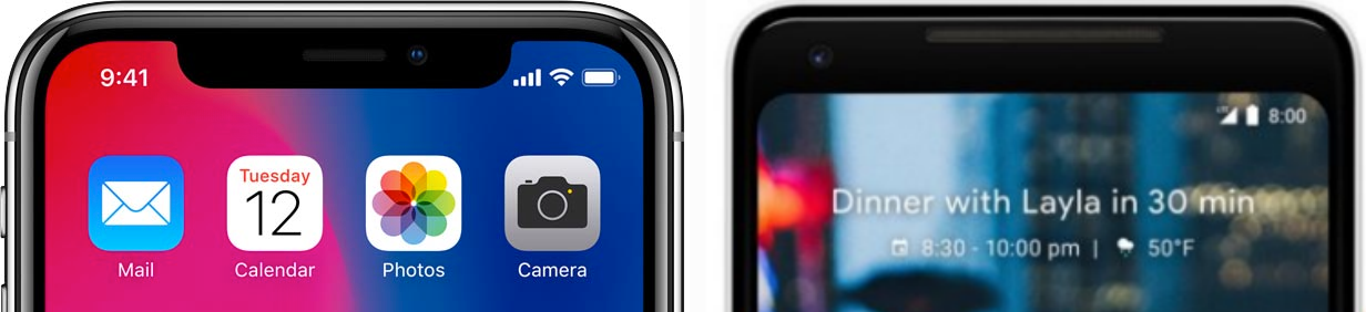
Following the debut of the iPhone X in September, Apple employees have been using the device in public, leading to a range of "in the wild" iPhone X photos and videos showing off new features and the device's revamped design.
The latest iPhone X video is short but demos a new app switching feature that's unique to the device. On iPhone X, you can swipe left or right on the display to quickly switch between apps, a process that's smooth and seamless in the video that was discovered on Imgur and then shared on Twitter.
Apple did demonstrate this gesture on stage when the iPhone X was introduced, but the video gives a clearer look at how well it works.
On previous devices, app switching was largely initiated through the Home button, but with no Home button available, Apple found a simpler, more intuitive solution for the iPhone X. iPhone X users will also be able to use a swipe upward and hold gesture to get to the traditional card-based app switching interface.
In other iPhone X news, Apple tonight revamped the Apple.com homepage to focus solely on the iPhone X ahead of pre-orders.
The page has an iPhone X front and center along with the pre-order time, and it features several animated sections highlighting various iPhone X features like the edge-to-edge display, Face ID, the TrueDepth Camera, the improved rear camera with Portrait Lighting, the A11 Bionic processor, and wireless charging.

iPhone X pre-orders will kick off in just two days on Friday, October 27 at 12:01 a.m. Pacific Time. The first pre-orders will begin arriving to customers on Friday, November 3, the official launch date for the iPhone X.
Article Link: iPhone X App Switching Demoed in New Video as Apple Revamps Homepage Ahead of Pre-Orders

That notch.....A real showstopper.
More like, iconic. In the most literal sense of the word:

This shape, and not an undescribed rectangle, is immediately recognizable as the new, modern iPhone, just like bezels and a circular home button were the iconic signs of the original iPhone. That's why Apple are telling developers to just embrace it. I personally love it.
I hope i can disable swipe up and have 3d touch from left side for home and app switcher
God. Weak troll.
[URL='https://twitter.com/sdw']Webastiaan the Sith ✔ @sdw
App switching on iPhone X looks pretty smooth. (via https://imgur.com/a/vfQoI )
[/URL]
 Webastiaan the Sith ✔ @sdw
 Well gee, that's nice to know where the $1000 has been spent.
Was beautiful to see the notch disappear into the black Spotify background. Apple could’ve embraced the notch by leaving it on the notification and home screens but then made the top bar background black inside all apps. That would be a perfect compromise to leave the phone recognizable without being distracting when inside an app.
I was thinking about this same thing just yesterday and i completely agree with you. Because if you look at all other phones, if the icon was made after lets say Samsung Note/S8, all it would be is rectangular shape with two horizontal lines portraying bezeles(one on the top and on on the bottom) and that would be it. So it wouldnt really look like a phone at first glance...More like, iconic. In the most literal sense of the word:
This shape, and not an undescribed rectangle, is immediately recognizable as the new, modern iPhone, just like bezels and a circular home button were the iconic signs of the original iPhone. That's why Apple are telling developers to just embrace it. I personally love it.
who will keep an X for 4 years?Can't wait to see the horrible burn-in from demo units that are on full blast 24x7.
Will be quite the marketing tool... ..
I'm sure the stores will rotate them out every few days in an effort to snow in customers, making them not realize OLED burn-in is a very real thing. Especially on a $1k+ telephone they will keep for like 4 years..
I'd say 90% of people buying an X over the next few weeks - will be upgrading again next year
More like, iconic. In the most literal sense of the word:
<pic>
This shape, and not an undescribed rectangle, is immediately recognizable as the new, modern iPhone, just like bezels and a circular home button were the iconic signs of the original iPhone. That's why Apple are telling developers to just embrace it. I personally love it.
If they could have made the X without the notch, I am sure they would have. And they would have figured out some nice icon for it. I do not think the notch is a "showstopper", like the previous poster called it, but to me it does feel like "tried, but failed", a weak compromise, not really good enough, but the best they could do. Embracing it, trying to make it "iconic", that is dressing up a pig. Maybe it is more honest than trying to hide it in black, but it remains a bit weak.
Why the hell is he using it like that???? He just has to swipe the bottom and move up and down while swiping... that's what Craig showed us..
I wish people would view the notch not as the bezel eating into the display, but the display eating into the bezel.
If they could have made the X without the notch, I am sure they would have. And they would have figured out some nice icon for it. I do not think the notch is a "showstopper", like the previous poster called it, but to me it does feel like "tried, but failed", a weak compromise, not really good enough, but the best they could do. Embracing it, trying to make it "iconic", that is dressing up a pig. Maybe it is more honest than trying to hide it in black, but it remains a bit weak.
Apple is using the notch as a logo. It's not a compromise, they did it on purpose. OLED allows for irregular shaped screens.
Register on MacRumors! This sidebar will go away, and you'll see fewer ads.