Become a MacRumors Supporter for $50/year with no ads, ability to filter front page stories, and private forums.
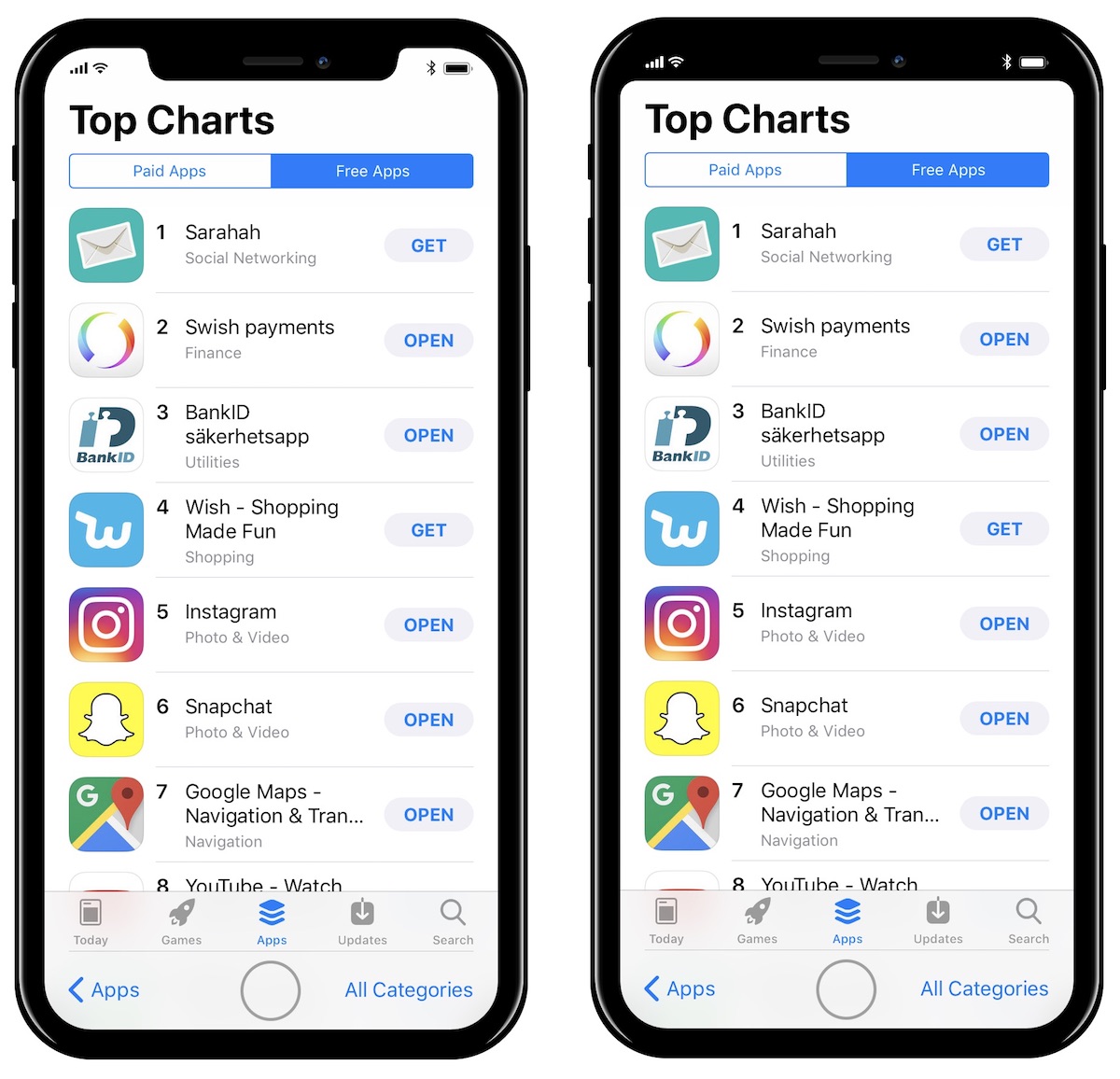
This has confirmed that I don't want the iPhone 8, I can't ignore the notch. The UI elements look so out of place :eek:
You can’t ignore the notch...on screenshots that feature just the status bar and the notch.

I’m pretty sure it will be easy to ignore after using it for 5 minutes.
 
I’m happy with everything I have seen. I like the looo of the notch and embrace the new changes that come along with it. Happy to see Apple went with an original design decision.
 
For people saying that the notch is intelligent because it takes advantage of space rather than leaving the big blank spot in the middle of the status bar...why not just add useful icons to the status bar? I don't even hate the notch, I just don't understand this argument.
 
  • Like
Reactions: mkeeley
I love these changes, and embrace the notch. It’s brilliant, really. It gives you the ability to have those notifications and clock etc while simultaneously not eating into the full horizontal screen-only real estate below.

Right, if there's a display cutoff point, below the camera/sensor/speaker cluster, why not use the additional space to the sides for a few indicators/icons? That space has been designed into the overall UX, they had a target spec for the "primary" display area, it's not like they backed into this concept, i.e., "Oh let's make X/Y res/size, hey let's take some of that space away ..."

Sign me up :D

As a developer, I'm also interested in if this space will go to a straight horizontal cutout through code, if landscape mode provides [creative] use, etc.


The carrier name is useful when wifi calling is enabled, let’s me know if I’m likely to loose the call when I step outside the house so I can prepare for it rather than hope that the call was on cellular when you loose wifi.

I'd suspect they'll have some other small indicator for WiFi calling, I don't need a carrier acronym, I know my carrier, I would just like a simple notification, like a change to the cell or WiFi strength meters :)
 
I will take the notch ANY DAY. Anyone who thought that wasn't going to be a thing bust have been okay with not having a front facing camera. This was pretty straight forward as far as design expectations go.
 
You like it but at the same time you wish it black all the time.
You sound like you want to like it.
I’m saying it looks good (better than I thought it would look), but I would prefer it to be black. Although if black, I would want the bottom bezel to be the same thickness, so really I’d have to see what it’s like in person to judge.
 
So it's official: iOS 11 will embrace the iPhone X's receding hairline.

yGROKoQ.gif


Actually, we'd prefer it if the software made this nice hardware more seamless by putting a black bar beneath the status bar icons. It's quite simple and in no way mad.

LMAO! @ receding hairline...it was bound to happen 10 is like 60 in phone years
 
  • Like
Reactions: Capitalist_King
So it's official: iOS 11 will embrace the iPhone X's receding hairline.

yGROKoQ.gif


Actually, we'd prefer it if the software made this nice hardware more seamless by putting a black bar beneath the status bar icons. It's quite simple and in no way mad.

A bar that takes up space for no reason? I fail to see the logic...
 
So it's official: iOS 11 will embrace the iPhone X's receding hairline.

yGROKoQ.gif


Actually, we'd prefer it if the software made this nice hardware more seamless by putting a black bar beneath the status bar icons. It's quite simple and in no way mad.

iPhone 8: Receding Line Edition™
 
I want to know what space are Galaxy S8/Note8 users losing lol. We can use any app in full screen mode so no lost of space. The iPhone display may be 5.8 in but if those measurements include notch space which it seems like it does, you guys are losing screen space.

Measure from the corner of the ear diagonally and you guys only have around 5.5 to 5.6 inches of effective screen space.

But the iPhone X can be essentially full screen while e.g. browsing in Safari and STILL show the time/battery etc which is situated around the sensors at the top. Doesn't need to be in some "full screen" mode. It's always full screen! On the Galaxy S8, you have wasted space to the left and right of the earpiece/sensors. It's funny how the S8 already looks dated to me with that huge bezel after seeing the new iPhone. :)
 
Tim will probably ramble on about the notch. Like the salesman he is, he will have you convinced the notch will cure all ills.
 
The bar and ears doesn't bother me. (and I think I like it even more since @Porco posted that hilarious Sesame Street blend image. :p)

Seriously, though, how the phone works and feels in hand is most important for me beyond the screen, battery life and price.)

All that said, I will be holding out until at least next year as I want to get my $ worth with the 7+ (despite not using all the bells and whistles.)
 
So no evidence of dark mode in IOs? That would eliminate the notch for most applications and situations. Why bother with Oled then?
 
  • Like
Reactions: tonyr6
Great, now fanbois will argue over the damn notch in a phone they've never even used.

Does ANYONE know if I'll be able to pick one of these up at an Apple Store on Tuesday? Or does Apple normally announce availability at the event? I haven't watched a keynote since Jobs died...
 
It doesn't take up an more usable space than the status icons already do; it would sit behind those icons and make the notch seamless, like the image on the right:

iphone-8-embrace-the-notch.jpg

I see what you're saying. Seeing them side by side, I still choose the notch. It's more coherent to have the screen be uniform in this regard. That said, I wouldn't be averse to there being a choice, but this isn't the Apple way.

Either way, the S8 looks so dated to me with the huge bezels. Who'd have thought it, after being aghast looking at my 7 Plus since the S8 came out...

http://cdn04.androidauthority.net/w...sung-galaxy-s8-review-aa-40-of-43-840x473.jpg
 
At first I wasn't sure about the notched ears but with this post it looks great and really makes great use of space with useable information for the consumer. I look forward to getting the iPhone 8s next year as my 6s is still doing fine.
 
But the iPhone X can be essentially full screen while e.g. browsing in Safari and STILL show the time/battery etc which is situated around the sensors at the top. Doesn't need to be in some "full screen" mode. It's always full screen! On the Galaxy S8, you have wasted space to the left and right of the earpiece/sensors. It's funny how the S8 already looks dated to me with that huge bezel after seeing the new iPhone. :)

There is nothing that looks dated on the S8 or Note 8. This sounds like a whako trying to force himself to appreciate Apples hideous design. The screen still does not have more useable space no matter how you try to spin it. That notch takes exactly the same amount of space or more than not having the ugly notch. How can you criticize samsungs design when you have a horrendous vertical camera bump, 2 bunny ears, and bezels on ALL sides with a ugly notch for goodness sake.

P.S. there is no such thing as a full screen "mode" on the recent Samsung devices...we have easy DIRECT full utilization of our screen...no mode to place it in for this
 
Last edited:
Register on MacRumors! This sidebar will go away, and you'll see fewer ads.