Plymouthbreezer said:
I'm I the only one who actually reads *every* post in the thread before I reply (so I don't make a fool out of myself, like many here do).
funkychunkz said:
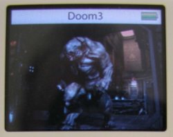
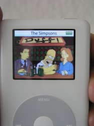
One could simply take a screenshot of an iphoto effect and take a picture of it being displayed on the ipod.
I disagree that everyone should be expected to read threads--especially when they get long--or not contribute. The repetition can be annoying, but it's not stupidity, it's simply that they didn't take the time to read all that. A forum with no repetition would be neat, but a forum where you were REQUIRED (theoretically) to read all posts in a thread before adding your contribution would be a real pain.
So if I have to choose one inconvenience over the other, I'll settle for the repeats. Myself, I tend to read the first and last several posts, but not all of them. It's just not worth the time. I don't think the consequences of that are too terrible, since you can just ignore repeated points.
HOWEVER, I did think the two posts above were funny in that order

dejo said:
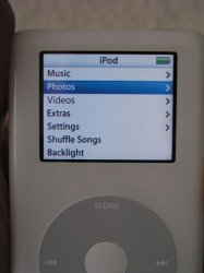
(If the damned Myriad font would be as thick in real use as it is in the iPod menus, this fake would be even more believable.)
You want Lucida Grande. Myriad is used for Apple product names and things, but the iPod and OS X UI use Lucida Grande. (And the different smoothing settings in Photoshop make a difference too.)
PS, although it's silly to consider faking these by any method OTHER than photographing a real iPod showing a real image (moire and all) that you uploaded... I was personally silly enough to consider just that

Here's my senselessly difficult method...
1. Put a blank white photo on your iPod and view it. Take a close-up shot and you've got your iPod-screen texture.
2. Make your fake screen in Photoshop--you could use pieces extracted by alterPod etc. (apps used to re-skin the iPod UI).
3. Layer your fake over the white-screen photo in Photoshop. Use Multiply mode to let the screen texture come through perfectly.
4. Free Transform and drag the corners into perspective.
5. Blur as needed to match the photo, and Adjust Curves to reduce the quality like an LCD.
7. Feel the need for reflections/glare? Take them from a similar photo of the iPod turned off. Composite that screen on top with a mode of Screen. Set curves on the layer to get a true black if you need to avoid brighting the whole thing.
8. Need to have focus or brightness or color/sat vary across the screen? Make a slightly different version, and composite that over the top. A soft layer mask with a big brush (or even a gradient) will let you paint in a gradual shift of focus or lighting.
But as I said, these fakes were made by a less fun but much simpler method


