Become a MacRumors Supporter for $50/year with no ads, ability to filter front page stories, and private forums.
autrefois said:
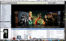
Thanks for the post, didn't think to do that. After reading your advice, I actually did this on my Powerbook (created a smart playlist called Music Videos) and then noticed there were TWO lists with that name. I was sure I didn't create it twice, so I went to my Power Mac (which I hadn't opened yet since updating) and lo and behold, iTunes 7 by default apparently already has a smart playlist called "Music Videos" (at least if you already have music videos in your library). I have 11 smart playlists I created myself, so I didn't notice the new one in there. Was this not the case with you? Maybe it's just the US version, for some reason?

So to summarize, it appears that instead of having a separate category for Music Videos under "Library", Apple made a smart playlist called "Music Videos" that music videos go under. Seems like it was just tacked on at the last minute as an afterthought, otherwise why wouldn't they have just put this under "Library"?!

Great catch. I also missed it and you are able to use one of the 3 viewing functions. Nice.....

Yes I changed my iTunes icon rather than complain about how it looks.
 

Attachments

  • Picture 2.jpg
    Picture 2.jpg
    187.9 KB · Views: 297
Anyone else thing it would have been cool if Apple treated their movies like they do their dashboard widgets? When you are scrolling through your movies in album view you click on the movie, it flips, and previews right there like Front Row does.
 
Cougarcat said:
Oh god please no...

I hope a new version of iTuno comes. Fast.

Those folder icons are new. Maybe they will show themselves in Leopard. OS X's icons have stayed unchanged since 10.0.

And what's up with the all caps text in the sidebar + store? Gives me a headache.

Aside from the interface issues, iTunes 7 has been the best upgrade yet. And unexpected––I just assumed a modest 6.1 upgrade for movie support. CoverFlow integration, gapless playback, slick new iPod interface...now Apple just needs to fix the GUI and all shall be well.

Hear hear. I sure as h e l l hope safari or any other iLife app doesnt transition to this. The new interface is just tooo Gunmetal looking
 
milo said:
Nope, they're just included in the MUSIC category.


Pricing is different, cheaper in some cases with a lower max price. And restrictions are much better in iTunes, 5 versus 2. Plus the amazon thing isn't mac compatible, it behaves like spyware, and requires a custom player to play the files.

You are right the Amazon UI sucks but Amazon did one thing that is very important to me. They offered rentals. I would much rather rent a movie for $3.99 from the Amazon store than buy a movie for $14.99 from the Apple one. If I want to watch it more than once Ill go get the DVD for less with all of the nice casing and extra features. I'm not really sure who in their right mind would pay these prices for content without physical media and I can't see people ripping all of their DVDs into iTunes either so it seems to me that this feature is dead in the water and so is the streaming media device. On-Demand from Verizon Fios if you have it in your area has this beat hands down. So does Netflix, Amazon, the video stores and buying the actual DVD from Walmart or Bestbuy for that matter IMO...
 
I don't know about you guys, but I think this is the perfect opportunity to get HD content out there. I want to watch HD content on my computer and on my tv (once "iTV" comes out)

Forget bluray and HDDVD - lets end all that and offer HD Movies and TV Shows.

Whats an extra 30 minutes for a download to get H.264 HD Content?

What do you think?
 
mooncaine said:
Speaking of your cat's breath: have you tried feeding it some greens? I have 2 cats here that, I recently discovered, like fresh spinach. Weirdest thing I ever saw our cats do. One of 'em actually loves the stuff and will eat it any time, apparently.

You might want to relay that message to Ralph Wiggum, or at least his legal guardians Clancy and Sarah with the advice.
 
Generally sound, time for the obligatory whine:

• The grey sliders aren't nice at all. Look entirely out of keeping with my blue ones everywhere else.
• It seems to want me to make my iTunes window full screen to avoid sliders on the playlist side. I'd really like to remove the headers for each of the sections. I know my playlists are playlists, I know my iPod is a device, and give me my disclosure triangle back for the iTMS/Shopping Cart icons as they were before please. Both need not always show. :(
• No button for visualiser any more. Keyboard shortcut it has to be then. Sigh.
• The views button really should disappear when you're at the store, as opposed to dimming out.

And the praise:

• Podcasts are, once again, no longer integrated in the main library. Yay. Only taken a year to change this back to how it was in iTunes 4. Will it change back in iTunes 8?
• It certainly seems faster.
• The iPod page thing is very nice, as is having the integrated updater.
• Views are niceish, but somewhat redundant when you're a "song" person rather than an album person (like myself).
• The entirely unwanted Ministore button has vanished. Good-o.
• Ah, I see they've returned to the old "limit search" drop down menu rather than the Spotlight-esque buttony thingies they had before. For the better. Makes a mockery of last year's "vastly improved" search claims, though.

Overall: solid, if slightly niggly update.
 
They is only one new 5G iPod Video the 80GB one, and all iPod owners 5G iPod need to update to 1.2 software on the iPod and you will then be able to have 640px in H.264 and not have to deal with 720px MPEG4 video ever again

720 MPEG4 Video content outputs to TV in 640 quality so 640x480 H.264 is better quality

so all with 5G iPod Video as from today with updated iPod internal software 1.2 have the latest iPod
 
mooncaine said:
Right on. You can tell at a glance, with the old style, that the FWD and REW buttons are not being used,
That's still the case, it's just not shown in that particular screenshot.
 

Attachments

  • Picture 2.png
    Picture 2.png
    5.5 KB · Views: 956
XArt@justinks.c said:
so all with 5G iPod Video as from today with updated iPod internal software 1.2 have the latest iPod
Apart from the updated screen brightness... :p

And what's this about 720px MPEG-4? I though the limit was 480x480?

B
 
Hide store?

In the past versions of itunes it gave you the option to hide or show the store, version 7 seems to have taken that away. Is there something I'm overlooking? Anyone know how to not make the store show up in the left bar?

Beyond that, I really don't like how everything has been moved around. I'm so used to being able to access the EQ and start the visualizer right from the bottom bar buttons, those are gone now. The button that looks like an eye should be the visualizer but it's not. They just made it harder to access both of those frequently used things now. Is there some reason we need a huge eject button in the bottom bar of itunes anyway? Isn't that what the eject key on our keyboards is for?
 
Multimedia said:
Nope it's not there. Guess it's off to eBay for us. We'll Have to sell our 60GB models for $299 and pay Apple another $50 for the 80GB model with proper search capability. :(


DARN.. Here goes another waist of good technology down the drain :-(
 
mostman said:
Ok - check this out.

In list view - click on the column header for Album.

-Mike

That is AWESOME!!!!
I've been waiting forever to have each artists albums listed chronologically.
This and gapless playback... sweet.
 
Mitthrawnuruodo said:
Mark album and get info... ;)

View attachment 57243

This is something separate.

Albums become automatically gapless if iTunes judges they should be (I guess it looks at silences in the files). That option in get info/properties to make the album lossless is for if you are using crossfade, to make iTunes not crossfade those tracks.

I saw a knowledge base article on this.
 
balamw said:
Yup, so for example you might have a track, "South Side" by Moby (featuring Gwen Stefani) and assign Album Artist as "Moby". It'll get files under Moby if you view the Album Artist tag, but it'll still find it if you search for Gwen Stefani.

It is useful, but it's definitely not intended for "multiples" in the way you want it. (Me too).B

Glad that somebody hear me :)
Well, actually, if it is used the way you say, then multiple artist would work too, pile them all in that tag, and it will find them when you type any of the artist in the searchbox. But, I mean, is that so hard to make them appear in both artists' lists. I wonder if there is a fundamental glitch in the way I want this to be implemented.

Anyways, while I'm at it, you know what else I want? Those dublicate songs... drive me nuts. iTunes can find and show them nicely but what for? They should make an option so that a dublicate song has two entries in the library but pointing the same mp3 file. That would save megs of space for me. Heck, I can even do this manually, by going to the xml of the library and changing the path of the file on that dublicate song entry. They should implement this too someway...
 
hiyel said:
But, I mean, is that so hard to make them appear in both artists' lists. I wonder if there is a fundamental glitch in the way I want this to be implemented.
FWIW Windows Media Player implements it pretty much the way you want it. :(

Duplicate songs don't bother me.

B
 
daneoni said:
Hear hear. I sure as h e l l hope safari or any other iLife app doesnt transition to this. The new interface is just tooo Gunmetal looking

I don't like the GUI either. I like my shiny blue "pill" scrollers. Gunmetal makes it look like a linux program. The buttons have lost their shine. The flip catalogue of albums is great, though. Only I've lost some of my artwork.

I hope leopard doesn't unify this theme into all of the iLife apps.
 
thequicksilver said:
The grey sliders aren't nice at all. Look entirely out of keeping with my blue ones everywhere else.

IMO the new sliders fit better with the understated Tiger Apple menu icon, Spotlight icon etc. The traditional bright Aqua look began disappearing from OS X when Tiger was released. In fact, if you take away the obligitory red/yellow/green window controls, there isn't much of the early Aqua-ness left in iTunes 7.

Personally, I like it. I remember being disappointed when the iTunes 6 gunmetal interface was released, moving away completely from the brushed metal theme. But I recently used iTunes 4 on a friends PowerBook, and it looked absolutely hideous! :eek:
 
alien2108 said:
Thank you Apple for making Cover Art download unusable for all ppl living outside "iTunes Store" Countries...Damn...I wish I could register but I can't! :(
As I mentioned in another thread, it's fairly well known that you can get an account by having someone in the US gift you a song. Or buying a gift card code from eBay...

B
 
Register on MacRumors! This sidebar will go away, and you'll see fewer ads.