Got a tip for us?
Let us know
Become a MacRumors Supporter for $50/year with no ads, ability to filter front page stories, and private forums.
Jony Ive Designed a One-of-a-Kind Yellow iPad Pro for Charity
- Thread starter MacRumors
- Start date
- Sort by reaction score
You are using an out of date browser. It may not display this or other websites correctly.
You should upgrade or use an alternative browser.
You should upgrade or use an alternative browser.
My post was based off of more than just the photo. It was also based off of the materials mentioned in the article and the process used to dye them. I'm was trying to maintain some objectiveness by taking about the processes of dying different finishes. Although, I do actually like the colors.Ummm. Just as shallow as we are for slamming it , you are praising its merits....based on a photo.
And his past donations for the project RED campaign included a red Mac Pro and Rose Gold EarPods. None of which included any new design expect a new color.
[doublepost=1460817919][/doublepost]
It is about taste when it comes to visual appeal but you can't deny the craftsmanship.It's about taste though... not about how difficult it is to achieve the colours.
I mean, it could take a lot of effort for me to drop a big bog down the dunny. However, that doesn't make it more valuable than the last.
Reminds me of Mondrian, this was obviously inspired by Mondrian. I love it
I'll take a black version of the Apple Pencil Case, Please!
Seriously, Apple Pencil Case?! YES!
(And a place to put the female to female charging port piece?)
Seriously, Apple Pencil Case?! YES!
(And a place to put the female to female charging port piece?)
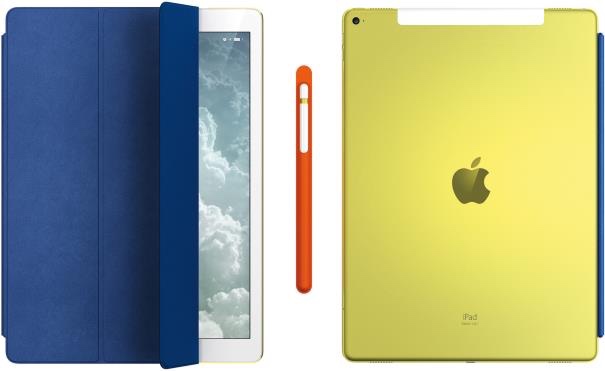
Jony Ive's design team has created a one-of-a-kind 12.9-inch iPad Pro, iPad Pro Smart Cover, and Apple Pencil holder that will be auctioned off as part of a fundraiser for the London Design Museum, reports Wallpaper.
The iPad Pro has been anodized with a bright yellow dye, making it unique among Apple's standard color lineup of Space Gray, Silver, Gold, and Rose Gold. Compared to the Gold iPad Pro, it's a much brighter, more vibrant shade of yellow.
Accompanying the yellow iPad Pro is Smart Cover made from a blue French leather and an Apple Pencil ensconced in an orange Italian calf leather case. According to the auction listing, the iPad Pro's back and the Smart Cover are etched with the words "Edition 1 of 1."
The iPad Pro has an estimated value of GBP10,000 - 15,000, the amount it is expected to fetch at auction. It will be available to bid on starting on April 28.
Apple has donated specially designed items for charity auctions several times in the past, with Jony Ive creating a red Mac Pro and solid gold EarPods, among other items.
Article Link: Jony Ive Designed a One-of-a-Kind Yellow iPad Pro for Charity
In response to those shocked that people here are criticizing something in the name of charity, keep in mind the charity is a design museum, not one helping starving humans, help stop a disease, homelessness, cancer, or some other human-worthy cause. It's a museum looking for money. It's nice Apple is helping them, but let's put it in perspective.
I thought chartreuse, as well. The whole ensemble seems to suggest a playful approach to colour, which is alright with me.Chartreuse. The man is a genius.
Best I can tell is that this an homage to the Bauhaus (use of primary colors) — a design movement that Apple has stood on the shoulders of since the original Mac.
These are the three colors that the London Design Museum uses.
So many people opinionated about a colored iPad, trying to be witty.
While I haven't been a big fan of Ive's latest design, in this instance he, like one poster mentioned and you all chose to ignore, you can see here, why the color suits this iPad for this particular auction.
I completely agree.
Someone will pay lots of money who likes it. There only needs to be one.
Like many people have said, I don't particularly find it appealing either, but that is a good thing for a unique customised piece I'll never even have the chance to own, let alone want to! I hope it raises lots of money for the museum.
In my case at least, it is not really about the actual item, it is about the self-congratulatory superlative bullshine description. Time to get over themselves. Just say it is a one off fun color combination to make money for a place set apart to allow this elite group of designers/artists to pat each other on the back. It's not even for a good cause.
Last edited:
These are the three colors that the London Design Museum uses.
Which three? Blue, yellow and white? I looked at their website and saw no orange anywhere, or really even blue for that matter, but I did see fuchsia as a primary accent color which is nowhere to be found on the iPad.
Wow… I find it hard to believe this guy is said to have brought us some of the greatest, most beautiful and even timeless industrial designs in personal computing when I see this… truly feeling sad… where has his magic gone to?
Steve was the magic. They were good lieutenants. Not a general in the lot.
I'd rather pay Colorware for an iPad that didn't remind me of vomit for 1/20th of the price. The iPad Pro is only a matter of time for the their product line up.
To start with something this genuinely new, you have to start again, I think with great intent, you disconnect from the past. Along with the experience of actually using it, what makes this once in a lifetime product so defined, is the evolutionary harmony of the bold yellow, blue leather and orange, the nuanced framework within how I have designed these colors. This took all of our learning, our best thinking to realize something something so profound.
Last edited:
Normally no. But lately this comes as no surprise whatsoever. The guy is off his rocker. "One-of-a-kind" is certainly true in this case, but not in a good way.Did you expect anything less from this style guru. Just look at the crappy color schemes in IOS.
Wow… I find it hard to believe this guy is said to have brought us some of the greatest, most beautiful and even timeless industrial designs in personal computing when I see this… truly feeling sad… where has his magic gone to?
When teamed up with a brilliant fellow with the last name of Jobs he brought us . . . .
Seems he is not being rained in with the current management. Guess it is kinda like that fellow name Dennis Rodman, a super star when playing with Jackson, Pippin, and Jordan, but not so much on his own. Maybe the superstar status was a little premature.
I think it actually looks pretty good... Not sure why people are so keen to bash it.
I would totally buy a bright yellow iPad Pro. Heck, if it had been available, I'd have bought it a couple weeks ago when I got my new 9.7. And the purple cover.
Register on MacRumors! This sidebar will go away, and you'll see fewer ads.


