Become a MacRumors Supporter for $50/year with no ads, ability to filter front page stories, and private forums.

Are the screenshots real or fake?

  • Real

    Votes: 119 26.1%
  • Fake

    Votes: 337 73.9%

  • Total voters
    456
Status
Not open for further replies.
real or fake

I am not sure, some windows applications currently do not have the shadow effect, or may not be suported in this version of Leopard.
I'm in doubt, both the real and the fake side have credibility to me.
Aside from that, if the features shown are real, then the Mac OS will have a very bright future indeed, more than currently the case!
 
I wish the faker would've posted a shot of the screen when clicking the
"More Info..." button in the "About This Mac" window. ;)
 
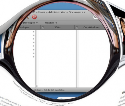
hmmm - look at file list in "documents" folder

not sure if this has been pointed out, but if you look at the list if "files" in the Documents folder that's being reviled there are only folders listed. what are the chances that documents folder only contain folders.

then again, maybe that's a new feature, in tree view you can do order-by too.

edit: oh, and the Administrator user folder is missing in the shortcuts.
 

Attachments

  • leopard_img02_cropped.png
    leopard_img02_cropped.png
    124.3 KB · Views: 159
Super Dave said:
1. FTP upload in Finder
2. Yahoo/MSN support in iChat (if only text and file sharing)
3. Spotlight Advanced Search (and/or, but not, etc)

I'll think of more later too, but those are at the top of my list.

David :cool:

Any or all of those would be fantastic. When I mentioned the Finder I was referring to the interface, but FTP upload/download functionality and boolean Spotlight searches would be more than welcome.

Also Mail has to get faster, and iChat, like you mention, would be more useful if they would bite the bullet and allow MSN compatibility.

They let Windows run on Macs, what's the big deal about adding MSN compatibility?
 
While these are probably fake, I must say that they are very well done. Props to whoever made these up...

All the ideas in those screen shots, by the way, seem really nice. I would love the ability to run Windows programs natively without having to reboot. It'd be great for games. :D
 
These are the real OS Lep screenshots

Ok, I promised a friend I wouldn't do this, but I have to, just to prove the current screenshots are not real. These are the real ones I will show you. The first thing you will notice with 10.5, Apple has done away completely with pin stripe, it does not exist, its a cleaner look and feel, also, there is a small take on using translucency in certain parts of the UI. But this is for inactive windows as can be seen in the About This Mac dialog box. The dock also reflects this but is permanent throughout the user session, its a subtle change, in active icons seem greyed out on the Dock, while running icons are brighter, this is considered to be a Visual cue.


The biggest change has to be the Leopard version of Boot camp, actually, its nothing like boot camp, its way superior, its Virtualization running at the hardware level, no drop in performance, of course, XP and 2000 are assigned with 128 and 64 MBs of RAM respectively. Of course, some of this might change by WWDC since these screenshots are from March around the same time Boot Camp for 10.4 was released. There is expected to be a whole lot more coming, but, currently, OS switching is probably the biggest right now. I have a screenshot of the new Finder, its a bit too ugly right now and its a work in progress, you don't want to see it, trust me, and its not brush metal either.

Other noticeable things, Recycle bin, not on the Dock by default it seems, although I don't know if this is user intervention.
 
Comments

Ok, I'd say this was real and not Photoshop faked. Let me rebut the fake comments:

1. The Internet Explorer window is missing a shadow on the right-hand side

Actually, it's not. If you look closely the shadow is there, it's the same size as the shadow on the other non-active window, About This Mac. Notice I said non-active window. The shadow size difference may be a new feature for active and non-active windows.

Of particular note in the first screen shot is that Internet Explorer has been revised for the Mac! MS dropped IE for the Mac many years ago. If it's back it does lend some credence to the rumors of a renewed collaboration between MS and Apple. It may even mean that the rumors of a Yellow Box (Mac APIs) for Windows and a Red Box (Windows APIs) for Mac OS are quite true. We'll have to stay tuned on that one. It will probably be announced at WWDC.

2. Typically the About This Mac box has a build number for development versions

Ummm...Not lately. Apple removed the build numbers from that screen a while back. I haven't noticed them there for quite some time, even on the pre-release builds of 10.4.x updates. I'll verify that tomorrow, but I'm pretty sure they stopped doing that in 10.4.

All-in-all, looking good. I'm guessing that the person that posted these is Apple internal, as they haven't let it off campus yet to my knowledge.
 
Mr. Dee said:
Ok, I promised a friend I wouldn't do this, but I have to, just to prove the current screenshots are not real. These are the real ones I will show you. The first thing you will notice with 10.5, Apple has done away completely with pin stripe, it does not exist, its a cleaner look and feel, also, there is a small take on using translucency in certain parts of the UI. But this is for inactive windows as can be seen in the About This Mac dialog box. The dock also reflects this but is permanent throughout the user session, its a subtle change, in active icons seem greyed out on the Dock, while running icons are brighter, this is considered to be a Visual cue.


The biggest change has to be the Leopard version of Boot camp, actually, its nothing like boot camp, its way superior, its Virtualization running at the hardware level, no drop in performance, of course, XP and 2000 are assigned with 128 and 64 MBs of RAM respectively. Of course, some of this might change by WWDC since these screenshots are from March around the same time Boot Camp for 10.4 was released. There is expected to be a whole lot more coming, but, currently, OS switching is probably the biggest right now. I have a screenshot of the new Finder, its a bit too ugly right now and its a work in progress, you don't want to see it, trust me, and its not brush metal either.

Other noticeable things, Recycle bin, not on the Dock by default it seems, although I don't know if this is user intervention.


Man can't people even get the friggin memory type correct in their fakes?
 
DougBTX said:
Then you would expect to see the picture icon from the first screenshot on the desktop. If he took the time to move the image file somewhere else, the clock would have (probably) changed.

Dougals

You know you can change where pics get saved, right? Also, there are other desktop image capture utilities than the built-in one.

From the lack of clutter on the desktop, I'd guess this particular individual has already figured out how to get screen grabs from descending to his desktop.
 
whenpaulsparks said:
i think the IE7 title bar is a compelling reason to think it's fake. if you run darwine, which uses wine and runs the original EXE, it shows the same text in the mac title bar as the windows app would. granted, i haven't gotten IE7 to work under darwine, but it would act in a similar fashion, there is no reason for it to change. it would say the title of the HTML page followed by " - Windows Internet Explorer". if you think mac os x would add "Windows Internet Explorer: " before the title of the app to show what app it is, it would then be "Windows Internet Explorer: TITLE OF HTML PAGE - Windows Internet Explorer" because it CAN NOT change the title like that. the app puts the title there, not the OS, and it can not control that.

Are you sure about that? It's been a while since I've done any MFC crap, but it seems like you would give two values for the window (depending on the windowing model): the app name and the document name. Windows added the dash and put the app name at the end. That's why Windows apps are consistent in that particular manner.

Seems like the developer just got the two strings backwards when displaying the title bar.
 
Mr. Dee said:
Ok, I promised a friend I wouldn't do this, but I have to, just to prove the current screenshots are not real. These are the real ones I will show you. The first thing you will notice with 10.5, Apple has done away completely with pin stripe, it does not exist, its a cleaner look and feel, also, there is a small take on using translucency in certain parts of the UI. But this is for inactive windows as can be seen in the About This Mac dialog box. The dock also reflects this but is permanent throughout the user session, its a subtle change, in active icons seem greyed out on the Dock, while running icons are brighter, this is considered to be a Visual cue.


The biggest change has to be the Leopard version of Boot camp, actually, its nothing like boot camp, its way superior, its Virtualization running at the hardware level, no drop in performance, of course, XP and 2000 are assigned with 128 and 64 MBs of RAM respectively. Of course, some of this might change by WWDC since these screenshots are from March around the same time Boot Camp for 10.4 was released. There is expected to be a whole lot more coming, but, currently, OS switching is probably the biggest right now. I have a screenshot of the new Finder, its a bit too ugly right now and its a work in progress, you don't want to see it, trust me, and its not brush metal either.

Other noticeable things, Recycle bin, not on the Dock by default it seems, although I don't know if this is user intervention.

Now how the hell do you expect us to beleive those if we dissect a very good fake like the one in the OP? Puh-lease.
 
About the originals: Tabbed Finder Windows? C'mon. It simply makes no sense from a UI standpoint.

And those pics posted a few posts up...c'mon man...
 
What does microsoft have to do with what apple puts in there? Apple may not want microsofts name appearing all over their os putting their name in your head over and over.

celebrian23 said:
I think the fact the word microsoft never appears is proof in and of itself this is fake. No way microsoft would let apple not mention them anywhere
 
RichP said:
Its the same ratio as 1680x1050; which makes the "machine" this was running on a 17" MBP or 20"iMac.

Although it does have a lot of good elements, and this thing has been thoroughly dissected here, my "fake" observation is this:

If OSX is running Windows apps the way they are depicted, where is OSX grabbing the icons for in the dock? Windows apps dont have icons with high enough resolution for the apple dock, do they? (I know Vista will support high res icons)

Standard Windows icons are at 32, 48, 64, 96, and 128 pixels square. So, yes, they are plenty big enough for a little Dock icon.

Vista introduces display of 256-pixel icons. IE 7 being a Vista project (compiled for XP, but primarily a Vista component) would include the 256-pixel version of the icon in its resources, and so it's possible OS X is able to use the large icons too. But, again, I don't think those icons are any larger than 128-pix (without actually getting out my ruler and measuring them :) ).
 
Question for all the WINErs out there: Does 'Windows' need its own partition/drive like in alleged screen shot or do the .exe simply reside in the Applications folder of OS X?

To me, it doesn't make sense to have a separate volume for WINDOWS stuff when in fact OS X can run the Windows APIs natively (without any kind of virtualization blah blah blah). Having a separate Windows volume makes sense only if you're keeping everything separate, as in a guest OS or dual boot situation.

If I remember correctly, the system components of Classic resided in the OS X system directory and all classic apps resided in the Applications directory like all other apps.
 
Although the idea of windows apps nativley running in OS X sounds kinda cool at first I think this could be the end of mac ports and maybe even native mac apps.
 
slash button

What's that button connected to the action button in the Finder? What function could it have? Any ideas?

Real? Yes, because i'm a believer and i do think it's apple style.
 
MBHockey said:
About the originals: Tabbed Finder Windows? C'mon. It simply makes no sense from a UI standpoint.

Why not?

IMHO, looking at these "Leopard" Finder pics and the PathFinder windows on my Mac and I can't help but notice some familiar cues, like the tabbed browsing (someone else did that prior to PathFinder) and shortcut drop-downs. They work quite well in a file browser. In fact, I rarely have more than one PathFinder window open, but 3-6 tabs are almost always being used.

Tabbed file browsing ... if you really don't think it's useful, you're in for a major surprise.
 
RichP said:
Although it does have a lot of good elements, and this thing has been thoroughly dissected here, my "fake" observation is this:

If OSX is running Windows apps the way they are depicted, where is OSX grabbing the icons for in the dock? Windows apps dont have icons with high enough resolution for the apple dock, do they? (I know Vista will support high res icons).

This is just an educated guess but I think that IE7 has a high resolution image (assuming the pics are real) because it is being deisgned with all of the other new apps for Vista. That means that the icon used for XP is the same used for Vista.

That said, I think that the images are fake, (especially the ones posted by Hyperpasta) it's just too unlikely and I think that there are a few subtle mistakes already mentioned by others, and the fact that apple legal doesn't seem to be doing anything about it.

EDIT: Oops, Jettredmont mentioned it first.
 
If they were real, Apple would have issued a cease and desist letter by now. The pics are still up. They are fake.
 
Status
Not open for further replies.
Register on MacRumors! This sidebar will go away, and you'll see fewer ads.