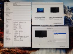
so one thing I would like to fix and I am not sure if there is a correction for this is the typeface. Maybe I am used to the retina display on my rMBP but the type is a lot more blocky than I like and I would love to have that seamless appearance that my rMBP has.
I know that I have greater pixel density on the laptop but the picture on the LG is tremendous apart from the type. As I type this I feel eye strain as compared to the rMBP.
Is it a setting I can adjust?
Edit: Looks to be a well known issue and an Apple issue not a display issue. As I mentioned, the pictures and video are gorgeous. The fonts are problematic.
This post highlighted and defined my issues.
https://forums.macrumors.com/threads/1390034/
The rmbp has a much higher PPI so you cannot really compare these two screens and sharpness of the fonts. I have a rMBP and know the difference. I switched from a ACD 27" to the 34" LG and the difference of the sharpness of the fonts is only minimal between the two, but it is normal because the PPI are almost identical.
LG will bring out a 29" with the same resolution and specs as the 34" later this year apparently. This screen will have more PPI and will be therefore sharper and probably more expensive, too, because I think the construction process of the panel is more expensive even though the screen is smaller.
They have some true 4K monitors in the works as well and with the upcoming 10.9.3 release they should be pretty well supported by the OS and give more of or "retina" feel.
For what it is worth I have put the sharpness on 6 in the menu and am pretty happy with the fonts.


