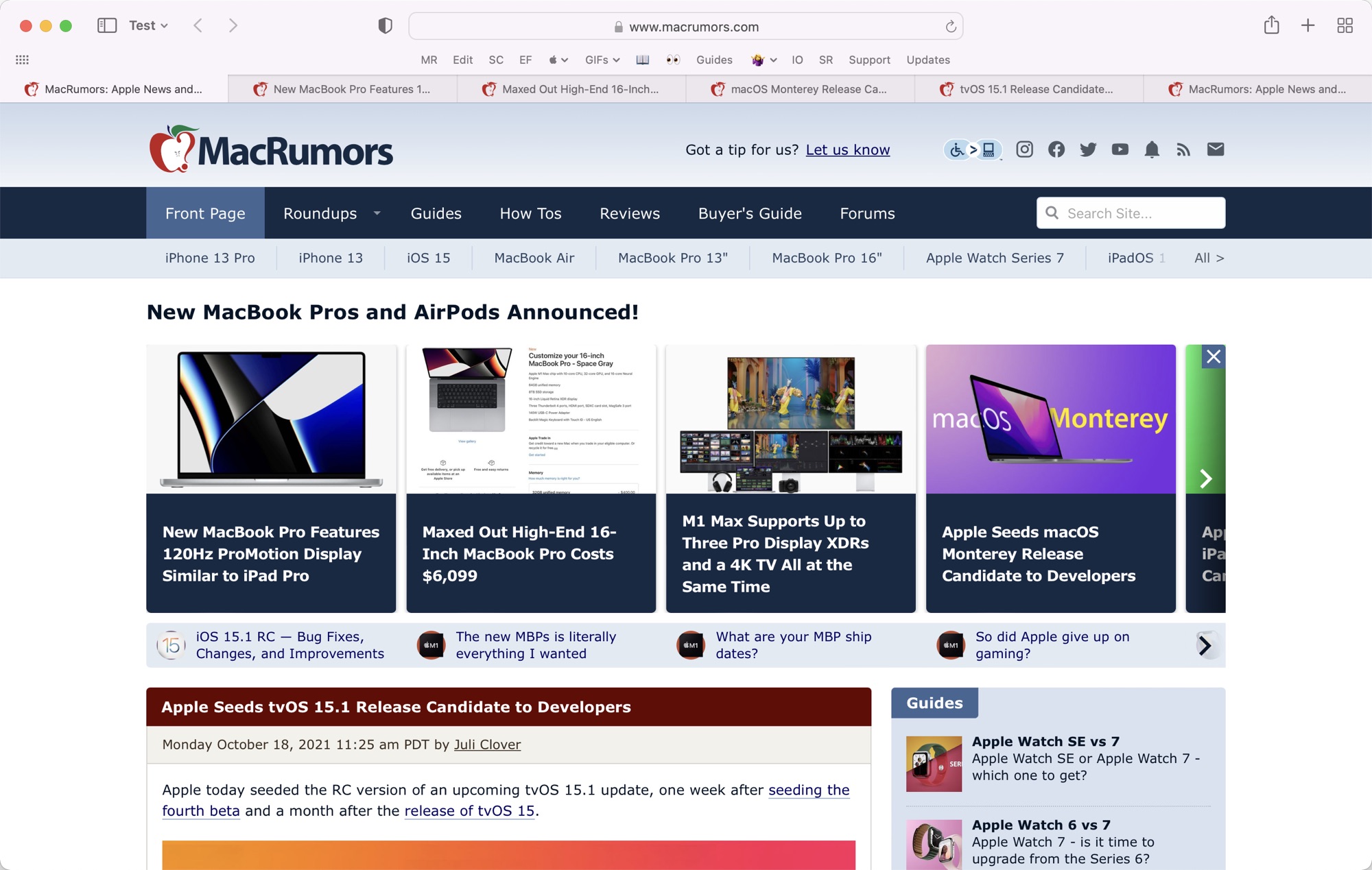
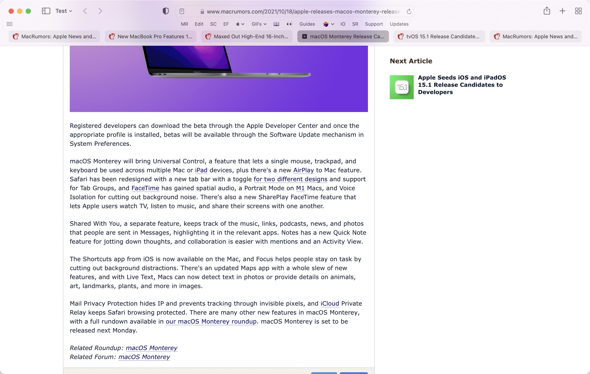
I actually really like the condensed nav bar with urls and tabs on the same bit. Since I use primarily keyboard commands it keeps things clean and focused on the content rather than causing distraction with widgets. I'm a minimalist for a lot of things, though, and less to see is always the direction I'll go.
Got a tip for us?
Let us know
Become a MacRumors Supporter for $50/year with no ads, ability to filter front page stories, and private forums.
macOS Monterey Release Candidate Undoes Safari Changes, Reintroduces Old Tab Design
- Thread starter MacRumors
- Start date
- Sort by reaction score
You are using an out of date browser. It may not display this or other websites correctly.
You should upgrade or use an alternative browser.
You should upgrade or use an alternative browser.
Proof? Example?The ones who shout the loudest are normally the vocal minority.
matter of opinion i guess — it bugs the s—t out of me, but whatcha gonna do. although the menubar is bisected — by the notch — won't be able to have as many apps sitting in itI think a straight cutoff to make it flush would actually look worse. (It’s just a personal opinion.) The way they‘ve done it, the menubar envelops the notch, and the menubar is still a single, non-bisected strip.
really? so every time apple makes a questionable design choice — they prototyped it and concluded that it was better this way?I mean, they definitely must have prototyped it and come to the conclusion that it looked better with it not being flush.
....yes? That's how design works.really? so every time apple makes a questionable design choice — they prototyped it and concluded that it was better this way?
yea, or it could be an oversight, no? i'm also not too concerned with how they came about doing it this way, but rather with the fact that this is what it looks like.....yes? That's how design works.
I didn't like the new tab design, but I welcome change so I figured I'd get used to it. I haven't. I'm very happy to hear they are going back to the previous style.
It was Return of the Jedi.
Dammit. That's what I get for getting old.
I think I’ll give the new design a try once I install Monterey.
Excuse me, How do you change the background of your avatar according to light/dark theme of the web? Maybe using a .png file and deleting the background of the picture? Thank youSometimes a change is good. In this case I believe that an argument can be made that it wasn't good. But at least Apple is trying to tackle the tab problems that most web browsers face today.
I also prefer the compact mode.I called it back in July
That being said, I actually really like Safari 15 and the fact that they gave the user the option to choose what UI layout they prefer to use. I'm in the minority who use and like the compact UI layout.
Thats just two out of many they should’ve accepted the reality long time ago. But hey, “innovation” and “progress”, right? Almost feel like throwing a bone after beating up the dog.The return of the pre-2016 MacBook Pro era and pre-Monterey Safari design in the same day. The mac is in the right direction now
Are you really breaking your back to lift an additional 100grams (which was the norm only a few years back?)yes, i saw it — they are ugly af.
they are thicker and heavier than previous ones. that hinge looks awful in the side view.
they have the notch, which doesn't bother me too much, but the least they could do is flush the menu bar with it.
option-wise they are the same, sans the processor and ram. it still costs a butt load to add some sufficient storage. the iphone now supports up to 1tb, yet the mbp still starts at 512.
so, to answer your question — wtf is wrong with you?
do you get many people staring at your macbook from the side assessing the appearance of the hinge?
storage has always been expensive at apple - this is nothing new.
If you are after a thinner and lighter macbook - its called the Air.
Pro models are meant to be for exactly that.
last I checked no pro gives a sh*t about the thickness of their pro workstation.
Why are people so scared of change????
Apple has admitted defeat on the Safari design changes that have been present for the entire macOS Monterey beta, and the release candidate that was provided to developers today reverts to the old style that was available prior to Safari 15.

Safari design in the macOS Monterey release candidate
macOS Monterey now features a standard Big Sur tab design that does have the tabs with spaces in between them, which Mac users who were unhappy with the design update will be pleased to hear.

Safari design in the prior macOS Monterey beta
The standard tab design is enabled by default and is labeled "Separate" in the Safari preferences, but for those who preferred the original Monterey Safari design, there's also a "Compact" option that merges the URL bar with the tab bar.
Apple in the prior Monterey beta moved the Favorites bar back up above the tab bar, so now Safari looks about the same as it did prior to when Apple made the Monterey changes. There are, however, still new Safari features like Tab Groups.
macOS Monterey with no changes to the Safari design will be coming on Monday, October 25.
Article Link: macOS Monterey Release Candidate Undoes Safari Changes, Reintroduces Old Tab Design
I still don’t like the URL bar which has that thin wire frame look. On the iPad it Looks like they went back to the solid gray look. Inconsistent.
I personally liked some aspects of the new design too. Telemetry was probably telling them majority of beta users went out of their way to switch off new features. Nowadays every pixel change is a/b tested.Disappointed in apple not sticking to their guns. I liked the new design. The ones who shout the loudest are normally the vocal minority.
Exactly. They have data on how many iOS/iPadOS 15 users opted for the old design and how many Monterey beta users disabled what they could of the changes.I personally liked some aspects of the new design too. Telemetry was probably telling them majority of beta users went out of their way to switch off new features. Nowadays every pixel change is a/b tested.
IMO the fine grey outlines and shading in Big Sur dark mode look quite elegant, much better than light mode. IMO is more attractive than the earlier flat styles, but not as fancy as snow leopard.Now get rid of the flat UI design too, OS X was sooo gorgeous.
They look pretty, and I haven’t had any difficulty identifying the active tab in foreground or background windows, but they do waste space compared to the old styleyeah I actually liked the button tabs. they were a cleaner look and I had zero problem telling they were tabs. I did not get the vocal minority outrage on that one.
I only had one that was ghastly (yellow, #FF0 background) and one that was hard to read (dull grey, just slightly too pale for safari to decide it was a dark colour).The color thing was obnoxious on some websites specifically the sites with dark colors. It was too much for the eyeballs.
I had no trouble with that, but the wasted space wasn’t great (whereas the new compact style is not suitable for large numbers of tabs). The tab metaphor has been strained a bit ever since Firefox 0.whatever, and buttons above the pages aren’t any less associated with the content than a non-matching tab that’s touching it.Because they weren't connected to the content, breaking the metaphor of tabs entirely. They weren't "pill-like" tabs, they were buttons that were hard to distinguish context and state
This! I have been complaining about this since it was introduced in beta 2 of iPadOS 15, but I understand Apple did this to help existing users transition to this new design. Giving users that share button helps them with familiarity, but it looks tacky imo.Compact bar is a good concept to save wasted space and that's what I'm using but still needs some work. IT's a little busy in the active tab with a bunch of icons crowded in there. The 'three dot' button repeats what the share button does.
I'm really hoping they don't remove the compact bar option. If so, I'm going to a different browser. People claim they want something new, but according to this... Safari can remain the same for 20 to 30 years and people are perfectly okay with it.
I think I’ll give the new design a try once I install Monterey.
Excuse me, How do you change the background of your avatar according to light/dark theme of the web? Maybe using a .png file and deleting the background of the picture? Thank you
It's a transparent image. The logo itself has no background.
I like the abandoned tab design for iOS as well. It was much more elegant.I feel like the only person that has liked everything they did with Safari, both on Mac with that design and on iOS with the address bar dropped to the bottom of the screen. Does this also rollback the way the nav bar inherits colors from the web page?
Register on MacRumors! This sidebar will go away, and you'll see fewer ads.


