Westside guy
macrumors 604
It's hard to believe that's what they did, given that version 26 of iOS and iPadOS are also kind of sucky.It’s like they focused mainly on iOS, as well as iPadOS, but macOS was rushed without a clear concept…

It's hard to believe that's what they did, given that version 26 of iOS and iPadOS are also kind of sucky.It’s like they focused mainly on iOS, as well as iPadOS, but macOS was rushed without a clear concept…
Finder does have an option to keep folders at the top though. It’s in the Finder SettingsI would like a Group by Folder option in Finder.
The current options for Group by are: Name, Kind, Application, Dates, Size, Tag.
File explorer on Windows has an option for grouping by folder.
Liquid Glass is an absolute disaster for Apple.
Every time I make a comment on here there's easily a 10-1 ratio of likes to dislikes on my post so clearly most agree.
Dye is an absolute moron. Thank god he's out.
This is indefensible. Hopefully we don't have to live with this s$^#show much longer.View attachment 2604520
The rough spots in the Mac OS UI are still dwarfed by the rough spots in the Windows 11 UI, so I am not going to be too critical. It has taken Microsoft more than 15 years to get rid of UIs from the Vista era.


People have different ways of working. For some people, not having visible scrollbars makes it hard for them to navigate and know what to point to (or they may forget the column is longer than what is showing) etc.Why would anyone leave these ugly ass scrollbars always visible? It's NOT the default LOL this is not Windows. People who leave these things visible actually deserve this.


Regardless of the 'they never used to do this stuff... this one flaw does drive me nuts. I count on that little trick! I'm glad to see it's not just me.
Apple released macOS Tahoe last September, but despite two point updates since then, it is still struggling to resolve an embarrassing interface issue in Finder that appears to have been introduced with its Liquid Glass redesign.

If you updated your Mac to macOS Tahoe and you prefer to work in Finder's column view, there's a good chance you've been frustrated by the glitch, which developer Jeff Johnson has been admirably tracking over on his blog.
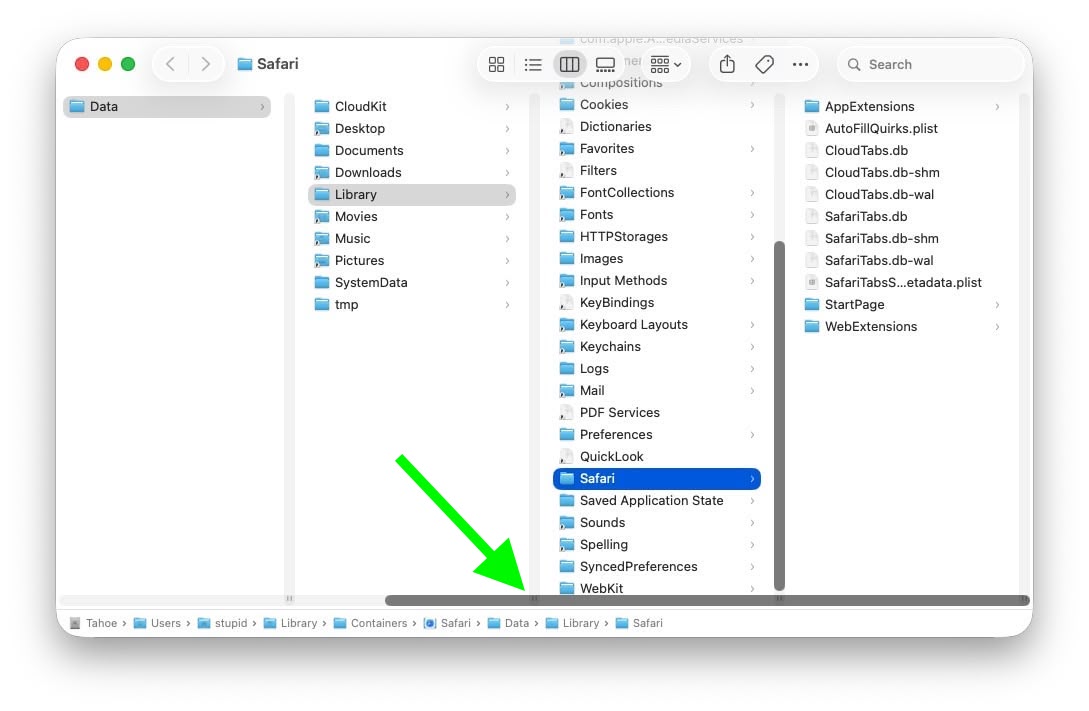
Scroll bar blocking column resize handles (Original image: Jeff Johnson)
At the bottom of each Finder column are handy little resize handles allowing you to expand or reduce each column as you see fit. But in macOS 26 and macOS 26.2, when scroll bars are set to "always show," the horizontal scroll bar at the bottom overlaps and covers those handles, so you can't click them to adjust column widths the way you could in earlier macOS versions like Sequoia.
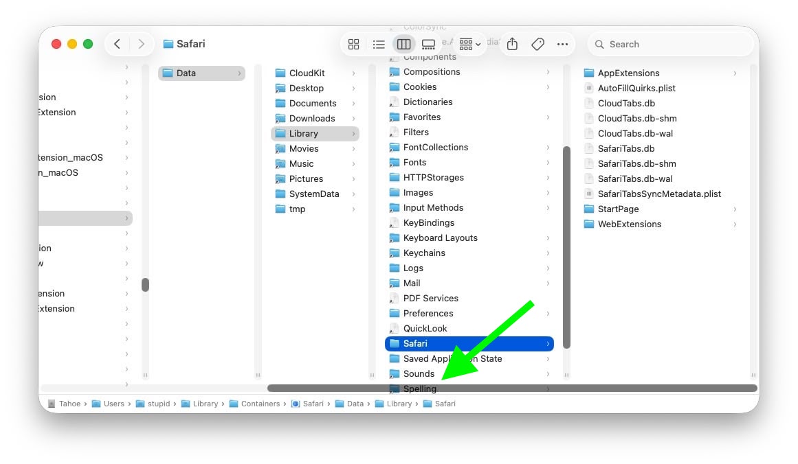
Scroll bar occluding column content (Original image: Jeff Johnson)
With the recent release of macOS 26.3, Apple attempted a fix. The vertical scrollers were shortened so the resizing widgets now sit above the horizontal bar and are technically clickable again. Unfortunately though, as Johnson points out, the horizontal scroll bar still overlaps file names in the view, causing it to regularly obscure content. Moreover, if you hide the path bar and status bar, the layout leaves a weird amount of empty space below the scrollers, making the whole thing look unfinished (see image below).
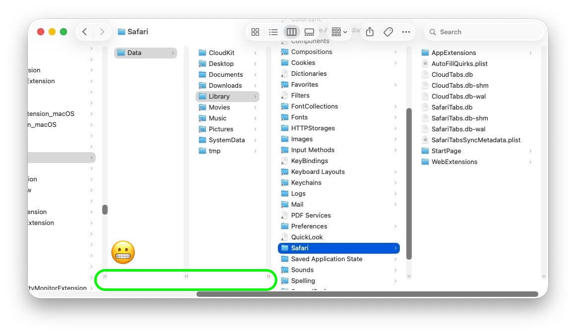
Column resize handles suspended in mid-air (Original image: Jeff Johnson)
Johnson's take is basically that while the most disruptive bug is less bad now, the overall column view layout still feels half-baked – especially for anyone who keeps scroll bars always visible.
As Daring Fireball's John Gruber points out, it's an embarrassing fudge for a company that used to pride itself on pixel-perfect settings across its Mac operating system.
At this point, it's unclear when Apple will manage to iron out the UI irregularities introduced by Liquid Glass. macOS Tahoe 26.4 is likely to be released in March or April, and could introduce some new Siri features, though at least some of the capabilities that we were expecting may have been delayed, depending on who you believe. The update is also expected to introduce new emoji characters.
Article Link: macOS Tahoe Finder Bug Underscores Apple's Slipping UI Polish

I agree with you for the most part, but I spend half of my day using Windows and still consider my Mac to be a breath of fresh air compared.Windows still has a lot of XP era UI in the admin tools.
You can't compare Windows and macOS. Windows has to support apps that go back years. I have two apps from the late 90s that still work with minor fuss. Apple doesn't care about that level of backwards compatibility because their user base is much smaller and the company is design focused.


apple doesn't have employees going on the web to read blogs, they have a feedback form on their website, you have to use that. or else they can't fix what they don't know aboutOther inconsistencies:
https://tonsky.me/blog/tahoe-icons/
They aren't using that either 😅they have a feedback form on their website

You need to have scrollbars set to always display, which then makes them affect layout (they create an inner scrollable view and take up space for the scrollbars, vs displaying as an overlay as-needed).I’ve never seen this either, I’m confused as well

As the saying goes, “You can’t polish a turd.”macOS Tahoe Finder Bug Underscores Apple's Slipping UI Polish

apple doesn't have employees going on the web to read blogs, they have a feedback form on their website, you have to use that. or else they can't fix what they don't know about
They probably should. I can't imagine not actively seeking customer feedback on my product.
Unless of course they don't actually care. In that case more power to them.


?? I wish they would go back to QuickTime 7 Pro, including the design which is so effective for making quick edits and exporting to any format of one's choice, saving a reference of the file without creating a whole new full copy etc.QuickTime is another example, it feels like a relic from decades ago. Why hasn’t Apple replaced it with a modern, unified “Video Player” app? What person born after year 2000 knows what "Quicktime" is? There are still many legacy elements throughout macOS that make the system feel dated, especially when compared to the polish and cohesion of iPadOS.