Become a MacRumors Supporter for $50/year with no ads, ability to filter front page stories, and private forums.
I haven't read all the 5 pages of posts, so forgive me if I am repeating this:

For heaven's sake why are we manually having to expand and contract columns to see file names in the Finder in 2026? Why hasn't Apple hired some college intern for a few weeks, which is all it would take, to provide a System Preferences setting that automatically adjusts column width so complete filenames are shown? Ellipses (...) in file names in the Finder column view suck, and they are evidence of supremely languid GUI standards. I have a 27" iMac with enough screen real estate to see full columns, but every time I open a Finder window I have to mouse around to see full filenames. This is true even if the columns don't even fill the width of the Finder window. You can see examples of this in screenshots MR users have posted above. I can't count the number of times I have tried to contact Apple to request they change this. I even wrote Cook once a short e-mail, and all of it was ignored.
 
There's a what now? I just have a clean vertical line I can grab anywhere? In principle I'm aligned with this article: Apple stuff has to "just work" and their raison d'être is to deliver near-bug-free, near-perfect, delightful user experiences, and it's valid to discuss and debate where they achieve this and where they fall short. I just don't "get" this specific issue myself. Eh well.

View attachment 2604429
No, not between columns
 
Liquid Glass is an absolute disaster for Apple.
Every time I make a comment on here there's easily a 10-1 ratio of likes to dislikes on my post so clearly most agree.

Dye is an absolute moron. Thank god he's out.

This is indefensible. Hopefully we don't have to live with this s$^#show much longer.
Screenshot 2026-02-13 at 9.05.06 AM.png
 
"Every Mac user needs Chrome installed as well as Safari is so useless following web-standards."

Only if you want all your browsing information stored and sold to anyone who wants it. Forever.

Since I'm extremely privacy oriented, I've used Firefox as my main browser for years. They have amazing add-ons not available on Chrome or Safari. Put Privacy Badger and UBlock Origin on, tweak the settings, and you're done.

Firefox is my default main browse. Duck Duck Go next. Edge third. Safari last.


Apple released macOS Tahoe last September, but despite two point updates since then, it is still struggling to resolve an embarrassing interface issue in Finder that appears to have been introduced with its Liquid Glass redesign.

macOS-Tahoe-Finder-Bug-Underscores-Apples-Slipping-UI-Polish-Feature.jpg

If you updated your Mac to macOS Tahoe and you prefer to work in Finder's column view, there's a good chance you've been frustrated by the glitch, which developer Jeff Johnson has been admirably tracking over on his blog.

macos-tahoe-finder-column-view-bug3.jpg

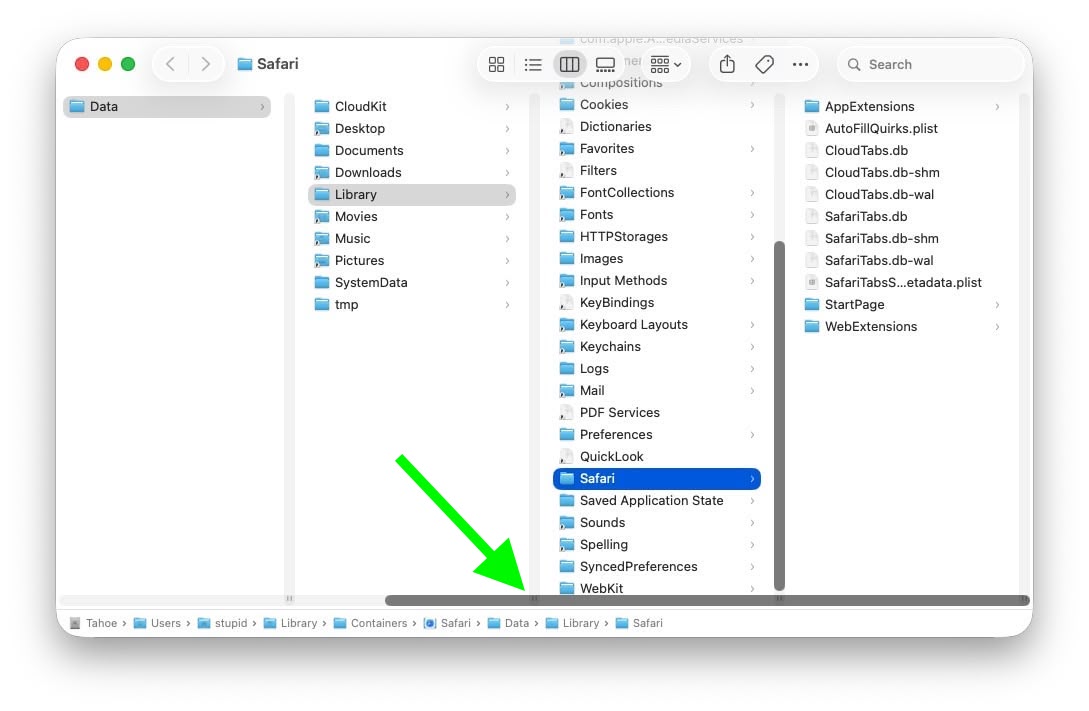
Scroll bar blocking column resize handles (Original image: Jeff Johnson)

At the bottom of each Finder column are handy little resize handles allowing you to expand or reduce each column as you see fit. But in macOS 26 and macOS 26.2, when scroll bars are set to "always show," the horizontal scroll bar at the bottom overlaps and covers those handles, so you can't click them to adjust column widths the way you could in earlier macOS versions like Sequoia.

macos-tahoe-finder-column-view-bug2.jpg

Scroll bar occluding column content (Original image: Jeff Johnson)

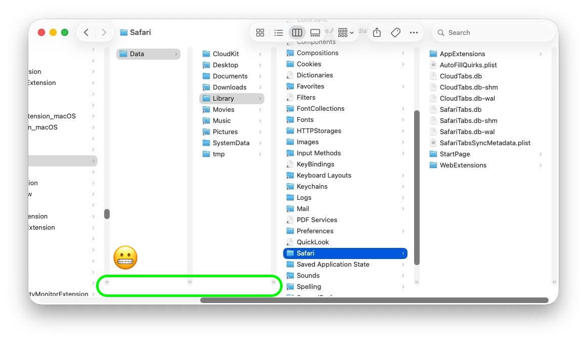
With the recent release of macOS 26.3, Apple attempted a fix. The vertical scrollers were shortened so the resizing widgets now sit above the horizontal bar and are technically clickable again. Unfortunately though, as Johnson points out, the horizontal scroll bar still overlaps file names in the view, causing it to regularly obscure content. Moreover, if you hide the path bar and status bar, the layout leaves a weird amount of empty space below the scrollers, making the whole thing look unfinished (see image below).

macos-tahoe-finder-column-view-bug1.jpg

Column resize handles suspended in mid-air (Original image: Jeff Johnson)

Johnson's take is basically that while the most disruptive bug is less bad now, the overall column view layout still feels half-baked – especially for anyone who keeps scroll bars always visible.

As Daring Fireball's John Gruber points out, it's an embarrassing fudge for a company that used to pride itself on pixel-perfect settings across its Mac operating system.

At this point, it's unclear when Apple will manage to iron out the UI irregularities introduced by Liquid Glass. macOS Tahoe‌ 26.4 is likely to be released in March or April, and could introduce some new Siri features, though at least some of the capabilities that we were expecting may have been delayed, depending on who you believe. The update is also expected to introduce new emoji characters.

Article Link: macOS Tahoe Finder Bug Underscores Apple's Slipping UI Polish
Anyone that must use the bottom as a handle is pretty obtuse.
 
I haven't read all the 5 pages of posts, so forgive me if I am repeating this:

For heaven's sake why are we manually having to expand and contract columns to see file names in the Finder in 2026? Why hasn't Apple hired some college intern for a few weeks, which is all it would take, to provide a System Preferences setting that automatically adjusts column width so complete filenames are shown? Ellipses (...) in file names in the Finder column view suck, and they are evidence of supremely languid GUI standards. I have a 27" iMac with enough screen real estate to see full columns, but every time I open a Finder window I have to mouse around to see full filenames. This is true even if the columns don't even fill the width of the Finder window. You can see examples of this in screenshots MR users have posted above. I can't count the number of times I have tried to contact Apple to request they change this. I even wrote Cook once a short e-mail, and all of it was ignored.

Hear me out .. I think I have the fix...

Finder+, now included with iCloud Premium Plus Pro Max subscription.
 
I completely agree. Liquid Glass on macOS Tahoe looks quite unfinished…

It’s like they focused mainly on iOS, as well as iPadOS, but macOS was rushed without a clear concept…

Let’s hope they focus a bit more on Mac’s Liquid Glass for macOS 27. The UI needs a lot of fixes and polish.
I feel like this has been happening for years. They keep ruining the desktop metaphor with touch metaphor from iOS whether it makes sense or not.
 
  • Like
Reactions: CrabQueenInc
I’d disagree that it’s a lack of care because who doesn’t care if they’re doing good work at this level?

I would agree that arbitrary deadlines and feature creep are likely candidates for these issues.
Yeah the marketing driven ‘we need features to talk about at the annual wwdc keynote!’ Approach needs to stop.

Having said that:

26.3 for my 16e had a great new feature - the cellular location limiting feature.

I’m in the uk and on EE and this feature was enabled by default on booting up 26.3 for the first time.

Now this is the kind of feature I applaud. It wasn’t even ‘set and forget’ - just a great privacy preserving feature that most people will never know is on but will silently help protect their privacy.

This is the Apple that I like.
 
"Every Mac user needs Chrome installed as well as Safari is so useless following web-standards."

Only if you want all your browsing information stored and sold to anyone who wants it. Forever.

Since I'm extremely privacy oriented, I've used Firefox as my main browser for years. They have amazing add-ons not available on Chrome or Safari. Put Privacy Badger and UBlock Origin on, tweak the settings, and you're done.

Firefox is my default main browse. Duck Duck Go next. Edge third. Safari last.
Firefox is quite good. And it continues to be admirable that the latest Firefox still runs on 10.15 Catalina or later. Mozilla are to be congratulated for supporting Macs that are almost 14 years old.
 
"Every Mac user needs Chrome installed as well as Safari is so useless following web-standards."

Only if you want all your browsing information stored and sold to anyone who wants it. Forever.

Since I'm extremely privacy oriented, I've used Firefox as my main browser for years. They have amazing add-ons not available on Chrome or Safari. Put Privacy Badger and UBlock Origin on, tweak the settings, and you're done.

Firefox is my default main browse. Duck Duck Go next. Edge third. Safari last.

Extremely privacy oriented but using Firefox is...a choice. Firefox is not that privacy-respecting either. I'd thought you'd at least use LibreWolf.
 
This is just the tip of the iceberg. There are a half dozen major bugs I've encountered in Tahoe, on top of the pre-existing bugs.
 
1771004729137.png

This is ugly like hell. Shadows and rounded frame in frame? Its even more prominent then the window itself! And this bluish color? Come on..

But besides this, the real issue here is, how come their --redacted-- "designers" think that my screen real estate belongs to their fat round corners? This is not a kids toy or a playground. I have that to do real work, not to pleasure them!
 
  1. brings in the biggest revenue
  2. has the potential to be monetised down the line
  3. can be removed or repackaged in a way that will increase revenue
  4. will keep shareholders happy (i.e. always non-product related)
$, $, $, $ I agree. I think future generations will look back on this time in history and shame us for not doing more to stop the overwhelming greed that has consumed corporate America.
 
  • Like
Reactions: CrabQueenInc
meh, bit of myth that Apple at some point delivered flawless design. people have always been complaining.
That doesn't mean things can't be worse now than they were then--and which part of then are we talking. If we are talking post Snow Leopard, for instance, we were in pretty good hands with stability and bugs.
 
The rough spots in the Mac OS UI are still dwarfed by the rough spots in the Windows 11 UI, so I am not going to be too critical. It has taken Microsoft more than 15 years to get rid of UIs from the Vista era.
 
View attachment 2604543
This is ugly like hell. Shadows and rounded frame in frame? Its even more prominent then the window itself! And this bluish color? Come on..

But besides this, the real issue here is, how come their --redacted-- "designers" think that my screen real estate belongs to their fat round corners? This is not a kids toy or a playground. I have that to do real work, not to pleasure them!
A kids toy seems to be the mentality prominent amongst the designers of Liquid Glass.

Apple has prioritized cutesy animations, image playground, contact posters, Memoji and the like. Squarely focused on the kids which has paid off well, but clearly ignoring those who actually use macOS for work.
 
  • Like
Reactions: TumbleDryer
I haven't read all the 5 pages of posts, so forgive me if I am repeating this:

For heaven's sake why are we manually having to expand and contract columns to see file names in the Finder in 2026? Why hasn't Apple hired some college intern for a few weeks, which is all it would take, to provide a System Preferences setting that automatically adjusts column width so complete filenames are shown? Ellipses (...) in file names in the Finder column view suck, and they are evidence of supremely languid GUI standards. I have a 27" iMac with enough screen real estate to see full columns, but every time I open a Finder window I have to mouse around to see full filenames. This is true even if the columns don't even fill the width of the Finder window. You can see examples of this in screenshots MR users have posted above. I can't count the number of times I have tried to contact Apple to request they change this. I even wrote Cook once a short e-mail, and all of it was ignored.

You don't have to. I'm still on Sequoia and I have column autosize on. You can turn it on in Terminal or with utilities like OnyX (in screenshot below) or similiar... I'm sure Tahoe has it too.
 

Attachments

  • sequoia-finder-columns-autoadjustment.jpg
    sequoia-finder-columns-autoadjustment.jpg
    244.4 KB · Views: 59
Last edited:
Register on MacRumors! This sidebar will go away, and you'll see fewer ads.