Got a tip for us?
Let us know
Become a MacRumors Supporter for $50/year with no ads, ability to filter front page stories, and private forums.
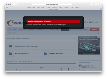
MacRumors Forums Theme Change and New Platform
- Thread starter arn
- Start date
- Sort by reaction score
You are using an out of date browser. It may not display this or other websites correctly.
You should upgrade or use an alternative browser.
You should upgrade or use an alternative browser.
Circular avatars
A poll began around a day before migration:
Circles vs Squares: The Most Pressing Migration Concern
I had that earlier and resolved it by deleting cookies.
Edit: Or not? It just threw me out again.
Is there an equivalent of the "My Posts" page from VB? I've found this but it doesn't show the "state" of the threads (ie. whether anyone has replied since my last visit) - in VB, updated threads would show up in bold.
Edit: It looks like "Watched Threads" may accomplish the same thing.
Last edited:
Look at the bottom of the quote. There is a very, very faint "click to expand" thingy there.
Some CSS tweaking needs to be done, for sure.
Thought you were joking, nope - that's some of the faintest text I've seen on a website...
While it is going to take a little bit of time to get familiar with the new layout, I like what I see thus far. I think it looks much more modern (and professional).
@arn will there be themes, for those that don't like the current bright setup?
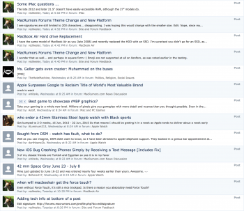
These results have already been pushed down in my post history, but still... 7 of them are not quite right.

Attachments
Last edited:
While it is going to take a little bit of time to get familiar with the new layout, I like what I see thus far. I think it looks much more modern (and professional).
The old iOS7 v iOS6 argument. Some liked the new look whilst others hated it, but most got used to it in the end. Really though, why does looking 'modern' always seem to trump looking 'good'?
I totally understand why the owners might have *had* to switch, such as vBulletin not being supported anymore and security issues etc, but how anyone can actually prefer this new look is beyond me. The old forums were infinitely nicer to look at and navigate.
I sacked Tapatalk off a year or more ago but might have to install it again...
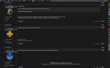
I agree, MR needs a dark mode.@arn will there be themes, for those that don't like the current bright setup?
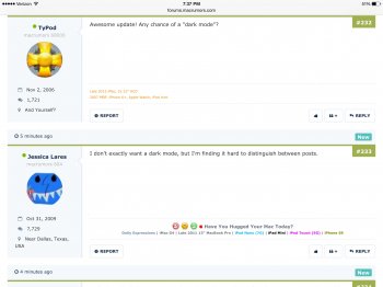
I don't exactly want a dark mode, but I'm finding it hard to distinguish between posts.
Well, through all this commotion about the updates, it has definitely grown on me and I would personally like to thank the mods who I'm sure have been working non-stop to get this up and running. So I raise a glass to the mods, the staff, the gods of MR, and anyone else who worked hard to make our fourm browsing experience better. Some may hate you for it, but others are very appreciate of what you have done. So, thank you...
While the new format looks nice, something needs to be done about how much space the user information on the left takes up. Because of all the room taken by the user name, avatar, membership date, post count, location, etc., the average page now shows about two posts at a time on a desktop browser before you have to scroll to see another one. Very inefficient use of space.
Since I get to enjoy the site for free, I am appreciative of what is involved in making the site run, and continue to draw new members.The old iOS7 v iOS6 argument. Some liked the new look whilst others hated it, but most got used to it in the end. Really though, why does looking 'modern' always seem to trump looking 'good'?
I totally understand why the owners might have *had* to switch, such as vBulletin not being supported anymore and security issues etc, but how anyone can actually prefer this new look is beyond me. The old forums were infinitely nicer to look at and navigate.
I sacked Tapatalk off a year or more ago but might have to install it again...
It's the same on the iPad Air 2, seems to be a lot of dead space:While the new format looks nice, something needs to be done about how much space the user information on the left takes up. Because of all the room taken by the user name, avatar, membership date, post count, location, etc., the average page now shows about two posts at a time on a desktop browser before you have to scroll to see another one. Very inefficient use of space.
Attachments
It appears that if you add an avatar, it's only associated with posts made after you add it, at least in the Watched Threads view.
You can unsubscribe by clicking the link at the bottom of the email(s).How do I turn off email for every time someone posts in here ? I seem to be getting email for each post in here.
Is there a way to disable the mobile view? I almost always prefer to use desktop view on any sites and forums I visit.
My initial reaction is I don't like it. It's too light, too much white and not enough contrast. I find it harder on the eyes.
i like that also, maybe alittle lighter, like a grey...
Register on MacRumors! This sidebar will go away, and you'll see fewer ads.


