No, carrier etc. are above the clock, next to the cameras/sensors. I'm talking about the clock that is below that, with nothing to the left or right at all. Waste of screen real estate.It’s not just the clock: carrier name, location, do not disturb, alarm, rotation lock...
Got a tip for us?
Let us know
Become a MacRumors Supporter for $50/year with no ads, ability to filter front page stories, and private forums.
Mockups Imagine What Apps Might Look Like on iPhone 8
- Thread starter MacRumors
- Start date
- Sort by reaction score
You are using an out of date browser. It may not display this or other websites correctly.
You should upgrade or use an alternative browser.
You should upgrade or use an alternative browser.
Phones phones and more phones.
Bloody hell...this is beyond boring.
You should change the name of this site to Apple rumors because there sure isn't much Mac around here...or Apple :-(
You do realize this is the most popular time of the year when the iPhone is on the brink of being released and the rumors are flourishing like crazy. It only makes sense for MacRumors to report iPhone related news weeks before the iPhone launch.
I think we are a club of three now.I second this. I know most prefer the black notch concealing the sensors. But the white contrast is appealing to me, along with the cooper color.

I do like dark mode on my S8+. Actually it's not so much a dark mode as much as I select black themes to apply and select dark screen options on apps that offer it. But anyway, given how I'm likely to choose dark display options when available, I probably should get the black iPhone front. And yet, I find I still am hoping for the quirky silver or copper phones with the white fronts. I think it's because my SE, 7 Plus, HTC 10 and S8+ have presented me with uniform onyx surfaces for a long time now and I'm just in the mood for something different.
They should have made the earpiece higher, then the time could have remained centered.
Cause you know it's a full OLED screen below that notch. They aren't actually going to be cutting that notch out of screens I wouldn't imgine, those pixels are just covered by the painted notch and will remain off through software.
*edit* ****, I forgot about the sensors! I guess the notch will be cut out, or at least the sensor holes will be.
I read that you can apparently remove individual pixels on OLED screens due to how they work. But I've no idea how many have tried it?
Too funny! What has been seen can not be unseen!If I was going to use this phone I'd hope that they don't use the top bits much other than blended in with info. It looks like it's frowning otherwise.

In this example, the Home button would become 'Bert's ticklish belly button'. Perhaps that is when he will frown. Also Siri is now voiced like Bert (or Ernie, you can choose in settings).
I hope you don't mind, but I've not been happy with my avatar today and I must steal this gem for the weekend! Did you make this?No, carrier etc. are above the clock, next to the cameras/sensors. I'm talking about the clock that is below that, with nothing to the left or right at all. Waste of screen real estate.
All those icons and carrier name don’t fit in that small space on the sides of the notch, dude. They have to be in the second row.
Attachments
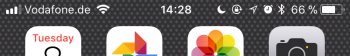
I'm talking about the mockups this thread is about (in the very first post of this thread). In all the pictures (except the middle one in the second set), in the first row, to the left and right of the notch, there are icons for reception, battery etc., and below that is a row with only the clock, with nothing else. I'm talking about that second row which only has the clock in it being a waste of space.All those icons and carrier name don’t fit in that small space on the sides of the notch, dude. They have to be in the second row.
I'm talking about the mockups this thread is about (in the very first post of this thread). In all the pictures (except the middle one in the second set), in the first row, to the left and right of the notch, there are icons for reception, battery etc., and below that is a row with only the clock, with nothing else. I'm talking about that second row which only has the clock in it being a waste of space.
I know! I’m trying to tell you that there has to be a second row to accommodate the clock and all the other information that doesn’t fit on the sides of the notch.
iPhone 8 looks like a normal upgrade to me. Why does Apple think they can charge more than 1000 $ for this???
Anyway, the iphone SE is being sold so cheap here in Europe at the moment. It's often less than 300 euros (NEW, 32GB). Iphone 8 will probably start at 1100 euros. It's a no-brainer which iphone to buy ...
Anyway, the iphone SE is being sold so cheap here in Europe at the moment. It's often less than 300 euros (NEW, 32GB). Iphone 8 will probably start at 1100 euros. It's a no-brainer which iphone to buy ...
Samsung didn’t get rid of all bezels either.Apple didn't get rid of bezels like Samsung.
This phone has reduced bezels.
Please Macrumors stop saying it's bezel-less
I love the cutout. No unused space. I love it all actually. Can't wait!
I'm also glad my brain doesn't think as negatively as some of the people here. It must suck.
I'm also glad my brain doesn't think as negatively as some of the people here. It must suck.
If I see one more mockup with a software home button I'm gonna loose my ****...
Am I the only one who thinks this is the laziest idea in the world?
Just realize the "go to home" via swiping up from the bottom edge.
No need in removing bezels and adding them back in. what is this? android?
Am I the only one who thinks this is the laziest idea in the world?
Just realize the "go to home" via swiping up from the bottom edge.
No need in removing bezels and adding them back in. what is this? android?
AhI know! I’m trying to tell you that there has to be a second row to accommodate the clock and all the other information that doesn’t fit on the sides of the notch.
I went back to the first post and didn't see any icons in that row on those mockups and thought "what the hell is he talking about?", but now I get what you mean.Well, who gives a crap about the carrier name? So the left side is sorted. Right side I'm not sure, I could imagine moving the least-used options to the control center.
Just today, while filming a video with my iPhone, I wondered why the elapsed time is being displayed. What is the value of that? Sometimes, removing everything are re-evaluating each single item can be a very good thing.
The left one. Please let it be the left one.
left one makes absolutely no sense. you loose a whole row for the clock which renders the area above useless. left one, yes. but without the clock.
Too funny! What has been seen can not be unseen!
Yes I made it, but I was partly inspired by another forumer member here whose name now escapes me (apologies/kudos to whoever that was) that used the term 'unibrow' in a post I read earlier... the thought stuck... !
Edit: thanks to MR's search function, it was @Chupa Chupa who somewhat inspired it.
Last edited:
Perhaps Apple will remove the time from the top center and ship the iPhone 8 with an Apple Watch.
They look nice but have far less caricature than what we have now. I say not, it does look like the old MS effort.
THat looks so stupid lmao t
Thank you for this wonderful, thoughtful contribution to the discussion.
You did an awesome job! I love it. Lol, @Chupa Chupa is known for his clever and wry observations.Yes I made it, but I was partly inspired by another forumer member here whose name now escapes me (apologies/kudos to whoever that was) that used the term 'unibrow' in a post I read earlier... the thought stuck... !
Edit: thanks to MR's search function, it was @Chupa Chupa who somewhat inspired it.
No. All apps will default to dark mode. For OLED, black is bliss - power-saving wise. It is unimaginable they wouldn't take advantage of that. It also hides the notch.
Rumor is that there might be a version of #iphone8 with white front. Here is a quick render of that.
 https://twitter.com/talkaboutdesign/status/895859999930540032
Register on MacRumors! This sidebar will go away, and you'll see fewer ads.