Got a tip for us?
Let us know
Become a MacRumors Supporter for $50/year with no ads, ability to filter front page stories, and private forums.
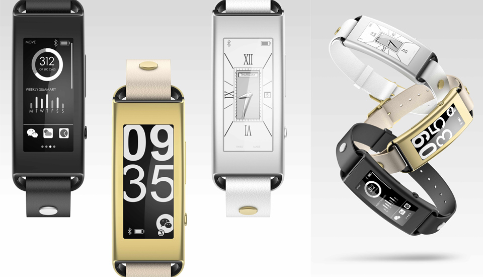
Moto 360 vs Watch Design. (Real photos)
- Thread starter iCore24
- Start date
- Sort by reaction score
You are using an out of date browser. It may not display this or other websites correctly.
You should upgrade or use an alternative browser.
You should upgrade or use an alternative browser.
Water resistant and water proof are two different things.
Indeed and I know.
My point is this:
Apple say, apparently from what we understand here:
You can use the Apple watch whilst taking part in sports activities.
Running, cycling etc etc.
This means loads of sweat running down your arms potentially, an also getting caught in rain/thunder storms.
Even myself a couple of months ago, set off on a cycle ride, half way into my outward journey the clouds decided to throw all they had at me.
I was in the middle of the countryside, and within 2 to 3 mins, I was as wet as if I had jumped into the bath, utterly soaked.
The rain got harder and harder, but no where to shelter, I was being drenched, my hands on the handle bars were being hit with a shower of water for the next 30 mins at least.
But, according to Apple that's totally fine.
However if I took a shower that's not.
So tell me. I go back to the Apple store with my non working watch that was totally drenched in water from the heavens.
How are they going to call me a liar?
How are they going to call anyone a liar?
If it's officially ok in outdoor sports, then, for all intents and purposes, it HAS to be regarded as water proof, at least down to a shallow depth in water of say 1m
The 'almost here' Apple Watch still looks like a girls toy watch you'd find on the discount rack at Target or WalMart.
It may have the greatest UI in the world, but it doesn't overcome the fugliness of the hardware. Given the choice between designs, the Moto 360 looks 1000x better.
On a side note, there is supposedly a new Pebble watch design coming out. Hoping it is round, like a more traditional watch.
It may have the greatest UI in the world, but it doesn't overcome the fugliness of the hardware. Given the choice between designs, the Moto 360 looks 1000x better.
On a side note, there is supposedly a new Pebble watch design coming out. Hoping it is round, like a more traditional watch.
The 'almost here' Apple Watch still looks like a girls toy watch you'd find on the discount rack at Target or WalMart.
It may have the greatest UI in the world, but it doesn't overcome the fugliness of the hardware. Given the choice between designs, the Moto 360 looks 1000x better.
On a side note, there is supposedly a new Pebble watch design coming out. Hoping it is round, like a more traditional watch.
Obviously everything you said is subjective. It's fugly because it's not round? I tried on an Almost 360 at Best Buy. It looked like a huge aluminum tire on my wrist. And it certainly didn't feel premium at all. It was so light it felt like a dummy unit with no internals. One thing we know from those who tried on Watch is it has heft to it so we know it's made from high quality materials. I don't get what the big obsession is with round. It's great if all you're doing is looking at an analog watch face. Not so great when displaying other content like notifications or maps. To me the Almost 360 is the epitome of form over function.
Obviously everything you said is subjective. It's fugly because it's not round? I tried on an Almost 360 at Best Buy. It looked like a huge aluminum tire on my wrist. And it certainly didn't feel premium at all. It was so light it felt like a dummy unit with no internals. One thing we know from those who tried on Watch is it has heft to it so we know it's made from high quality materials. I don't get what the big obsession is with round. It's great if all you're doing is looking at an analog watch face. Not so great when displaying other content like notifications or maps. To me the Almost 360 is the epitome of form over function.
Obviously, the large round look of the Moto 360 won't look like it fits on smaller, feminine wrists so the small, Apple Watch may be a better form factor for some.
As for heft equating to quality? By your definition, the iphone and ipad must not feel very premium. They feel so light, they are like dummy units, right? Ridiculous.
And the round display worjs perfectly fine for displaying information wuth Android Wear. Maybe when we actually see what Apple has for an OS for the Apple Watch we can see if it would also work with a round display. Maybe it will? All we have right now is conjecture on it. What we don't have conjecture on is the gawd-awful looking Apple 'almost' smartwatch. The Asus Zen-Watch looks elegant by comparison if you wish to discuss rectangular watches.
Gold is more massive than steel, and steel is more massive than aluminum. When dealing with jewelry and wearables, things matter that don't with electronics. The key to understanding the likely pricing of the Apple Watch is that it is being marketed as a fashion item that happens to incorporate technology, rather than a technology item that happens to be trying to be fashionable.
Sure, I'd love it if the Edition sold for $1200. I'm just trying to be realistic in my pricing expectations.
And the round display worjs perfectly fine for displaying information wuth Android Wear.
Lol, wut?
Pictures please!!!!!
Every pic I've seen it looks lame as hell. Text weirdly & randomly cut off. Were text messages formatted to be displayed in a circle? Nope. Looks bad. Was the maps app formatted to be displayed in a circle? Nope. Looks bad.
I'll let the other opinions of yours that you are pretending are facts instead slide. But this one..?? Nope. You better make something else up. Here come the fact police! =P
Edit:
Here are a few pics from their own marketing team!!! So probably the VERY best it can look.
http://www.androidcentral.com/sites...silver_chamfer_distortion_0.jpg?itok=KhBE6bil
http://mobilesyrup.com/wp-content/uploads/2014/06/moto360-02569.jpg
Last edited:
Android Wear based on Lollipop seems to have corrected a lot of the things you refer to. Plus for third party notifications/apps there are guidelines and formatting rules for being able to tell when your content is displayed on a round watch.Lol, wut?
Pictures please!!!!!
Every pic I've seen it looks lame as hell. Text weirdly & randomly cut off. Were text messages formatted to be displayed in a circle? Nope. Looks bad. Was the maps app formatted to be displayed in a circle? Nope. Looks bad.
I'll let the other opinions of yours that you are pretending are facts instead slide. But this one..?? Nope. You better make something else up. Here come the fact police! =P
Edit:
Here are a few pics from their own marketing team!!! So probably the VERY best it can look.
http://www.androidcentral.com/sites...silver_chamfer_distortion_0.jpg?itok=KhBE6bil
http://mobilesyrup.com/wp-content/uploads/2014/06/moto360-02569.jpg
Android Wear based on Lollipop seems to have corrected a lot of the things you refer to. Plus for third party notifications/apps there are guidelines and formatting rules for being able to tell when your content is displayed on a round watch.
Cool cool. Good to know. I'm glad to hear that is being addressed.
However, I'm of the school of thought that while a circular watch may be more visually appealing to some, it will able to display info as well for none.
If it's worth that trade off, have at it, I suppose.
For literally thousands of years the rectangle has been the preferred shape to place print upon... from scrolls, to books & magazines, newspapers, computer/tablet/phone screens, etc. If a circle was a better (or even equally good) way to display text, we'd certainly have seen a few circular books & newspapers by now, no?
It is quite clearly an inferior shape to display text, particularly if the text is not being curved to match the display. It is left in a rectangular box on a circle screen, effectively wasting a significant amount of space.
Similarly, other than an actual full globe (which would be of dubious use on a watch), maps have always been rectangular.
If you snap a pic on your camera of choice & bring it to a print shop- you will have MANY options of print sizes, from wallet size, on up to poster. NONE of those options will be a circle. That's not how photos are taken.
Sooooooo.... by virtue of convention of geometric shapes, all rectangular images can simply not show full size on a circle without cropping unnaturally or sizing down to the largest rectangle that can fit in a circle with empty wasted space on all four sides.
If I know for certain that text, maps, and images will work better on a particular shape... I'm going to be drawn toward that shape. Literally, the only thing I can think of that would look better on a circular watch face is the one thing that seems least important... an actual watch face.
And Apple seems to have came up with a clever way to not suffer from having the wasted space in the four corners of a rectangle, when displaying a circle on it, by allowing complications of your choice to live in each of those four spots.
Apple always gets knocked as being form over function. I think Watch is one case where it is function over form. Does anyone actually think Apple wouldn't be able to engineer a watch with a round face? If Moto can do it certainly Apple could. And we also know Apple gets knocked for being obsessed with thinness. Surely if they could have made the watch thinner they would have, no?
I think square watches are just fine. I wore a Toq for most of the year so square doesn't bother me. I just found it interesting that the Moto360 is seen as the flagship Android Wear purely based on looks (I think the Zen Watch looks better).Cool cool. Good to know. I'm glad to hear that is being addressed.
However, I'm of the school of thought that while a circular watch may be more visually appealing to some, it will able to display info as well for none.
If it's worth that trade off, have at it, I suppose.
For literally thousands of years the rectangle has been the preferred shape to place print upon... from scrolls, to books & magazines, newspapers, computer/tablet/phone screens, etc. If a circle was a better (or even equally good) way to display text, we'd certainly have seen a few circular books & newspapers by now, no?
It is quite clearly an inferior shape to display text, particularly if the text is not being curved to match the display. It is left in a rectangular box on a circle screen, effectively wasting a significant amount of space.
Similarly, other than an actual full globe (which would be of dubious use on a watch), maps have always been rectangular.
If you snap a pic on your camera of choice & bring it to a print shop- you will have MANY options of print sizes, from wallet size, on up to poster. NONE of those options will be a circle. That's not how photos are taken.
Sooooooo.... by virtue of convention of geometric shapes, all rectangular images can simply not show full size on a circle without cropping unnaturally or sizing down to the largest rectangle that can fit in a circle with empty wasted space on all four sides.
If I know for certain that text, maps, and images will work better on a particular shape... I'm going to be drawn toward that shape. Literally, the only thing I can think of that would look better on a circular watch face is the one thing that seems least important... an actual watch face.
And Apple seems to have came up with a clever way to not suffer from having the wasted space in the four corners of a rectangle, when displaying a circle on it, by allowing complications of your choice to live in each of those four spots.
Most likely the battery size (thickness) is the limiting factor. To put it in the band would limit the styles of band (see the Toq for reference).Apple always gets knocked as being form over function. I think Watch is one case where it is function over form. Does anyone actually think Apple wouldn't be able to engineer a watch with a round face? If Moto can do it certainly Apple could. And we also know Apple gets knocked for being obsessed with thinness. Surely if they could have made the watch thinner they would have, no?
Thanks for the great discussion. I agree with most of your thoughts on the looks of the watches. It's worth noting that according to this Apple Watch vs. Morotola Moto 360 comparison, there are a small number of feature differences between the watches. The Apple Watch can do audio calls, unlike the 360. Also, the Watch has an AMOLED rather than an LCD. No word yet on sleep tracking, battery duration, or water resistance.
One is for android , the other iOS. Both have those pros and cons, whichever is you choose you have a choice of a very good looking accessory. What's the point of convincing people one is better than the other before the apple watch is actually available ?
I have a moto 360 to try out wearables, my biggest concern is battery life, if apple watch is worse, it's a deal breaker, moto 360 is very bad.
----------
Looking at Apple products, the shape of the watch fits in, they just don't do round. In relation to thinness, battery is the limiting factor, also they have to impress the masses in 12 months time by making thinner, so a little padding for a 1st gen is not a bad idea.
----------
Calm down. Fact is none of thse apps were designed for something so small. geez you do not even own one, and judge the usability on pictures, lame!
I have one, it works fine, in time apple and android wearables will improve. Be it a square or round face, both will have trouble with apps your used to seeing on a HD display on your phone, ie they will look ****.
I have a moto 360 to try out wearables, my biggest concern is battery life, if apple watch is worse, it's a deal breaker, moto 360 is very bad.
----------
Apple always gets knocked as being form over function. I think Watch is one case where it is function over form. Does anyone actually think Apple wouldn't be able to engineer a watch with a round face? If Moto can do it certainly Apple could. And we also know Apple gets knocked for being obsessed with thinness. Surely if they could have made the watch thinner they would have, no?
Looking at Apple products, the shape of the watch fits in, they just don't do round. In relation to thinness, battery is the limiting factor, also they have to impress the masses in 12 months time by making thinner, so a little padding for a 1st gen is not a bad idea.
----------
Lol, wut?
Pictures please!!!!!
Every pic I've seen it looks lame as hell. Text weirdly & randomly cut off. Were text messages formatted to be displayed in a circle? Nope. Looks bad. Was the maps app formatted to be displayed in a circle? Nope. Looks bad.
I'll let the other opinions of yours that you are pretending are facts instead slide. But this one..?? Nope. You better make something else up. Here come the fact police! =P
Edit:
Here are a few pics from their own marketing team!!! So probably the VERY best it can look.
http://www.androidcentral.com/sites...silver_chamfer_distortion_0.jpg?itok=KhBE6bil
http://mobilesyrup.com/wp-content/uploads/2014/06/moto360-02569.jpg
Calm down. Fact is none of thse apps were designed for something so small. geez you do not even own one, and judge the usability on pictures, lame!
I have one, it works fine, in time apple and android wearables will improve. Be it a square or round face, both will have trouble with apps your used to seeing on a HD display on your phone, ie they will look ****.
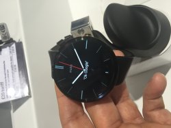
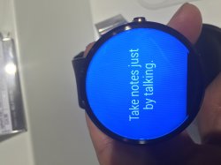
Looks like CES is going to be flooded with "smart" watches from no-name companies whose only criteria seems to be make sure the display is round and make sure it's cheap. The one below from Alcatel takes the worst of the Almost 360 and G Watch R and mashes them into a cheap device. I would not be surprised if a lot of these either get returned or get shoved in a drawer and not used.

Looks like CES is going to be flooded with "smart" watches from no-name companies whose only criteria seems to be make sure the display is round and make sure it's cheap. The one below from Alcatel takes the worst of the Almost 360 and G Watch R and mashes them into a cheap device. I would not be surprised if a lot of these either get returned or get shoved in a drawer and not used.
Image
Yeah that is pretty bad. The only thing going for it is compatibility with iOS and Android (like Pebble). Android Central has a hands on with the device, and they are kinda meh about it.
Yeah that is pretty bad. The only thing going for it is compatibility with iOS and Android (like Pebble). Android Central has a hands on with the device, and they are kinda meh about it.
I can see where fitness bands that have iOS and Android apps (or integrate into HealthKit) might survive. But things like this that run their own Watch/Android Wear like software? Doubtful.
I can see where fitness bands that have iOS and Android apps (or integrate into HealthKit) might survive. But things like this that run their own Watch/Android Wear like software? Doubtful.
I think that for pieces like this price will also play a pretty big factor. I don't think it will do that well, but I also don't think it will be a complete bust.
I think that for pieces like this price will also play a pretty big factor. I don't think it will do that well, but I also don't think it will be a complete bust.
I think its going to be hard to build a high quality device for cheap. So these devices will be cheap but will sacrifice quality.
And the hits keep coming. I'm sorry but I think this looks hideous.  And I can't see any man wearing one. Some posters on Engadget were saying this makes Watch look tired, outdated and overpriced. I darn well guarantee you if Apple released a watch that looked like this people would be barfing all over it. The only thing this might have going for it is battery life (looks like it's not a color screen). But I'd hate trying to read a text or notification on that screen. Seems like it would be difficult to read.
And I can't see any man wearing one. Some posters on Engadget were saying this makes Watch look tired, outdated and overpriced. I darn well guarantee you if Apple released a watch that looked like this people would be barfing all over it. The only thing this might have going for it is battery life (looks like it's not a color screen). But I'd hate trying to read a text or notification on that screen. Seems like it would be difficult to read.
The problem is.
This is like you showing photo's out of Men's and Women's clothing catalogues and saying what looks good and what looks bad.
This is THE thing about watches.
There are literally millions of designs in all shapes, sizes, colours and price points, and not one of them is Right or Wrong.
You might love some, or hate some
I might love some or hate some
But that's the point, they are often fashion and a very personal item as it's something you wear a lot.
This is THE biggest problem Apple, and anyone who makes one watch faces.
You are hoping everyone likes your one design.
Some will some won't
In an Ideal world Apple would in some way Licence the guts and tech of the watch and we could in a few years have hundreds of Apple Watch designs out there. but of course, we both know that's never going to happen.
Apple may indeed get totally and utterly swamped in a very short time with Android Wear watches if they stick to their normal 1 model each year upgrade routine.
I guess we will see.
The difference of course this time is that, right now, and I guess for quite a long time, this is just an iPhone accessory, so instantly they are market limited to just a percentage of people who own a compatible iPhone, so unlike an iPad of iMac of other product it's instantly limited.
Who knows, it may be amazing, it may be another Apple TV or worse as people realise, hey I like MY watch better and the phone is with me anyway so can't be bothered.
Be interesting to see how it pans out.
Main point being. I can go into a normal watch store tomorrow and see over 100 watches I think are terrible, but someone else may love them, it does not matter what I or you think about a design. The point is you need to offer different ones.
Android wear, like it or not will offer this to customers as you may have 20 or 30 companies making multiple designs in the future, whilst apple had one.
Last edited:
Sony announced a stainless steel watch at CES. Unfortunately the bezels ruin it. I prefer other designs that try to mask the bezel as much as possible. Unfortunately a lot of Android Wear UI has a white background so that makes the black bezel stand out even more.
I thought this was clever: lets you keep your current watch.
http://www.gizmag.com/montblanc-timewalker-urban-speed/35442/
jdg
http://www.gizmag.com/montblanc-timewalker-urban-speed/35442/
jdg
One thing I've noticed among friends of mine (ages late twenties to mid 30s) is that bigger watches (even the thickness) are actually "in". Only difference is that most of them are round. But other than that, this is looking to fall into that general category of how thick the watch is. In fact, a bunch of guys are sporting 45mm+ sizes!
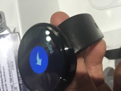
I had the chance to see and play with the Motorola watch yesterday at an O2 store. It doesn't look bad at all, I think the circular display is quite nice. I would even consider buying one if I was using Android phone as is definitely one of the best smart watches out there. But I think that wrist band is awful, it really does give it a very cheap feel.
Attachments
I had the chance to see and play with the Motorola watch yesterday at an O2 store. It doesn't look bad at all, I think the circular display is quite nice. I would even consider buying one if I was using Android phone as is definitely one of the best smart watches out there. But I think that wrist band is awful, it really does give it a very cheap feel.
Good lord it looks like a huge tire! I think the placement of the band also makes the watch face look huge (and the band looks cheap).
Register on MacRumors! This sidebar will go away, and you'll see fewer ads.