The same Steve Jobs that gushed over the hockey puck mouse?Steve Jobs is spinning in his grave...
A design that would never have been released under his leadership, unbelievable.
Got a tip for us?
Let us know
Become a MacRumors Supporter for $50/year with no ads, ability to filter front page stories, and private forums.
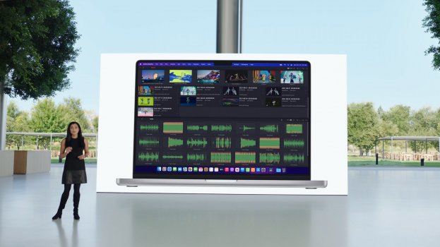
New MacBook Pro Finally Features a 1080p Webcam Within a Notch
- Thread starter MacRumors
- Start date
- Sort by reaction score
You are using an out of date browser. It may not display this or other websites correctly.
You should upgrade or use an alternative browser.
You should upgrade or use an alternative browser.
Yep, that puck mouse at least didn't have to lay on its back to charge up 🤣The same Steve Jobs that gushed over the hockey puck mouse?

Yes, I agree, Apple made a lot of dumb design decisions under Steve Jobs and under Tim Cook.Yep, that puck mouse at least didn't have to lay on its back to charge up 🤣
That's why... if you are a pro... you actually autohide the Dock.To me, the funniest part about all the complaining about a notch that content appears below is that most people have been living with one that content appears above this whole time.
Edit: Yes I mean the Dock, or the wasted space on either side of it depending on how you look at it.
Darth Tulhu
macrumors 68020
The XPS does not have a bigger bezel anywhere.By having a bigger bezel on top? Not really a mystery. I prefer the MBP solution - more screen space for the menu bar.
For me, the notch is a distraction, as if someone left a barbecue sauce thumbprint in the middle of the top of my screen when opening it. I often hid the menu bar, so now it has to stay there to hide that thing hanging down the top of my screen that I'd like to flick off until I realize it's built in.
No one wants a notch, they're just willing to live with it.
As it's the case with Apple, there is ALWAYS a drawback you have to get around to be able to enjoy the KILLER stuff they put into their products.
The pre-2016 MBP design with updates would have been better than this, in my opinion.
I'm seriously thankful the iPad is where it's at capability-wise, because I really don't like these machines. Maybe they'll grow on me (like the iMac did), but I don't really need it to.
Imagine editing a photo, using your trackpad to zoom into a section and the big black rectangle notch covers part of your image, so you zoom back out again and move it around so you can see the full image again.
The notch was ugly enough on the iPhone, now they've gone and added it to the MacBook. For clean aesthetic fans, the notch is awful. Even more annoying that the iPad looks better and is the more futuristic device (touch screen, pencil, attachable keyboard etc.), but people need devices like the MacBook to do their day job (Xcode, Ableton Live, Unity, Unreal Engine to name a few).
From a programmers perspective, it makes app design that little bit more awkward and I'm wondering if Windows will ever have support for this awkward layout.
I had high hopes for this machine, reluctantly will hold on to my 2013 MacBook pro for now.
Darth Tulhu
macrumors 68020
Worth it. I'd rather have that than a notch, ANY day.The Dell has a awful fuzzy 720p webcam with a tiny sensor
I’d say lose the camera period. Then it’s not necessary.And so you would rather completely useless dead space bezels? Yep, I hate this nose on my face, gonna cut it off!
Notch is dreadful. Nobody will notice a bigger screen. Everybody will see an interference in the user interface… Just that, a black brick in the top middle of the screen.
Did you come up with that all by yourself?I've got to say though - this design really is top notch!
I think many pros would share your thoughts, pro machines have no place for gimmicksWorth it. I'd rather have that than a notch, ANY day.
So far everything we've actually seen suggests that the menu/notch part of the screen is not available for windows or editing content ("full screen" content ends just below it).Imagine editing a photo, using your trackpad to zoom into a section and the big black rectangle notch covers part of your image, so you zoom back out again and move it around so you can see the full image again.
...
From a programmers perspective, it makes app design that little bit more awkward and I'm wondering if Windows will ever have support for this awkward layout.

There is such a thing as "too much." For instance for me personally I would find the MacBook Pro trackpad a little more ergonomic if it was a little smaller because of occasional accidental input while typing. If they made it larger and added a notch I would really find it annoying. Same with the screen. Just because the touch bar added real estate didn't improve the usability of the device.All you people complaining about the notch don’t realize that it doesn’t give you less screen real estate, it gives you more. Same 16X9 ratio, but a bit more on top now for the menu bar. Maybe you don’t like the look, but what on earth will it possibly cover up? Functionally, it’s a no-brainer
From the pics on the site and during the keynote, it appears that it does thatNotch doesn't bother me. It would be great if the menu bar goes black during full screen mode.
3 XDR plus a 4K tv.Can the new M1 Pro chip power 2 monitors?
Tell that to the developers who made "illegal" iPhone apps Notchless or NoNotchIt'll be like the iPhone. After one week you won't even notice it anymore. Just wish they added FaceID.
You do get unlock with Apple Watch….No Face ID! 🤦♀️
In the case of a screen there is definitely improved usability… it’s not like an edge to edge track pad at allThere is such a thing as "too much." For instance for me personally I would find the MacBook Pro trackpad a little more ergonomic if it was a little smaller because of occasional accidental input while typing. If they made it larger and added a notch I would really find it annoying. Same with the screen. Just because the touch bar added real estate didn't improve the usability of the device.
Yeah, but they always had that problem. In fact it was worse back when the displays were lower-res. Losing one or two slots isn't a huge deal.It's not that simple as you must have X amount of menu items. What amount may fit in English may not in another language.
But then it wouldn't be 16/10 ratio.And people would complain about the tall forehead, Apple makes all their bezels the same size all the way around, there are still flag ship phones without symmetrical bezels, and I think they look horrible(my opinion). A notch will alway provide more screen real-estate, if they make it 74 pixels taller, they could also add a notch to that, and have more screen.
I personally think that those motorized cameras would be the best solution. Then I know my camera isn't capturing anything when hidden, takes no extra screen, and you don't have to worry about dropping it as much as you do with a phone.
And yeah, I'm sure there is demand for a 17/18" MBP.
Apparently, we already know how it works.Yeah, but they always had that problem. In fact it was worse back when the displays were lower-res. Losing one or two slots isn't a huge deal.
Attachments
Register on MacRumors! This sidebar will go away, and you'll see fewer ads.