........

....
no
think iTunes 5.

vs. iTunes 8

No contest. iTunes 5 was beautiful.
........
....
no
Much more looking forward to the upcoming Iridium interface:The marble is a lie?


There's no such thing as a "Marble" theme. It was a baseless rumor. It doesn't even make sense, because marble looks like this.
It was a rumor about a new interface revamp one of the Mac sites posted long ago when we knew little about Snow Leopard, and for some reason, nobody has let go of it.
I use 4 to 7 monitors with my Intel Mac Pro. I'm in the Income tax prep/accounting field. Try a few displays, you'll like the increased work space.
Much more looking forward to the upcoming Iridium interface:
think iTunes 5.
vs. iTunes 8
No contest. iTunes 5 was beautiful.
so far I am not that impressed with the over-hyped Snow Leopardno wonder it is less than $30!
WHERE ARE THE MULTIPLE OPTONS FOR FONT SMOOTHING STYLE?
Is Apple NOT going to give us options with Font smoothing as they did with all other versions of OS X? Even Windows gives options for it's version of Font smoothing.
If this is the case, I will not upgrade to SL, even though they are giving this dog away for almost free.
Apple's font smoothing is one of the main reasons keeping me from using windows. MS Windows 7 is not looking so bad now.
Also, the on / off toggle for font smoothing in SL does not look too good. Small fonts in a browser look like crap in SL.
What Apple needs to change in the interface of iTunes is the giant section at the top that display playback, syncing, and other information. It looks like like a dot matrix display from an old nintendo gameboy. Needs a BIG facelift (should look more like the iPhone's playback controls whole listening to music).
Much more looking forward to the upcoming Iridium interface:
Come on, guys.
Not too harsh.
It's like donating money to your favorite football club. Like paying too much money to Manchester United via buying a new home-shirt at the shop inside the stadium.
You KNOW you are paying far too much money for something you can get a lot cheaper... but you want to pay for it...
He is simply enthusiastic! And he is willing to pay more for something he really wants.
Gross.
Does anyone here care about practicality or do you guys only consider looks?
You do realize that the top picture (I'm pretty sure) is from the iTunes 8 visualizer, right?
Indeed...
It is somewhat annoying that Apple doesn't want you to touch anything when it comes to customizing OS X. Then again that leaves it open to anyone willing to use Terminal.so far I am not that impressed with the over-hyped Snow Leopardno wonder it is less than $30!
WHERE ARE THE MULTIPLE OPTONS FOR FONT SMOOTHING STYLE?
Is Apple NOT going to give us options with Font smoothing as they did with all other versions of OS X? Even Windows gives options for it's version of Font smoothing.
If this is the case, I will not upgrade to SL, even though they are giving this dog away for almost free.
Apple's font smoothing is one of the main reasons keeping me from using windows. MS Windows 7 is not looking so bad now.
Also, the on / off toggle for font smoothing in SL does not look too good. Small fonts in a browser look like crap in SL.

Being text, I can't sense if there is any sarcasm in there.
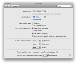
No sarcasm intended. And font smoothing is already available on Appearance...what gives?
so far I am not that impressed with the over-hyped Snow Leopardno wonder it is less than $30!
WHERE ARE THE MULTIPLE OPTONS FOR FONT SMOOTHING STYLE?
Is Apple NOT going to give us options with Font smoothing as they did with all other versions of OS X? Even Windows gives options for it's version of Font smoothing.
If this is the case, I will not upgrade to SL, even though they are giving this dog away for almost free.
Apple's font smoothing is one of the main reasons keeping me from using windows. MS Windows 7 is not looking so bad now.
Also, the on / off toggle for font smoothing in SL does not look too good. Small fonts in a browser look like crap in SL.
I don't think they look bad at all.I have no idea what you talk about in terms of "font smoothing options"...what I would ask instead is: why do fonts look SO bad in every version of Windows when compared with OS X?
Really. Of people would just take the time to look around. And oh no, search.
I don't think they look bad at all.
But to answer your question, Apple uses Quartz for font smoothing, while Microsoft uses ClearType. Different font smoothing techniques, but both look fine on their respective platforms.
As for "font smoothing options," he's referring to how Leopard gave you various choices in terms of the amount of smoothing: heavy, medium, light, etc. But in Snow Leopard, you don't have that anymore. It's either on or off.
Of course, what does Windows have to do at all with this thread, which is about Snow Leopard?
I have no idea what you talk about in terms of "font smoothing options"...what I would ask instead is: why do fonts look SO bad in every version of Windows when compared with OS X?
It's nothing. It's just some "mythical" UI that people are convinced Apple is working on, which they aren't. All we are seeing are Aqua refinements, improvements and evolutions. People are kidding themselves with all this "Marble" talk.Seriously, what is Marble? Cause I never heard Apple mention anything about Marble being a UI name.
I was taught in design 101 never use small white text on a darker background.