Got a tip for us?
Let us know
Become a MacRumors Supporter for $50/year with no ads, ability to filter front page stories, and private forums.
Photo of the Day - April 2012
- Thread starter oblomow
- Start date
- Sort by reaction score
You are using an out of date browser. It may not display this or other websites correctly.
You should upgrade or use an alternative browser.
You should upgrade or use an alternative browser.


Love the leading lines of the road and the stone walls. And of course the timing of the light is teriffic: very Doylemesque!
")


Love this photo and I love all your photos. The colors are always so nice. Awesome!!!!!!
----------

Beautiful, as usual. I just want to stare at it and pretend I'm there.
----------
Many thanks for the congratulations and kind words regarding my last post. It almost makes me think that maybe I should take my lens cap off more often.
Thanks, Dale. That's funny, if anything, I would associate the opposite photo with each point you made, but that kind of difference is what makes talking about photos so much fun. I would explain it by noting that detailed areas have visual weight, but areas with bright colors do as well (anything that attracts the eye has visual weight).
Nonetheless, I'm happy to hear that someone prefers the shot with the sun in it. That one is a risky, rule-breaking kind of photo, much more so than "Kindred Spirits." The latter is a very lucky shot to get, though, which is surely what appealed to the editors who chose it: a concentrated grove of larches in their autumn state set below a sky that momentarily matches them in color, and with the silhouette of a prominent mountain peak echoing their forms--and all of this correspondence cranked up a notch by a sea of fog stretching between these points of interest. In other words: SUPER DUMB LUCK!
Anyway, I had forgotten about Critique of the Week; yes, by all means, post it up on Monday! Friday through Sunday tends to be pretty slow around here, so a new thread like that might get buried if posted before Monday. I think the thread could be a real winner, and I look forward to participating in it.
Photo after photo that you post is unbelievable. I really doubt "luck" has much to do with it. More of an artistic eye and incredible talent. If I had to pick an artist to aspire to be like, it would most definately be you.
Well, it's just not a very inspiring composition! With most of the photographers who post here, I can generally understand what excited them about a particular moment or location... but not this shot. What would I have done differently? I wouldn't have pressed the shutter...
Thanks for your input. I hope I can be as good as you one day.
Took this shot by accident... After just reviewing some photos, I set the camera down on the table and attempted to press the shutter half way to turn off the playback screen. But instead pressed too hard and took this shot...

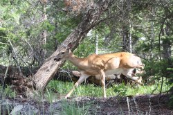
My friends were playing with some flowers while I had my camera out, so I told them to stop so I could take some photos. Here's one of them.


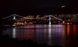
Vancouver BC
After reading your post I just had to post my picture. I saw the bird in the lower left when I looked at the picture the next day. The night I took the picture it was cold and dark, but it was a clear. Glad I got this shot. Enjoy.
Mine for the first:
So here in Sudbury, Ontario, it is dull and grey and +2 C. We had a snow overnight that's melting. I thought I'd go out with the 105 just to mess about. This plant has been in my kitchen for a month and a half now. So before I headed to the bush, I took it outside, put it on the railing and took a couple of hand held shots. It's not a good photo I know. But as I was making some adjustments to the RAW file, I noticed the bug at exactly 9 o'clock from the centre of the flower. I've had this experience with the 105 previously. It sees stuff I never see. I think this is so cool. The lens, not the photo. I'm sure lots of us have had the same experience. Any stories and photos of the unexpected ? BJ
Image
After reading your post I just had to post my picture. I saw the bird in the lower left when I looked at the picture the next day. The night I took the picture it was cold and dark, but it was a clear. Glad I got this shot. Enjoy.
Attachments

Got my new d3100 out of the box and snapped this just outside with the kit lens. Was playing around with the macro mode just for fun. I was curious to see what the camera would do with the aperture, ISO, etc. First post to this thread, hopefully not the last

D3100, 1/60, f/4.0, ISO 800
D3100, 1/60, f/4.0, ISO 800
Thanks for your input. I hope I can be as good as you one day.
My response looked a bit sour. Sorry. But you have a capable and sophisticated camera, and appear to live in a fascinating place. Ruler-straight horizons represent both a challenge and an opportunity. Geometric fields, big skies, straight roads, etc. You get a sunrise and a sunset every day of the year, and the light is always changing.
Love this photo and I love all your photos. The colors are always so nice. Awesome!!!!!!
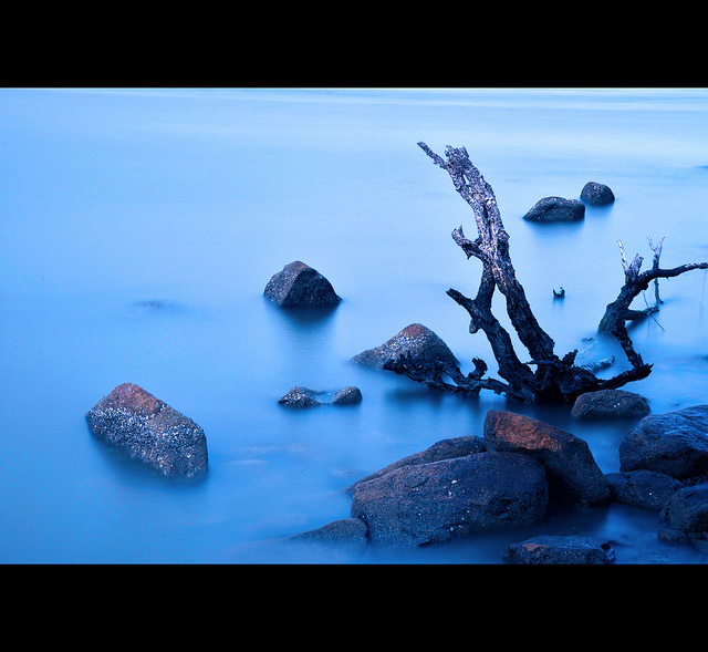
Thank you. I wish I could reciprocate, but I really don't care for the PP technique you use for a lot of your pix (like the one of the lake above). As with a lot of techniques (HDR, tilt/shift, the 'retro look', etc), the pix look good - or, at least, interesting - the first time you see them. The second and third time too. But the pleasure recedes as the novelty wears off. Now I see your pix and the first thing that registers is the 'look' you give them: the 'curly' foliage, etc. It makes the pix two-dimensional, like 'painting by numbers', destroying the (illusion of) depth. But I understand that this is how you like them to look, so it's a matter of personal taste, I suppose.
Thank you. I wish I could reciprocate, but I really don't care for the PP technique you use for a lot of your pix (like the one of the lake above). As with a lot of techniques (HDR, tilt/shift, the 'retro look', etc), the pix look good - or, at least, interesting - the first time you see them. The second and third time too. But the pleasure recedes as the novelty wears off. Now I see your pix and the first thing that registers is the 'look' you give them: the 'curly' foliage, etc. It makes the pix two-dimensional, like 'painting by numbers', destroying the (illusion of) depth. But I understand that this is how you like them to look, so it's a matter of personal taste, I suppose.
I love Oberhammer's look. While I wouldn't want everyone applying that treatment, I'm glad he is... I find it fascinating and spend a lot of time taking in the details of how things transformed as a result.

I love that painterly look. Lovely colors
At first I taught maybe croping out the left part before the deck, to balance things out with the yellow tree on the right, but on second look, the benchs / tables take care of the balancing act, so its perfect the way it is
A beautiful spring morning has finally arrived. So my wife and I took advantage of the walking trail that winds through the northern end of town "up on the hill."

My response looked a bit sour. Sorry. But you have a capable and sophisticated camera, and appear to live in a fascinating place. Ruler-straight horizons represent both a challenge and an opportunity. Geometric fields, big skies, straight roads, etc. You get a sunrise and a sunset every day of the year, and the light is always changing.
Thank you. I wish I could reciprocate, but I really don't care for the PP technique you use for a lot of your pix (like the one of the lake above). As with a lot of techniques (HDR, tilt/shift, the 'retro look', etc), the pix look good - or, at least, interesting - the first time you see them. The second and third time too. But the pleasure recedes as the novelty wears off. Now I see your pix and the first thing that registers is the 'look' you give them: the 'curly' foliage, etc. It makes the pix two-dimensional, like 'painting by numbers', destroying the (illusion of) depth. But I understand that this is how you like them to look, so it's a matter of personal taste, I suppose.
I know you don't like my photos. However, I do love yours. I happen to like my photos and I do try for a certain look. I am after a painterly feel so I can hang them as art. In fact, I do hang them as art after I have them enlarged. I do get a lot of compliments. Really though, I try to create something nice and pleasing to the eye. I kind of go by by what I think looks good. Certainly, my photos and what I create are not any thing near your untouched photos. You have great talent and a great eye and certainly know your stuff. I do like to think there is room in the forum for my painterly photos. I like to think my photos and what I try to do is semi-unique and somewhat interesting. If we were all the same, it would be boring. I am creative and it is my blood. I like computers and software and photography and try to blend all my interests. I have fun using photoshop and various plugins. I like learning. I am eclectic and love all different styles. I like HDR, pure, and everything in between as long as they look nice and are interesting. Again, Your photos are 10s almost every time and I would love to spend a week with you learning some of your skills.
I love that painterly look. Lovely colors
At first I taught maybe croping out the left part before the deck, to balance things out with the yellow tree on the right, but on second look, the benchs / tables take care of the balancing act, so its perfect the way it is
Thanks Rowbear. BTW, I love all your photos. You post some of the nicest photos on this forum.
Register on MacRumors! This sidebar will go away, and you'll see fewer ads.