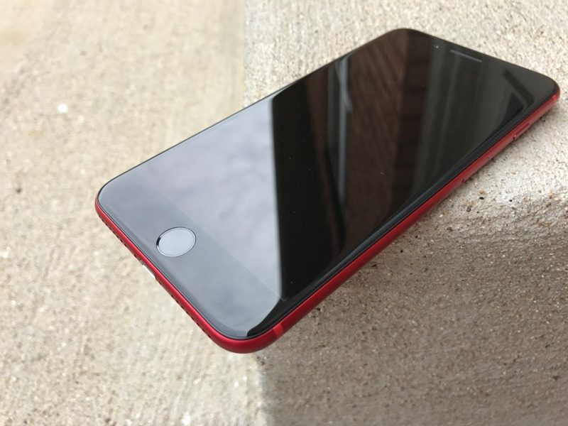
Good. The white bezel is an eyesore.
When you look at an iOS device, what's on the display (the software) should be the focus of the device, not POW! BEZEL! IN YOUR FACE!
If it were seamless with the display emerging from out of the white, then that'd be one thing, but it isn't. The display graphics butt up to a black area, which the white doesn't even completely cover, leaving you with the odd blinding white display, abrupt black ring around it to visually trip over, on your way to the bright white face, with more black holes in it. The white looks cheap, ill-fitting, and like the kind of fashion statement a teenager who goes around wearing white sunglasses is trying to make.
It is a much cleaner and better design for bold graphics to emerge from the uniform darkness of the black face.
Silver (clear anodized) should also come with the black face, as the original, classic iPhone did.