Become a MacRumors Supporter for $50/year with no ads, ability to filter front page stories, and private forums.
I'm using iPhone 4 beta 3 and at my screen it's frosted so it works fine.

They're doing major changes with layering concept and they need to iron things out like how much the opacity, blurriness, contrast, font size/weight, etc.

I also not like it at first but after try for a while and improvement during betas make me more optimist. Eg: most of us will complain that there's no dots for dates that contain events, they fix it and add dots with beta 3.
 

Attachments

  • Picture 077.png
    Picture 077.png
    168.5 KB · Views: 156
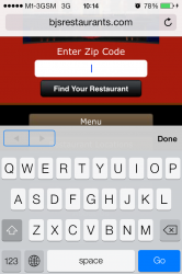
Just take a look at the simple keyboard entry UI design. It's beyond pathetic. There is a thin blue outline over the next/previous field buttons and that's how they solve the "layered" transparency design problems.

every day I look at iOS 7 UI and I shake my head in disbelief: 5 years of pure iOS UI design down the toilet and this is the best we can get from the same team that brought us the first iPHONE.

I'm in disbelief that they actually let these fake designers work on a flagship operating system.

When I think this is about to end.... every single day there's a new and improved troll more annoying than the day before. :(
 
Last edited:
While everyone here is thrashing the OP for their rather extreme statements, I'll say one thing.

"It's a beta" is a terrible argument in that 1. We heard the same thing about Apple Maps (look how that turned out) and 2. These UI elements are most likely finalized. We will only see VERY MINOR UI tweaks before the GM, and buttons are pretty major in the UI.

Just my thoughts.

I think that issues with UI elements being unreadable over certain backgrounds is not intended and is exactly the kind of thing that could be fixed before launch. Just like they have begun responding to complaints about the ultra light font weights and readability.

What the OP actually should have done here is file a bug report.
 
Just take a look at the simple keyboard entry UI design. It's beyond pathetic. There is a thin blue outline over the next/previous field buttons and that's how they solve the "layered" transparency design problems.

every day I look at iOS 7 UI and I shake my head in disbelief: 5 years of pure iOS UI design down the toilet and this is the best we can get from the same team that brought us the first iPHONE.

I'm in disbelief that they actually let these fake designers work on a flagship operating system.


09kp.jpg


7nc5.jpg
Hey Scott!
 
So basically same discussion as last year when we had some people saying that Apple was going to switch on "real" maps data after the release of ios6 and how this was going to solve all the issues with maps... A year later and we are still waiting...

Hopefully we won't have to wait another year for GUI...

Im not sure why Apple maps is still getting such a bad wrap. I have had nothing but great success using maps/Siri for directions. Lock screen directions are great too.

I challenge any of you to go try using the MyFord Touch map navigation and then come back and tell us how "crummy" Apple maps are.
 
The hyperbole around here is hillarious. But what's even more hillarious is everyone who's suddenly become a design expert. Some of these threads would be perfect for the Angry Mac Bastards podcast. :D

Can the mods merge this thread with this existing one? https://forums.macrumors.com/threads/1597114/

While not a UI design expert, I'm a professional graphic designer. My thoughts as many other here echo what current iOS app devs for apps like letterpress and instapaper have been saying about iOS7. Apple simply made a few more obvious design mistakes here in comparison to prior iOS versions.

Professional icons designers are calling Ive's "icon grid" just plain wrong on multiple levels and yet its plastered all over Apples site and iOS 7 video as some work of genius....thats scary.

Will some of it be fixed? Sure, but not all of it. At least not quickly. They will wait till 7.1 or whatever first. I'll use the iOS 5 iPad music app as a prime example. It took months for them to fix a HORRIBLE design/color choice for the music shuffle button. Originally it was white when "inactive" and white to light gray when "active" and on the navigation screen it was opposite!?!?!?! Not only confusing, but in order to see the changed state you had to really stare at it to see the difference. A few months later they changed it to be the current orange "active state" after enough people complained. Just an example of an absolutely idiotic design choice that had to be corrected. See below.
 

Attachments

  • nav-compare-cjr.jpeg
    nav-compare-cjr.jpeg
    34.4 KB · Views: 153
  • nowplaying-compare-cjr.jpeg
    nowplaying-compare-cjr.jpeg
    33 KB · Views: 159
Dude there's still a couple months until release.

UI changes take an awful lot of work. You can spend weeks working on a small feature in a program to get the animations and colors and all the tiny little crap nobody really notices just right.
 
While not a UI design expert, I'm a professional graphic designer. My thoughts as many other here echo what current iOS app devs for apps like letterpress and instapaper have been saying about iOS7. Apple simply made a few more obvious design mistakes here in comparison to prior iOS versions.

Professional icons designers are calling Ive's "icon grid" just plain wrong on multiple levels and yet its plastered all over Apples site and iOS 7 video as some work of genius....thats scary.

Will some of it be fixed? Sure, but not all of it. At least not quickly. They will wait till 7.1 or whatever first. I'll use the iOS 5 iPad music app as a prime example. It took months for them to fix a HORRIBLE design/color choice for the music shuffle button. Originally it was white when "inactive" and white to light gray when "active" and on the navigation screen it was opposite!?!?!?! Not only confusing, but in order to see the changed state you had to really stare at it to see the difference. A few months later they changed it to be the current orange "active state" after enough people complained. Just an example of an absolutely idiotic design choice that had to be corrected. See below.

I'm waiting to judge until we get closer to GM. And it might be iOS 8 before the new design language is really polished. Jony Ive said this was a beginning. I think the direction is right and I'm blown away by everything they did in only 6-7 months. I think they rushed to get something ready to show at WWDC, so in many ways this is really an unfinished product.

My hope is this will force Apple to iterate more frequently. We shouldn't have to wait a whole year to get changes to iOS.
 
When I think this is about to end.... every single day there's a new and improved troll more annoying than the day before. :(

It's disheartening to see people just dismiss all of the issues with the IOS7 design.

It would be more useful to be constructive - point out specific examples of where the new design isn't working, suggest improvements, etc.

It is not constructive or mature to call everybody with a criticism a "troll".

It is also not helpful to sit back and say "oh, this will all be fixed by GM"; if you don't want to engage in the discussion, that's fine - you don't have to. From my experience with iOS betas (basically all of them), there are lots and lots of serious UI bugs that don't get fixed for ages even after GM - the repeat/shuffle icons are a good example. Sometimes people like to vent about niggly little things that annoy them (I know I certainly do!)

Discussion is good and healthy; nobody but the site's owners have the right to preclude discussion on this board. So please do not dismiss those with points to make.
 
I too am not a fan of translucency as it adds no value and makes it very hard to create a colour scheme that fits every situation

That's why there is no colour scheme. The transparency is just enough so it serves as a background to the header and buttons, but the colour is from the content. It gives the OS a less heavy feeling and makes the content king.

While everyone here is thrashing the OP for their rather extreme statements, I'll say one thing.

"It's a beta" is a terrible argument in that 1. We heard the same thing about Apple Maps (look how that turned out) and 2. These UI elements are most likely finalized. We will only see VERY MINOR UI tweaks before the GM, and buttons are pretty major in the UI.

Just my thoughts.

1) It turned out fine. Apple Maps has been more accurate than Google Maps in my experience with data points, and directions have been identical.

2) The buttons are most likely final, but your silly arguments like the invisible volume bar is going to change. Not even Android would leave it like that. Minor tweaks are what we need as user interactions are pretty polished.
 
I see you know what developer and operating system is, but do you know what beta means?
It will get worked out by the time the public get a it.
Close the thread please.

Not to insult you or anything, but you are kind of naive thinking the OS will change that much until release.
 
Another prime example of junk:

Look at apple's own lot of videos. White background and you can't even see the volume control (what level is it on?) - when the progress indicator moves, part of the progress (which is in white) will just disappear with the white background of the video.

These are the sorts of design cues that should be developed when the first iphone circa 2007 was invented. You don't throw out 5 years worth of good stuff just to satisfy a majority of android geeks. Now I can totally tell the ones here who are defending this mess are just a bunch of apple sheeps.

I have had my fair share of android (since the GS2) and I was happy with iOS up until this mess. This is not going to change much my friends. Beta is already along the path of what is to become iOS 7.

Sure they can tweak it perhaps add a drop shadow but come on, these are just bad designs period. Everything in this new iOS 7.0 (aside from the new API additions) are just complete junk.

Slap on all the new features of the slide up control center, the new drop down notifications to iOS 6 and you will have satisfied both sides. These new parallax layers and frosted glass BS is just complete utter garbage. It's eye candy but ugly eye candy.

If not for the proven technology backend of iOS 6 and up, no one will ever use an iPhone again. Seriously, it's not even an iPhone anymore. Might as well call it Metroid (windows + android) fused in a crap pile.

hxfh.jpg

Wrong on so many levels, enjoy android troll.
 
Right. It's a beta. So by the start of this Fall, we will see a dramatically improved version of iOS 7 free of all these asinine design cues. Give me a break. These "bugs" are already reported. I just felt the need to vent a bit more because obviously it's beta 3 and this junk has been included since beta 1 and have not been addressed.

You clowns continue on saying to yourself, "it's a beta, it's a beta...oh god, please let this be a beta!!!"...while in your sleep.

OP, I've learnt from here that you seem to take a very high importance of your own opinions, and you take yourself as superior to others.

Goodbye, I'm out of this thread.
 
Just take a look at the simple keyboard entry UI design. It's beyond pathetic. There is a thin blue outline over the next/previous field buttons and that's how they solve the "layered" transparency design problems.

every day I look at iOS 7 UI and I shake my head in disbelief: 5 years of pure iOS UI design down the toilet and this is the best we can get from the same team that brought us the first iPHONE.

I'm in disbelief that they actually let these fake designers work on a flagship operating system.


09kp.jpg


7nc5.jpg


While i believe the new design of ios 7 is some ugly touchwhiz mashup nightmare. I have gotten used to it on my iphone. I have said this many times. You either get used to it, and say it is what it is. And not worry about the design. Or you move to another platform. Criticizing it over and over will not do anything to change the way it looks.
 
I see you know what developer and operating system is, but do you know what beta means?
It will get worked out by the time the public get a it.
Close the thread please.

People were saying the same about Apple Maps this time last year: "It's a beta", "Everything will be fixed by October" "You know what a beta is?" - Now, just look at the pathetic app they shoveled on us in October, nothing was fixed, searches were useless, the interface compared to that of Google's was a disaster... Even Tim Cook had to write a letter saying sorry to all of Apple's customers.

I feel the same thing will happen with iOS7.

PS - Don't be such a little I know-everything-***** by saying "close thread." Be a little nicer.
 
Just take a look at the simple keyboard entry UI design. It's beyond pathetic. There is a thin blue outline over the next/previous field buttons and that's how they solve the "layered" transparency design problems.

every day I look at iOS 7 UI and I shake my head in disbelief: 5 years of pure iOS UI design down the toilet and this is the best we can get from the same team that brought us the first iPHONE.

I'm in disbelief that they actually let these fake designers work on a flagship operating system.


09kp.jpg


7nc5.jpg

I'm not sure if I should laugh or be surprised by this post.

This is not proof, it's your opinion. And a very crummy one I might add.
 
You know what? Sure, you complainers may be complaining now. But there's a reason it's called beta.

Besides, you'll probably get used to it over time.

At first, I was jarred by the design change but within minutes, I got used to it and started liking it. Except for the translucency (although it looks great in Notification Center).

You can't expect Apple to please everyone. Skeuomorphic design has been around since iPhone OS 1. Change has to come at some point of time because we all will get bored of the same design over time.

The overall look of OS X has been largely the same for almost 10 years. Especially in the last 5-6 years since Leopard. You don't see them blowing up OSX.

----------

I'm waiting to judge until we get closer to GM. And it might be iOS 8 before the new design language is really polished. Jony Ive said this was a beginning. I think the direction is right and I'm blown away by everything they did in only 6-7 months. I think they rushed to get something ready to show at WWDC, so in many ways this is really an unfinished product.

My hope is this will force Apple to iterate more frequently. We shouldn't have to wait a whole year to get changes to iOS.

Having to wait for another year for them to polish what is now a turd is not exactly comforting. I highly doubt they will bump up there release cycle. Once a year is quite a lot to release a new OS. Last year it took till iOS 6.1 before it was really really polished.
 
Ahaha, I like so much people saying "It's a beta you can't judge".

Just as if Apple will change BIG things like this on the beta.

YOU should learn what beta means folks: tweak and bug fixing.

This reminds me people saying that Apple will fix the icons because it was just a beta.
Sure, because they put all the screenshots on their end user -public- website as a final product to change everything before lunch.

Still waiting the icon fixes beta after beta. Guess what, there will be none.
 
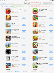
Because UI elements are so simple (text, with only differentiation by text size, boldness or colour), it becomes confusing what is selected.

For example, blue text is always a button / something tappable in iOS7. But in the Top Charts on the App Store, the selector between Paid and Top Grossing is the wrong way round.

The 'Free' column has black text; but in the left hand column you would expect it to be showing 'Paid', as it's black, and be able to tap on 'Top Grossing' (as it's blue). But you can't. It's the other way around: you're current viewing 'Top Grossing' and can tap on 'Paid'.

It does make sense by it's self -- which ever is highlighted blue is the one you're currently viewing; but, because a 'button' in iOS 7 is blue text, you expect to be able to tap Top Grossing.

This text colour would be fine, if there was a subtle gradient to show which one is selected, and which is not - or a slider that you can drag to each side.

But, because of the colour scheme, that they've tried to keep consistent, it ends up being confusing -- if they used light grey text for the one that isn't selected then it would be obvious which one is selected; but that text is limited to description.

I feel Apple has limited themselves, by having no gradients or shadows to elaborate on what is selected / not selected. And, the fact that they only have three colours to work with: black, blue* and grey.
 

Attachments

  • photo.PNG
    photo.PNG
    373.6 KB · Views: 166
Ahaha, I like so much people saying "It's a beta you can't judge".

Just as if Apple will change BIG things like this on the beta.

YOU should learn what beta means folks: tweak and bug fixing.

This reminds me people saying that Apple will fix the icons because it was just a beta.
Sure, because they put all the screenshots on their end user -public- website as a final product to change everything before lunch.

Still waiting the icon fixes beta after beta. Guess what, there will be none.
Icons probably won't look different come launch but that doesn't mean other things won't change over time. For instance if they went a bit to far in removing the "chrome" that might get dialed back. Look at how OSX has been refined over time.
 
I love these discussions. A few months ago there were plenty of threads about if IOS 7 doesn't have drastically different ICONS and a flat look Apple is dead. Now the threads are if Apple doesn't go back to the old ones then it is dead.

IOS 7 brings more function and with all the new API's new application function. That is what is important and not the looks of ICONS.

Really folks - if you spend that much time loving the look of your phone screen - GET a life!

Internet is French for irrational. :D

But really, I am with you.
 
Register on MacRumors! This sidebar will go away, and you'll see fewer ads.