Become a MacRumors Supporter for $50/year with no ads, ability to filter front page stories, and private forums.
Asymmetry doesn't bother me, and depending on how its done I sometimes prefer it to symmetry.
I actually like symmetry better, but with the advent of the notch, I noticed landscape symmetry is even more glaring a problem for me than portrait.

I really just wish they go back to having the camera stuff in a bezel and leave the screen symmetry alone!!
 
  • Like
Reactions: 3530025
I never use the front facing camera. Wish they would make a version with no front camera and a touch button like the iPads. I’m probably in a very tiny minority. Never gonna happen. Lol
 
  • Like
Reactions: 3530025
I actually like symmetry better, but with the advent of the notch, I noticed landscape symmetry is even more glaring a problem for me than portrait.

I really just wish they go back to having the camera stuff in a bezel and leave the screen symmetry alone!!
The separate pill & circle cutouts are just Apple being retro. 😜

The pre-notch phones were really asymmetrical with the line being centered and the dot hanging off its side, as opposed to both shapes being centered on the new phones.

iphone6plus.jpg
 
The separate pill & circle cutouts are just Apple being retro. 😜

The pre-notch phones were really asymmetrical with the line being centered and the dot hanging off its side, as opposed to both shapes being centered on the new phones.

View attachment 2049323
Big issue with that, one it’s not cut into the screen, and the another is that a large amount of iPhone’s have a black bezel so that asymmetry was no where near as noticeable as with the white iPhone’s or in the screen.
 
What’s the point of a punch hole physical design if the final use case looks the same as the current wide notch?


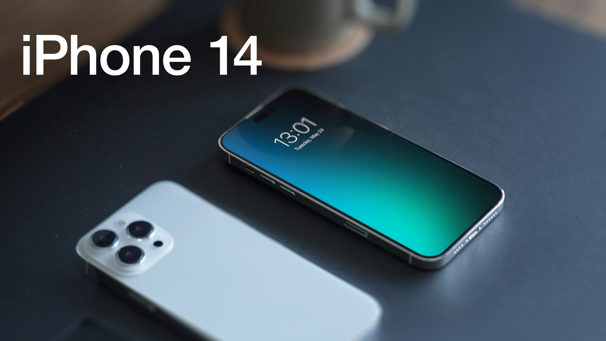
It's been almost 12 months since rumors 
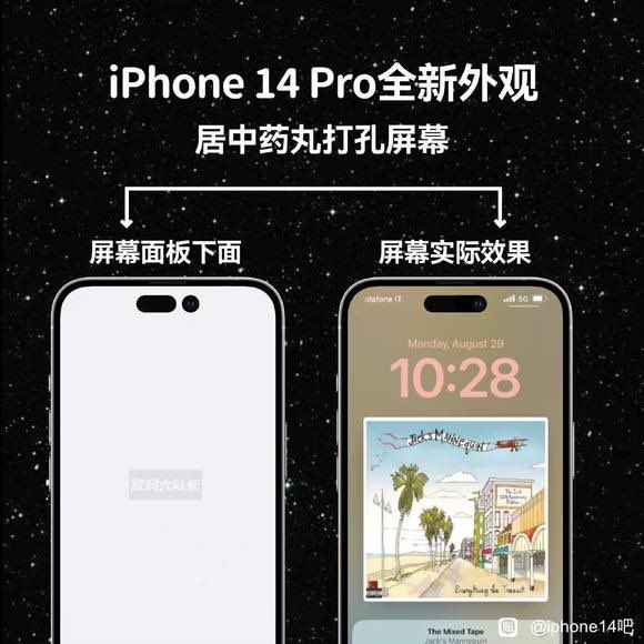
first suggested that Apple's upcoming iPhone 14 Pro models will feature both hole-punch and pill-shaped cutouts near the top of the display. While this design detail has since been corroborated by respected analysts, what has remained less clear is how Apple's software will accommodate the cutouts when the iPhone display is active. Today, we may well have been given another piece of the puzzle.

iPhone-14-Dummies-2.jpg

According to information provided to MacRumors by an anonymous tipster, the discrete pill and hole cutouts are not visually separated when the display is powered on, but in fact appear as one contiguous, longer pill shape.

Rather than stick with the uneven aesthetic, the suggestion is that Apple has chosen to turn off the pixels in the "dead space" between the cutouts in order to create the appearance of a unified pill shape that is less distracting when viewing content on the screen.

In another intriguing twist, the tipster also claims that Apple intends to visually expand the blacked-out areas around the cutouts to host content. For example, Apple could make the area slightly wider to fit status icons on the left and right sides, or even extend it downward into a large rounded square when delivering certain notifications.

iphone-14-pro-cutouts-active-display.jpeg

Image depicts visual difference of cutouts with display off (left) versus on.

MacRumors has discovered chatter across Chinese social media networks, purportedly originating from Foxconn employees involved in iPhone 14 Pro assembly, suggesting the same unified pill software implementation. Like the original tipster, these sources have not been verified and we are only presenting the information up front to our readers with the usual caveats as a topic for discussion.

We'll know for sure whether this last-minute rumor turns out to be true next Wednesday, September 7, when Apple holds its "Far Out" media event, where it will unveil the new iPhone 14 series. We are expecting a 6.1-inch ‌iPhone 14‌, a 6.7-inch iPhone Max, a 6.1-inch iPhone 14 Pro, and a 6.7-inch ‌iPhone 14 Pro‌ Max. There will be no 5.4-inch ‌iPhone‌ "mini" this year, with Apple instead opting for larger devices.

Article Link: Rumor: iPhone 14 Pro Display Cutouts Could Appear as a Single Long Pill Shape When Turned On


wait ... "Apple could make the area slightly wider to fit status icons" how does this make any sense at all?

Extend wider (which means less space on left or right) to fit status icons on the left or right?

Anyone else with common sense here not actually getting this at all?
 
A pill shape design would be ideal however my money is on the pole-punch design. Whichever one we are going to get. We are bound to receive more space around the screen. Hopefully, Apple will utilize the extra screen.

FbZhaqnXEAA-vjt

The thing about the last two designs is that they are not actually an improvement. On the 13 the notch actually got *bigger* in the direction that matters most. There is no more information being shown on the more narrow sides, but it does cut farther into my usable screen space.

Same problem with the proposed 14 design. You’re not actually getting anything back. That space is still wasted. Maybe it’s not physically possible but it should be flush with the top of the screen. This was more design work for no actual benefit. It arguably doesn’t even look better.

This combined with the “floating” Dock since Big Sur are probably more annoying to me than they should be, but they show a continued trend in the wrong direction. I don’t need lit up empty pixels, I need (at least the option for) as much information on my screen as possible.

Google has had this inexplicable love of whitespace for years now and Apple seems to be getting ideas from the wrong places (like the Windows settings app.)
 
Big issue with that, one it’s not cut into the screen, and the another is that a large amount of iPhone’s have a black bezel so that asymmetry was no where near as noticeable as with the white iPhone’s or in the screen.
Even worse is how long it takes to faceID unlock the phone vs what Android's face unlock works on gaming phones. yeah yeah the whole argument of which is more secure yadda yabba dooo ... but speed should be with the best solution, right?

My gripe is with iPhone Pro (14 onward having the latest and greatest chipset, or iPhone 13 down to iPhone 8/X) ...

what exactly is Apple doing with iOS that it seems to be so far behind on? I mean what good is having the lastest and fastest CPU featured in bench marks is willing to claim when:

Face unlock is much slower than the competition,
We still cannot fully theme the launcher, font and icons natively within iOS,
iPhones STILL charge wired / wireless under 25W/12-15W MagSafe respectively?!
Slow charging due to the line above - an hour to charge to full capacity on a 12 mini!!
small battery capacity levels across the board yet they have amongst the largest size phones?!
absolutely NO proper cooling vapour chambers - which just about ALL the competition has that specifically allows longer higher cpu performance beyond 5, 10, 20, 40 mins time on screen! And at a lower cost!
 
Remember when the rumours reckoned Apple was gonna shrink the FaceID components & hide 'em in the bezel.
Or they would be the ones to perfect transparent OLED pixels to hide it under the screen.
Last year they moved the ear speaker to the bezel which narrowed the notch, but inexplicably made it deeper too.
Now they've narrowed things yet again, but they've kept them in the same spot and so we're left with...

iPhone 14Pro.jpg


ooh they're gonna software dead pixel the gap between the pill & hole. Why the gap at all? Why couldn't they join the 2, push it to the top and have the narrowest, shallowest, least intrusive notch ever. No matter what the fanbois say to fool themselves this is NOT improvement. It looks janky, poorly thought out & the product of a bad design. Since Jonny Ive left who is the design leader 'cause this (along with a lot at Apple) looks like the product of a directionless committee.
 
I never use the front facing camera. Wish they would make a version with no front camera and a touch button like the iPads. I’m probably in a very tiny minority. Never gonna happen. Lol
I'm with you on this. I rarely use the front camera that I wouldnt mind it not being there at all or having the lower quality camera that the Samsung underscreen Fold has.

This getting away from notch while simultaneously rolling out the notch on other devices is just getting silly.

Having said that I do like the notch.
 
  • Disagree
Reactions: bejib66000
Well this is exciting.. a 23rd hour pivot from what we've been seeing in rumors all along... This makes the event next week way more exciting... waiting to see what kind of pill design they go with and how its implemented. Things just got a little spicy in an what was an otherwise pretty boring event.
 
Even worse is how long it takes to faceID unlock the phone vs what Android's face unlock works on gaming phones. yeah yeah the whole argument of which is more secure yadda yabba dooo ... but speed should be with the best solution, right?

My gripe is with iPhone Pro (14 onward having the latest and greatest chipset, or iPhone 13 down to iPhone 8/X) ...

what exactly is Apple doing with iOS that it seems to be so far behind on? I mean what good is having the lastest and fastest CPU featured in bench marks is willing to claim when:

Face unlock is much slower than the competition,
We still cannot fully theme the launcher, font and icons natively within iOS,
iPhones STILL charge wired / wireless under 25W/12-15W MagSafe respectively?!
Slow charging due to the line above - an hour to charge to full capacity on a 12 mini!!
small battery capacity levels across the board yet they have amongst the largest size phones?!
absolutely NO proper cooling vapour chambers - which just about ALL the competition has that specifically allows longer higher cpu performance beyond 5, 10, 20, 40 mins time on screen! And at a lower cost!

People are disagreeing but no challenges.

I've been using iOS and iPhones for years now and just seeing what's evolved on the other side. I've tried android in the past and completely hated it. Yet its been quite refined.

To add to the above:
DeX - full desktop Linux distro's for complete Desktop/Laptop computing experience.
RedMagic phones can fully game like a laptop connected to Windows, only BT for keyboard/mouse/gaming controller and USB-C cable needed ... why can we not have this on iPhone Pro models without the need for AppleTV Box?!!!

my AppleTV4 was updated and I updated again using beta ... each update this past 30 days has completely rendered the experience watching Youtube, Tubi, Disney+ annoying as hell.
Youtube: queue the video ... add comes up, screen flickers off for 1 second before ad is visible and already started. when add is done, same flicker off again for 1.5seconds before the real video plays - you cannot hear it until the screen comes back on. EVERY single time!
Other apps maybe no add plays but same video start experience. This is garbage and never had this in over 3yrs I've owned this!

like come-on Apple. the iOS security could NOT be taking up so many CPU cycles right!?
Why is iOS video playback on device which pops-out not universal regardless of the video source?!

Why are we STILL not able to delete ALL iMessages/SMS messages on WatchOS?!
Why are they still not fully sync'd regardless of LTE on Watch or just WiFi with iPhone when the specific setting to MIRROR iPhone is ON!?

Grrrrr - 8yrs now since iMessage in iCloud was implemented promising to resolve this!

How long are all of us going to keep being ignored for features that are half-stepping and Craig and team being mum on resolution! Countless threads on this iMesage + iPhone + Watch here alone!
 
  • Disagree
Reactions: KurtWilde
I guess they will use this area of black pixels for mic/cam orange green indicators ..
Shocking to me that in 6 pages of responses so far, you were the only person to point this out (though with one quote reply agreeing).

If Apple DOESN'T do this, they're stupid. Because this would be the single smartest thing to do. By using those surrounding pixels for indication, it would be keeping within the purpose of the top status bar AND focusing the user right to what privacy-compromising components are activated. No little colored dots that 8/10 have no idea what they mean. A pulsing red ring around the cam is pretty self-explanatory (unless colorblind). And an orange or green ring around the ear-speaker, when either the speaker OR mic is in use, same. And when neither are in use, black… so as to not look out of the ordinary, not "indicate" anything to the user (as well as subtly call back to the original iPhone's speaker slot).

This seems no-brainer to me.
The only other cool thing I could think of would be to finally have a notification indicator
 
Register on MacRumors! This sidebar will go away, and you'll see fewer ads.