I do like Snow Leopard, but I think Mountain Lion is my overall favorite.That was my favorite osx of all time. I'd take that back in a second.
Got a tip for us?
Let us know
Become a MacRumors Supporter for $50/year with no ads, ability to filter front page stories, and private forums.
Sketchy Rumor Says iOS 18 Will Have visionOS-Inspired Design Changes
- Thread starter MacRumors
- Start date
- Sort by reaction score
You are using an out of date browser. It may not display this or other websites correctly.
You should upgrade or use an alternative browser.
You should upgrade or use an alternative browser.

View attachment 2347858
I mean, let's really stop and take a look a the basic phone app. Does it seem like the pinnacle of innovation and design? It feels like Apple has been taking the "if it ain't broke, don't fix it approach" but for a company that always touts words such as "innovative" and "revolutionary", and with some iPhones costing over $1000, they are capable of so much more...
Agreed, I’ve always thought the phone app was one of the worst looking since iOS 7, it’s bland and flat, looks like some intern threw it together in five minutes. Almost anything looks better, over the past 15 years I’ve seen some truly gorgeous designs on phones people have made in the jailbreak community. You’d think the wealthiest company on Earth could afford to hire some talented designers right??
I have to say I really like the variable speed that the icon rows swipe when switching pages on the visionOS springboard. Happy to bring that over to iOS and iPadOS. Wonder if we’ll get round icons too? Force stagnant devs to make app updates, if only for the icon.
Far too many devs have used the same horrible and flat icons ever since iOS 7, it’s lazy. Anything to kick start them into having to put some effort into it.
I must be an outlier. But when I use my phone I don’t look for character or flair. I just want it to do whatever it needs to do for me
I want all the flair.
it looks bland and like aero glass. Apple is becoming android and windows wanna be's now. Sad when they used to lead the way. They haven't done a single thing unique or new since jobs died. you can't tell any of the icons apart anymore.. they are just boxed pastel colours. It hurts my eyes jsut trying to find the right icon now.
Tabs didn't really look like tabs anymore since 10.3 Panther...Back when buttons looked like buttons, and tabs looked like tabs!
10.2:

10.3:

Pepperidge Farm remembers...
I’d love to get that back!
iOS needs a refresh but I can get that colour outside by rolling my wheelchair near the dog bin! I had to do a test a few years ago based on the Munsell colour system, which is a a colour test that specifies colours based on three properties of colour, hue (basic colour), chroma (colour intensity), and value (lightness) and got a 0 (perfect score) to my surprise. That is not grey, its like a spilt milky coffee with a hint of grey and personally I detest it. Oh and that's viewed though a Apple Studio Display which are calibrated pretty well. That GUI colour palette GUI needs a lot of work more contrast and definetly shadow effects but minimal ones but to help seperate the GUI more where where there are toggles or overlaps etc. Or maybe just a different colour altogether.
I wouldn’t be surprised since Apple TV seems to be adopting it. Not really interesting but it fits with the current hardware design language.
Last edited:
Once a man metaphorically said "if you put a task manager you blew it". 😅Most Apple platforms give you the option to disable effects.
I really doubt if this would come to iOS. It makes sense for Vision Pro as the VisionOS is interacted in Spatial (surrounding). iOS is restricted to a glass slab so the translucency wouldn't make sense on iOS. I could be wrong, but just my 2 cents.
I thought the new settings is an improvement over what we had. We couldn’t resize the window before and I relied heavily on the search function to find everything except the most commonly used items. I didn’t like it at first because I had to relearn where everything was after a decade of using the old system preferences but the categorization now makes a lot more sense than what we had before.
You can't resize the window now either (only vertically) and I now rely on search to find everything.
Kids today would say "sketch." Or maybe that, too, was yesterday."sketchy" is a word i expect people to say in high school...
Heck YES!! I wanna lick my Ui again too. I miss Steve.
Bringing back skeuomorphism would be nice. I hope they at least do something new, flat interface is boring.
I'm not too keen on rounded corners on windows and in menus either.
I'm not too keen on rounded corners on windows and in menus either.
This looks way too good, apple would never do it.
Apple- Best we can do is more stickers and maybe a few more rounded corners...
Apple- Best we can do is more stickers and maybe a few more rounded corners...
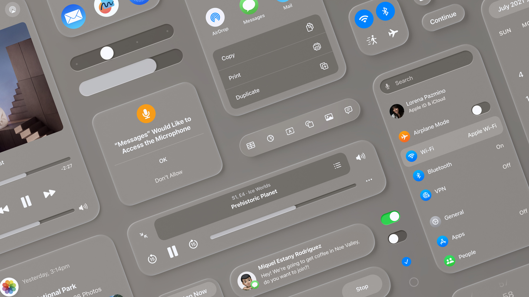
Looks like the Windows 10 start menu. Over-skinned with shadows and rounded rectangles.
Where is my attention and focus supposed to be in this mess?
Looks like the Windows 10 start menu. Over-skinned with shadows and rounded rectangles.
Where is my attention and focus supposed to be in this mess?
Yea that looks like some sort of boomerOS for a jitterbug smartphone.
Register on MacRumors! This sidebar will go away, and you'll see fewer ads.