I think the stock wallpaper was the worst choice apple could have chose as a marketing picture. The pink and circles in the back give it a "childish" appearance. Using a different wallpaper really changes it up and gives the icons a much better "pop".
Got a tip for us?
Let us know
Become a MacRumors Supporter for $50/year with no ads, ability to filter front page stories, and private forums.
So why exactly does a new 'flat' design have to mean girly pastel colors??
- Thread starter krashx7
- Start date
- Sort by reaction score
You are using an out of date browser. It may not display this or other websites correctly.
You should upgrade or use an alternative browser.
You should upgrade or use an alternative browser.
- Status
- Not open for further replies.
Actually, using "girly" to denote something's worth in a negative way, is the definition of misogynistic.
First of all, the OP wasn't commenting on the UI's "worth," he was using "girly" as an adjective to describe the UI's color palette. If you've ever been to the Barbie aisle at the toy store, you know that iOS 7's color palette is, indeed, reminiscent of the color palette favored by little girls.

"Misogynistic" means, "reflecting or exhibiting hatred, dislike, mistrust, or mistreatment of women." OP has an eight-year-old daughter. I doubt he hates her. And it's not misogynistic to wish that his smart phone interface wasn't colored like her toys.
First of all, the OP wasn't commenting on the UI's "worth," he was using "girly" as an adjective to describe the UI's color palette. If you've ever been to the Barbie aisle at the toy store, you know that iOS 7's color palette is, indeed, reminiscent of the color palette favored by little girls.
Image
"Misogynistic" means, "reflecting or exhibiting hatred, dislike, mistrust, or mistreatment of women." OP has an eight-year-old daughter. I doubt he hates her. And it's not misogynistic to wish that his smart phone interface wasn't colored like her toys.
Yes, because misogynists can't have daughters or wives. The whole first post was him calling the colors "ugly" which is a negative reference, and his use of "girly" as a pejorative in the title, screams "boo, I don't want this, because it's girly". Which is misogynistic.
Secondly, there is ZERO in iOS7 that's "girly" and this is from a woman who grew up on Barbie and Jem. The colors are saturated, which would be more akin to this:

They're saturated primary (secondary & tertiary) colors. Just like Lego. They're not pastel, they're not Barbie colored (which is generally pastel and hyper-saturated pinks).
Actually, using "girly" to denote something's worth in a negative way, is the definition of misogynistic.
Pay attention to what is being quoted before making your statement.
Grow up. Anyone who base their masculinity in the colors of their operating system should seriously reconsider their opinions.
Quoted for posterity and can you get the feck over your misogynist 50s views? It's embarrassing everyone here.
Springsteen didn't say anything misogynistic, and ErikGrim didn't say girly.
If men in the military can dance naked to Call Me Maybe, then yeah I can see them using this.
As someone who works in the military, and with many of the people developing military iOS apps I can guarantee you they could care less how it looks. They use all propriety apps that are locked down and built specifically for the task at hand. They only care about function and could care less what it looks like.
PS The number of times I've seen marines or sailors with bright pink hello kitties on the back of their cars you would realize that the military isn't as 'butch' as you would probably think.
Oh I know. I'm in the military. I know that very well.
It's funny you should mention Hello Kitty though, because the design looks just like it.


Yes, because misogynists can't have daughters or wives. The whole first post was him calling the colors "ugly" which is a negative reference, and his use of "girly" as a pejorative in the title, screams "boo, I don't want this, because it's girly". Which is misogynistic.
Well, obviously we perceived different things from OP's post. I understood him to say he doesn't like the iOS 7 color palette, not that he doesn't like women.
When I look at this:

I can see why someone might describe it as "girly." But I think it's possible to dislike those colors without disliking girls, and I do not think it follows that if you dislike those colors, you necessarily dislike them because they're "girly." Maybe you just don't like those colors.
Secondly, there is ZERO in iOS7 that's "girly" and this is from a woman who grew up on Barbie and Jem. The colors are saturated, which would be more akin to this:
Image
They're saturated primary (secondary & tertiary) colors. Just like Lego. They're not pastel, they're not Barbie colored (which is generally pastel and hyper-saturated pinks).
Well, some are, some aren't. The iTunes Store icon is "Barbie colored," if you ask me. Others, like Weather and Mail, aren't, though. Also, as I mentioned in another post, iOS 7 is a bit of a chameleon. Its appearance can be changed quite a bit just by changing the wallpaper.

Well, some are, some aren't. The iTunes Store icon is "Barbie colored," if you ask me.
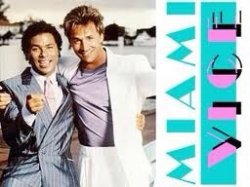
Funny. I see "girly" like this.

You are a sad sad person if things like icons that you can hide in a folder are bothering you to the point that you need to justify your whining on a forum every hour. Get a grip.
Interesting. I may like iOS 7 if I can understand it.
iOS and OS X are now being divorced. Which is the opposite of how they pitched OS X Mountain Lion when it came out.
OS X Mountain Lion makes your Mac more like your iPhone
iMessage on Mac. Many people have been asking for this, and finally were going to get it. The Messages app, which will appear very familiar to iOS users, replaces iChat. Itll let you start a conversation on a Mac and continue it on a different device, like your iPhone or iPad.
http://news.yahoo.com/blogs/technology-blog/os-x-mountain-lion-makes-mac-more-iphone-190456481.html
Straw man or not, it's true. How can you say iOS 7 makes iOS 6 look bad, and continue to humbly use OS X, which has design iOS 6 design cues?
It doesn't matter really, I just think it's hypocritical.
You speak as if I actually have a horse in this race. I haven't ever said that iOS 7 makes iOS 6 look bad myself. I just don't agree with your arguments.
OS X's "design cues" taken from iOS come primarily in the form of features: Notifications, Launchpad, Reminders, etc. And not even all of them work well on the desktop, IMO (especially Launchpad). Some new apps like iMessages and Reminders do use a common look to the iOS version though (although Messages on iOS copied the iChat look first), and those have been fixed in 10.9 (no more linen, no more skueomorphism).
So assuming I do like iOS 7 over iOS 6, I don't have any reason to ditch OS X for the same reason, and there is no hypocrisy. It's a bit like going up to someone who will drink grape and orange Fanta, but won't drink strawberry... and then calling them a hypocrite because it is still Fanta. Doesn't mean it tastes the same at all, even if their basic water/sugar content is identical. The flavoring, albeit a detail, is still kinda important.
These new icons look fine but the colors... Ugh they look like my 8 year old daughter colored them in coloring book or something.
Here's to hoping we get some different color schemes.
They actually come from the fashion kids and 20 years old wear. They want to appeal to them.
The back to school ad proves this: http://store.apple.com/us/browse/campaigns/back_to_school
Well if "flat is where it's at" then OS X is not flat enough. Not directed at you but.You speak as if I actually have a horse in this race. I haven't ever said that iOS 7 makes iOS 6 look bad myself. I just don't agree with your arguments.
OS X's "design cues" taken from iOS come primarily in the form of features: Notifications, Launchpad, Reminders, etc. And not even all of them work well on the desktop, IMO (especially Launchpad). Some new apps like iMessages and Reminders do use a common look to the iOS version though (although Messages on iOS copied the iChat look first), and those have been fixed in 10.9 (no more linen, no more skueomorphism).
So assuming I do like iOS 7 over iOS 6, I don't have any reason to ditch OS X for the same reason, and there is no hypocrisy. It's a bit like going up to someone who will drink grape and orange Fanta, but won't drink strawberry... and then calling them a hypocrite because it is still Fanta. Doesn't mean it tastes the same at all, even if their basic water/sugar content is identical. The flavoring, albeit a detail, is still kinda important.
They may not say it, but unintelligible design makes it to the bottom line. iOS 7 gets away with it because it's basically iOS 6 with less detail. That's all. We already know it works.As someone who works in the military, and with many of the people developing military iOS apps I can guarantee you they could care less how it looks. They use all propriety apps that are locked down and built specifically for the task at hand. They only care about function and could care less what it looks like.
PS The number of times I've seen marines or sailors with bright pink hello kitties on the back of their cars you would realize that the military isn't as 'butch' as you would probably think.
Everything is pretty much the same except they just erased the detail. Which I don't really care because less to look at. It's not that different.
Last edited:
There's a few color decisions I REALLY dig in iOS 7, but I mostly agree with you OP. The off-white & salmon red color scheme in the Music app and the gradient on its icon for example look killer. The matte green & blue hues in the Messages app chat bubbles are nice, too. The frosted translucent alerts are sweet as well.
Some of them though, like those icons for Reminders, Contacts & Notes... what the hell. Yuck. Doesn't give me much hope that they will be changed for the master release if they haven't already been by this point either. An inconsistently applied design vision is all I can call it.
Some of them though, like those icons for Reminders, Contacts & Notes... what the hell. Yuck. Doesn't give me much hope that they will be changed for the master release if they haven't already been by this point either. An inconsistently applied design vision is all I can call it.
Last edited:
I think the stock wallpaper was the worst choice apple could have chose as a marketing picture. The pink and circles in the back give it a "childish" appearance. Using a different wallpaper really changes it up and gives the icons a much better "pop".
The odd thing is that being cleaner it also allows the background image to be more vivid. iOS 6 I always ended up going back to black and white or dark backgrounds but with iOS 7 I'm finding Holiday landscape photos work really well behind the new icons.
You are a sad sad person if things like icons that you can hide in a folder are bothering you to the point that you need to justify your whining on a forum every hour. Get a grip.
What's sad is that some people get so offended if someone criticizes their favorite corporation that they result to insults.
IOS 7 just looks plain terrible, to everyone outside of the famous Apple fanboys that is. And boy are they losing their collective minds in defense of it.
What I'm confused by is why folks are really surprised at iOS 7's look when Jony Ive is also known for design like this:
http://en.wikipedia.org/wiki/File:IMac_G3_flavors.jpg
Or this. It's European!

Attachments

Nope. I like it. My gf likes it. Friends of mine like it. And we all like Apple but aren't really fanboys. The pastel background is a bit much imo but women are going to love it. And it's easy to change so I don't really see the problem. Its kind of unisex if you look at it. Starts at blue, goes to pink.IOS 7 just looks plain terrible, to everyone outside of the famous Apple fanboys that is.
. . . I like it. My gf likes it. Friends of mine like it . . .
Reminds me of John Candy in, "Planes, Trains and Automobiles"
You picked the wrong Android phone. Hope you love 3G forever.
$300, and the Nexus 5 coming out in 2 months for the same price. I mean, who wouldn't upgrade with that Spec to Price offer Google makes
These new icons look fine but the colors... Ugh they look like my 8 year old daughter colored them in coloring book or something.
Here's to hoping we get some different color schemes.
your daughter must be an artist!! is she taking lessons?
You mean OS X which pre-dates iOS and was the inspiration for iOS (not the other way around)? Not only is it a straw man, it isn't even true.
What I'm confused by is why folks are really surprised at iOS 7's look when Jony Ive is also known for design like this:
http://en.wikipedia.org/wiki/File:IMac_G3_flavors.jpg
and the same designers who brought us OS X's original look:
http://www.guidebookgallery.org/screenshots/macosx100
There was always the chance that concepts like what the original iMac and OS X used would make some sort of comeback. I'm just surprised they had to punt Forestall to the curb before it did.
Well, I would have expected that he had moved on since then. Maybe he's still in the 80s. Or thinks retro is cool enough to be mainstream.
.
Attachments


Do a youtube search for Gigglebellies Old McDonald had a farm. I posted it before, but they thought I was just trolling.
I'm telling you, the colour palette was identical. LOL
And some of their others too.
http://www.youtube.com/results?sear....10.10.0...0.0...1ac.1.11.youtube.wjInCnS5CGo
I'm telling you, the colour palette was identical. LOL
And some of their others too.
http://www.youtube.com/results?sear....10.10.0...0.0...1ac.1.11.youtube.wjInCnS5CGo
- Status
- Not open for further replies.
Register on MacRumors! This sidebar will go away, and you'll see fewer ads.