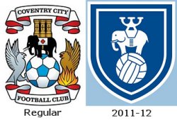
It manages to look modern and retro at the same time – simple and elegant. I've long thought that Liverpool should do something similar with the Liver bird – drop the cumbersome crest and accoutrements and just have said bird standing bold and proud on the red shirt. It'd look unquestionably ace.
I do like the Forest crest, and I think that the Liverpool crest could use an 'uncluttering'. I like the crest design itself, but a stripped-down version might look better on a shirt. Perhaps they could use the traditional crest on the home kit and a more contemporary version on their away/third kits. How common is it for a club to use more than one crest design simultaneously? Has that ever happened?


