Image
As someone who adores Apple Maps because he finds the accuracy the same between Google/Apple/Waze/Scout but the Apple UI leaps and bounds ahead...
I am woefully disappointed in Apple's literal interpretation of skewmorphism when it comes to apps that are naturally superior because of their skewmorphism. I don't need leather stitching on an address book, but I do need green signs on Maps, sorry. The disappointments:
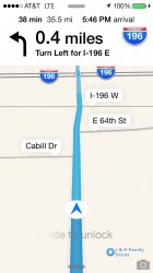
- Loss of drop shadow on the car arrow and road signs makes it harder to spot the necessities.
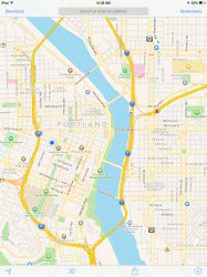
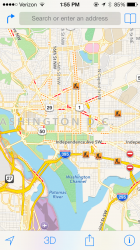
- Ugly white background on the whole display is garish and distracting.
- The thick white bar at the top removes 10% of the viewable area underneath.
The only thing Apple got right was the inclusion of ETA and total time, no longer do you need to tap and reveal a bar, but they took the magic out of the app completely. Apple had the best turn-by-turn UI and display and they blew it. This looks worse than Google Maps, unbelievable, so back to Google I go.
BJ


