Become a MacRumors Supporter for $50/year with no ads, ability to filter front page stories, and private forums.
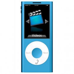
Here is my slight redesign of my version. I'll maybe make a more original one but I'm happy with this one at the moment.
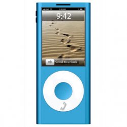
The one on the left is the redesigned one and the one on the right is just for comparison.

Nice, yes, you use my arrows... my arrows;). nice redesign.

And have you seen my signature???
 
okay i made a new mockup with the original ipod nano background it has, it looks a little like yours, but the colors on the word videos isn't good, i don't know how to do it proper with gimp :( make like a beautiful thing like you made behind your photos word under the icon. here it is:
iphonenanogreenvideosjuyz7.jpg

By Lorenz at 2007-07-29
 
Nice, yes, you use my arrows... my arrows;). nice redesign.

And have you seen my signature???

thanks!
Yeah your arrows:cool:
Your mock-up is nice, but the video icon looks a bit Microsoftish ad the font that apple uses is Myriad Pro, but I don't know if thats supplied in Gimp:(

Liking your signature;)
 
thanks!
Yeah your arrows:cool:
Your mock-up is nice, but the video icon looks a bit Microsoftish ad the font that apple uses is Myriad Pro, but I don't know if thats supplied in Gimp:(

Liking your signature;)
I know it uses myriad pro, haven't found yet on gimp, yeah yes it looks a little microsoftish, via iconfinder i found it... it's not great. and do you know how or if it is possible to make , like in your mockup, the background of the word photos, with gimp???
 
What do you mean "background of the word photos"? I don't understand...
This is a part of your latest mockup in this piece the background of the word photos, the colored thing behind the word photos, can you and how do you make that in gimp??
afbeelding1ce9.png
 
Uh, I really doubt that Apple would recycle one of their old nano designs. My guess is that it will be more similar to the current iPhone.
 
Where are you planning to put the phone? You know... the parts where you hear people speaking out of and where you speak into? The only appearance they've made is on the iPhone look-alike and that's just because it was already on there (since the iPhone is a phone).
 
Where are you planning to put the phone? You know... the parts where you hear people speaking out of and where you speak into? The only appearance they've made is on the iPhone look-alike and that's just because it was already on there (since the iPhone is a phone).

MMM...WRONG! look at the last post on page 4 of this thread.
 
This is a part of your latest mockup in this piece the background of the word photos, the colored thing behind the word photos, can you and how do you make that in gimp??
afbeelding1ce9.png

First what I did was make a rectangle then I made the top half darker then made black triangles to cut the edges of. Its quite simple.
 
MMM...WRONG! look at the last post on page 4 of this thread.

Okay, but do you think you'll actually be able to hear out of that thing? Better yet, do you think that the other person will be able to hear you through the clickwheel? Adding a slit on the top and buttons on the side aren't going to make it viable. The proportions of an iPod nano are not going to be able to support the hardware of a phone unless you double the thickness. You want flash memory, a phone, a clickwheel, the antenna, and the display to fit in that? The mockups look nice for the most part, but I don't think you could accomplish the feat within a price bracket that the intended age group could afford for the number of features it would possess.
 
Okay, but do you think you'll actually be able to hear out of that thing? Better yet, do you think that the other person will be able to hear you through the clickwheel? Adding a slit on the top and buttons on the side aren't going to make it viable. The proportions of an iPod nano are not going to be able to support the hardware of a phone unless you double the thickness. You want flash memory, a phone, a clickwheel, the antenna, and the display to fit in that? The mockups look nice for the most part, but I don't think you could accomplish the feat within a price bracket that the intended age group could afford for the number of features it would possess.

try not to focus so much on the details , we're only people that make the mockups for pleasure...
 
My version of the iPhone Nano

Touchpad is more advanced then ever, a OLED Screen Background displays certain options depending on the program/situation. For instance, in the phone option, the touchpad displays the numbers and call options while in iPod, it displays the familiar Menu, Fastforward, Rewind, and Play/Pause options.

Menu uses CoverFlow, allowing use of touchpad. Shortcuts can also be assigned to the navigation touchpad.

Since the nano does not feature a keyboard or keypad, it recognizes speech, allowing people to say what they want on their SMS instead of typing it. This feature will also work in many other applications such as Notes and SafariNano.

iphonenano1.PNG
iphonenano2.PNG


More pics later. I didn't have too much time to do these.

Love it! :D
 
tomorrow = new mockup, ... other people also make a new tomorrow please!!

Here are a couple of my new ones I'm waiting to see yours!:)
 

Attachments

  • iPhone-Final-2.jpg
    iPhone-Final-2.jpg
    27.3 KB · Views: 1,284
  • iPhone-Final-3.jpg
    iPhone-Final-3.jpg
    32.6 KB · Views: 1,289
Here are a couple of my new ones I'm waiting to see yours!:)

nice, but the left video icon is a little out order... :p mione are not so great cause of stupid Gimp :(( GIMP is not stupid, i was just frustrated), but i made a little place on the top too hear the people when you call.
iphonegreenvideostelicamo6.jpg

By Lorenz at 2007-07-30
 
nice, but the left video icon is a little out order... :p mione are not so great cause of stupid Gimp :(, but i made a little place on the top too hear the people when you call.

Yeah I guess you are right about the video icon now that you mention it!
GIMP isn't stupid, it round about the same capabilities as Photoshop, but its a little different. Some people actually prefer GIMP to Photoshop, I'm not one of them:D

I like your mockup it's much better than your last one, well done! Good Job!;)
it certainly not stupid, but i was a little bit frustrated about it. GIMP the same capabilities as photoshop?? really?? i always thought photoshop is much better. and has more features??
I also made a new mockup with a background... clouds and improved some things.`
iphonenanogreenbackgrouls8.jpg

By Lorenzz at 2007-07-30
 
Here is my improved Movie screenshot!

I like yours lofight, I like it a lot!! having a background+d gives it a nice feeling about it. I'll try that! (if you don't mind:p)
 

Attachments

  • iPhone-Final-2.jpg
    iPhone-Final-2.jpg
    25.8 KB · Views: 1,211
To be honest, there are some great mockups here and some crap ones.

A lot of these don't look Apple-like in their interface... the icons aren't Apple, the icon perspective isn't Apple, the arrows (much discussed) aren't Apple, and the clouds/backgrounds aren't Apple either.

I also don't really see the nano clickwheel, if OLED, showing words. Have you touched a nano lately? That is toooo small for words on there. I could see it lighting up and showing or hiding arrows, and the numbers, and other functions... but most likely if this design were to be recycled into a phone sans full touchscreen, the scrollwheel will simply be blank or the symbols will be less noticable.
 
Here is my improved Movie screenshot!

I like yours lofight, I like it a lot!! having a background+d gives it a nice feeling about it. I'll try that! (if you don't mind:p)

Thanks, your new one is very nice!! no i dont mind try it with background.

To be honest, there are some great mockups here and some crap ones.

A lot of these don't look Apple-like in their interface... the icons aren't Apple, the icon perspective isn't Apple, the arrows (much discussed) aren't Apple, and the clouds/backgrounds aren't Apple either.

I also don't really see the nano clickwheel, if OLED, showing words. Have you touched a nano lately? That is toooo small for words on there. I could see it lighting up and showing or hiding arrows, and the numbers, and other functions... but most likely if this design were to be recycled into a phone sans full touchscreen, the scrollwheel will simply be blank or the symbols will be less noticable.
Are some of my mockups good? and so you know we're not pro's ey, and who cares that the arrows or icons aren't apple like, we're not working for apple to make these mockups. I don't believe in Apple making oled clickwheels but will see (hopefully 07/08/07, see signature)
 
To be honest, there are some great mockups here and some crap ones.

A lot of these don't look Apple-like in their interface... the icons aren't Apple, the icon perspective isn't Apple, the arrows (much discussed) aren't Apple, and the clouds/backgrounds aren't Apple either.

I also don't really see the nano clickwheel, if OLED, showing words. Have you touched a nano lately? That is toooo small for words on there. I could see it lighting up and showing or hiding arrows, and the numbers, and other functions... but most likely if this design were to be recycled into a phone sans full touchscreen, the scrollwheel will simply be blank or the symbols will be less noticable.

We're just making these for fun, as Lofight says we don't work for apple and these will probably nothing like what the iPhone Nano prototypes are or are going to be...
 
A lot of these don't look Apple-like in their interface... the icons aren't Apple, the icon perspective isn't Apple, the arrows (much discussed) aren't Apple, and the clouds/backgrounds aren't Apple either.

Is this more Apple-orientated for you?
 

Attachments

  • iPhone-Final-1-EDIT.jpg
    iPhone-Final-1-EDIT.jpg
    27.8 KB · Views: 1,169
Is this more Apple-orientated for you?
Nice mockup! good said about that we only make theese for fun, and you can name me by my name , Lorenz, lofight sounds so stupid... looking forward too more mockups and tomorrow i'm gonna make a new one... you too??, :p
 
Register on MacRumors! This sidebar will go away, and you'll see fewer ads.