So this round, it is agreed that...
G9P is best Samsung panel
GH3 is best LG panel
G9P is best Samsung panel
GH3 is best LG panel
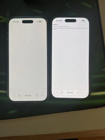
Is this your 17PM with GH3 screen? Looks perfect.You can be the judge of that. I just removed the screen protector as I was gonna replace it with a privacy one anyway and I feel it got brighter/as bright as my 13P’s G9N.
View attachment 2576412
View attachment 2576413
Not at all 😂So this round, it is agreed that...
G9P is best Samsung panel
GH3 is best LG panel

I can only encourage everyone to read the article above. It explains a lot concerning the different screen manufacturers and quality’s.Found this very interesting article in a German forum.

Apple Users Return and Exchange Good Phones Over a Dozen Times for "Samsung Screen"
Discover Which Prize Your iPhone Has Won! Come and Check Now!eu.36kr.com
Well, for one, do you have auto brightness on?My friends hello. I’m noticed this idk what is it. Iph 17 pro max. It’s not an hdr video it’s standard video. My screen gets a good brightness and than it dimming why? I dont know who can help? I haven’t seen this before. Why its get dimming? It’s can be software? I also can scroll my inst and its can be brightness up( not made photo or video) standard photo and video and than gets dimming. G9Q. I’m worrying really😕
I deliberately lowered the brightness of the video on the phone I was filming on so that it would be visible.
I can only encourage everyone to read the article above. It explains a lot concerning the different screen manufacturers and quality’s.
I don’t think so. I have the GVC and is perfect. No green tint at all. Ill be honest that i dont take sides, I don’t go chasing after a manufacturer. Both are equally good and bad.So this round, it is agreed that...
G9P is best Samsung panel
GH3 is best LG panel
Is this your 17PM with GH3 screen? Looks perfect.
Is it really? By whom?So this round, it is agreed that...
G9P is best Samsung panel
GH3 is best LG panel
No No No.. My J5V is the best. I can't be left out of this game!Is it really? By whom?
The G9Qs I have seen are better to be honest.So this round, it is agreed that...
G9P is best Samsung panel
GH3 is best LG panel
It’s undoubtedly the best… of the BOEsNo No No.. My J5V is the best. I can't be left out of this game!
Zoop! I honestly don't see any issues. I do notice that True Tone does change hues between my two phones (Air and 17P) side by side.It’s undoubtedly the best… of the BOEs
So true regarding Samsung panels and diamond pentile panels. I remember this discussion when Samsung introduced this also at the time. The article that the poster linked to was nothing more than hearsay. Personally I don’t buy into Samsung panel P or Q or N having any sort of grading attributes to them.One of the most serious technical errors in the article is the assumption that Samsung panels are “sharper” because they use a Diamond Pixel arrangement. At first glance this sounds plausible, but it reflects a fundamental misunderstanding between subpixel geometry and effective visual resolution.
The Diamond Pixel layout is a variant of the PenTile OLED matrix developed by Samsung Display for AMOLED panels.
Unlike a standard RGB stripe arrangement, where every logical pixel contains three subpixels (red, green, and blue) of equal size in linear order, a Diamond Pixel matrix uses:
-unequal subpixel sizes: green is smaller and more numerous, while red and blue are larger and less frequent
-a non-linear pattern: subpixels are arranged in a diamond shape, alternating the position of red and blue in successive rows
This layout was introduced for manufacturing and efficiency reasons, not to improve visual sharpness or color fidelity.
In other words, it is an engineering variation, not an optical enhancement.
In an RGB stripe display, every logical pixel is composed of three dedicated subpixels.
In a Diamond or PenTile layout, neighboring pixels share subpixels.
As a result, the total subpixel count is lower than in an RGB equivalent.
For example, an RGB matrix of 1170×2532 pixels would have roughly 8.88 million subpixels.
A Diamond Pixel panel of the same logical resolution has about 25–30% fewer physical subpixels.
From a physical standpoint, this means the color resolution is slightly reduced and must be compensated by software.
To avoid visible color fringing and jagged edges, the operating system performs subpixel rendering, adjusting how each subpixel contributes to the perceived color and edge definition.
In iOS, this process is specifically tuned to each panel’s subpixel geometry.
That means the text does not look sharper because of the Diamond Pixel layout; it looks normal because iOS compensates for the geometric irregularities.
Depending on font size, zoom level, and alignment, Diamond layouts can even produce color fringing if the rendering algorithm is not perfectly adjusted.
Apparent sharpness therefore varies with rendering conditions, not with the hardware itself.
Objective sharpness is measured by the Modulation Transfer Function (MTF), which describes a panel’s ability to reproduce contrast at different spatial frequencies.
When PenTile and RGB panels with the same nominal pixel density are measured, PenTile panels typically show a lower MTF, especially along diagonal and vertical edges, because the subpixels are not perfectly aligned.
Apple’s rendering pipeline smooths these edges intentionally to reduce aliasing, which in turn lowers edge contrast slightly.
From an optical standpoint, a Diamond Pixel panel does not deliver higher measurable sharpness. In many cases, it delivers less.
About panel uniformity and tint/hue,
I refer to the evidence from the cases presented in this thread and in previous years.
The True Tone lottery. It behaves differently with every single panel. The other day, while looking at an iPhone 13 GH3, I had to check twice to make sure Night Shift wasn’t on. Super aggressive. Without True Tone, the whites looked similar to those on my Air.Zoop! I honestly don't see any issues. I do notice that True Tone does change hues between my two phones (Air and 17P) side by side.
It’s a very poorly documented article that also does a disservice to Samsung panels by using as an example something that has always been considered a botched design in circles that discuss OLED panels. In this very forum there are dozens of threads talking about PenTile or, as Samsung perhaps calls it for marketing reasons, Diamond Pixel.So true regarding Samsung panels and diamond pentile panels. I remember this discussion when Samsung introduced this also at the time. The article that the poster linked to was nothing more than hearsay. Personally I don’t buy into Samsung panel P or Q or N having any sort of grading attributes to them.
What does this have to do with the iPhone panels?! You keep talking about the TV OLED technologies (WOLED vs QD-OLED), which has nothing to do with the iPhone panels whatsoever. Apples to oranges, literally.It’s a very poorly documented article that also does a disservice to Samsung panels by using as an example something that has always been considered a botched design in circles that discuss OLED panels. In this very forum there are dozens of threads talking about PenTile or, as Samsung perhaps calls it for marketing reasons, Diamond Pixel.
In any case, one thing must also be taken into account: user preferences. Ninety percent of the new participants in this thread judge a panel’s quality solely by whether or not it shows color shift when tilted. In the past, as in the thread I shared recently, people tended to prioritize uniformity and color tint when viewed head-on as the main criteria for evaluating an OLED panel’s quality.
I suppose times change, and so do users. I know what matters to me, and I’m not trying to convince anyone to think like I do—but I do like discussing the many other factors that affect the quality of an OLED panel.
Thats good to know because I thought I was losing it. Seems like BOE might be more aggressive than the G9Q in my Air. At least no dead pixels. That's always a bummer.The True Tone lottery. It behaves differently with every single panel. The other day, while looking at an iPhone 13 GH3, I had to check twice to make sure Night Shift wasn’t on. Super aggressive. Without True Tone, the whites looked similar to those on my Air.
TT cracks me up. Apple know the screen calibration, Apple know the temperature of the light entering the sensors, but they can’t calibrate it to make 2 screens next to each other look the same 🤣🤣Zoop! I honestly don't see any issues. I do notice that True Tone does change hues between my two phones (Air and 17P) side by side.
Air looks bad comparing to that 16 Pro. What’s even the point of upgrading from 16 pro to Air?I have a strange issue. Left is iPhone Air, right is 16 Pro. Both phones have GVC according to 3utools. But on Air white looks... a bit strange. Also Air gives me eyestrain and just a little bit dizziness. It didnt on 1-2 days, but since the 3rd day it does (now the 5th). Was thinking about selling my 16 Pro, but now i'm on a fence