It's OSX 10.9 Cats in a bag.
Once the cats are all dead they can move to X11.
OSX 10.9 Schroedinger maybe...
It's OSX 10.9 Cats in a bag.
Once the cats are all dead they can move to X11.
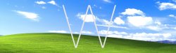
Perhaps the wave signifies a clean start.
OS 10.9 "Schrödinger's Cat"
Is it dead or alive?
I like this idea too but I don't think the next version would be "Y" since the X was a Roman numeral. I think it's more likely to be X1.
Perhaps the wave signifies a clean start.
Launchpad is just that, an app launcher, a superficial thing. There are more profound and fundamental differences between iOS and OS X that will keep them separate for a long time, if not indefinitely.
Launchpad is completely optional on the Mac - it is not an essential feature, just another alternative for launching applications. I have used it once to check it out but never since that one time. Windows 8, on the other hand, forces this touchscreen-optimised Start screen on every user.
Not really. As 10.4.10 was not the same as 10.4.1 In this numbering scheme .10 is not the same as .1

It's not a decimal, it's a version number. It's a like a phone number...I hope you wouldn't claim that 555.2000 is "really" 555.2.
--Eric
No. The "." in 10.10 is not a decimal point. It is a separator between two numbers.
I don't think that it's that important that "X" was meant to be a Roman numeral. It has become a brand on its own, regardless what it once stood for. It makes sense from many perspectives to go with the letter as the name.
You guys both missed the point.
Everyone in this thread is actually wrong. The billboard is clearly hinting at Apple's much rumoured new product line:
Image

Maybe it's a tidal wave about to wash OSX under and and only iOS will remain?
COME ON guys... it's EASY. the WAVE is an indication of ios (ios had always some kind of aquatic background. Even from the start with the nemo fish.). and steve said "bring it all back to the Mac. well, now their doing it!
the wallpaper is an indication of iOS taking Over the mac. that was easy to figure out...
It would be called Liger
OSX's full name is "Mac OS X"