Got a tip for us?
Let us know
Become a MacRumors Supporter for $50/year with no ads, ability to filter front page stories, and private forums.
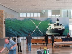
Wave-Themed OS X Banner Goes Up at Moscone West for WWDC 2013
- Thread starter MacRumors
- Start date
- Sort by reaction score
You are using an out of date browser. It may not display this or other websites correctly.
You should upgrade or use an alternative browser.
You should upgrade or use an alternative browser.
Magical.
no,no it's not a thinner X, it's a concentration of all that is good in X in a smaller package...
I can hear him saying that in his British Accent

"I hope 10.9 is our last OS X release and the last ****ing cat product we ship. I really want to name OS 11 releases after dinosaurs."
~Jony Ive
~Jony Ive
OS X "Lion Fish"?what does the wave mean? Nothing like a big cat
Evolution of the X's
I quickly photoshopped the evolution of the X's: from thin over thick to ultrathin.

I quickly photoshopped the evolution of the X's: from thin over thick to ultrathin.
Ok everyone, we've got new buzzwords for the week: HELVETICA NEUE ULTRA LIGHT! Let's all post it in every comment we make.
Do not try and make the X thinner, that is impossible, instead try to see the truth.
What truth?
There is no X.
There is no X?
Then you will see it is not the X that is thinner, it is only yourself.
If only;
What truth?
There is no X.
There is no X?
Then you will see it is not the X that is thinner, it is only yourself.
If only;
That's interesting. It's almost a throw back to the first release with a thinner font, but also breaks away from the "cat/German tank" naming scheme. Hmmm. Nice work.
Then again, "space" was a theme for 10.4, the "aurora" was a main focus for the "Leopard" releases, only 10.2, 10.7 and 10.8 seemed to emphasize the names in the logo.

Brilliant
Wonder if someone at Apple will print that out and pin it on Jony's office door?
Absolutely agree, and I question the 'designers' who find this visually pleasing.
Regardless, I am happy to see a common theme among these pictures that suggests a visual redesign of iOS and OSX at the hands of Jony I've. It can potentially be good.
.
You don't need the ' ' around designers, it is visually pleasing, this was designed with J.I's guidance - who is one of the world's leading designers. So it's not just us - It's far better than past years banners for sure. Elegant, minimal and beautiful.

OS X will be washed away by that wave and OS XI will be announced!!
Given that Apple does not like Java, and killed Rosetta, that might require CPUs with both x86 and ARM cores first (before going full ARM).
Register on MacRumors! This sidebar will go away, and you'll see fewer ads.