Become a MacRumors Supporter for $50/year with no ads, ability to filter front page stories, and private forums.
A basic file repository like they ALREADY DO with photos is much simpler than the convoluted sandbox system in place now. If your saying that adding an attachment when replying to an existing email is too complicated, then ios is truely for grandmothers only.

Even with this, iOS still feels like grandmother OS for me. I really wish there is a centralized place for us to store all downloaded files, attachments etc.

By the way, Apple could probably never do a file repository, it just against their ideology. I am going to keep my jailbreak as long as I could for iFiles

Ideologies are always bad news, they take one mans beliefs and force them on others, making people unyielding and stubborn to change. It's the sort of thing that topples companies. The computing world is different now from when Steve was around.

He invisioned Apple devices as social tools connecting our lives, but today they are used more and more for productivity and business use as well. I think Tim does get this and iOS 8 a file system may come around of some description hence this new way of managing photos via Siri. Apple does need to catch on fast though as they are pushing hard in to foreign markets but ignore the potential revenue stream in just their own country from the professional sector.

Hope they get this going as it is just such an easy thing to do. Turn photo album in to iFolder, put a tab in there for documents and give it the same swipe delete/more functions like an email except now you can send, save, attach,upload,edit and open with.

Then also build quick search in to spotlight, with the iPad's extra display space allowing for live preview right within spotlight search.
 
I was comparing the sandbox system to a fully accessible filesystem. Something like an expanded version of what Apple does with the photos, as in placing different types of commonly accessible files into "silos", would be a nice middle ground.

I agree wholeheartedly.
 
Well, an adult color PALLET would contain less pastels conveying a more serious tone. A color pallet for a children typically would convey a more whimsical feel. Although that is only one reason people hate ios7.

In 7.1, theres an option to darken colours.

----------

A more consistent UI in terms of design.

One thing I don't get is that iOS 7 brought out a lot more consistency in design the 6, then people go and say the iOS 7 is inconsistent. What?
 
Well, an adult color PALLET would contain less pastels conveying a more serious tone. A color pallet for a children typically would convey a more whimsical feel. Although that is only one reason people hate ios7.

Actually, adults spell the word "palette".

Now, it's not very fair for me to pin you like that, is it? I think you'd agree with me when I say that your maturity isn't defined by your incorrect spelling of one word. Neither is iOS defined as "adult" or "childish" based on what colors are used throughout the OS. A quick look at my home screen reveals that color-wise, Apple's icons fit right in with third-party apps. And much of the OS is actually pretty bland in comparison to the pinstripes and shadows that provided depth in previous versions of iOS.

iOS has never been for adults, nor is it now for children. It's for everybody, despite some people's perception that certain color combinations appear "childish".
 
The only inconsistency to me is the home screen.

Thry brought in paralax effect to show off wallpapers then hide it behind horrible docks frosted or solid... And solid folder backgrounds.

That needs to go, no dock effect or a clear one.

Stop ruining wallpapers !
 
Actually, adults spell the word "palette".

Now, it's not very fair for me to pin you like that, is it? I think you'd agree with me when I say that your maturity isn't defined by your incorrect spelling of one word. Neither is iOS defined as "adult" or "childish" based on what colors are used throughout the OS. A quick look at my home screen reveals that color-wise, Apple's icons fit right in with third-party apps. And much of the OS is actually pretty bland in comparison to the pinstripes and shadows that provided depth in previous versions of iOS.

iOS has never been for adults, nor is it now for children. It's for everybody, despite some people's perception that certain color combinations appear "childish".

Why would you assume I'm trying to pin anyone? Just because the color palette is childish, doesn't mean you, or anyone who likes it, is childish. It just means the palette is childish. The colors would be more likely found in a kindergarden classroom then a boardroom. Not that they can't be used in a boardroom, or that the person who uses them in a boardroom is childish. Get it?
 
Why would you assume I'm trying to pin anyone? Just because the color palette is childish, doesn't mean you, or anyone who likes it, is childish. It just means the palette is childish. The colors would be more likely found in a kindergarden classroom then a boardroom. Not that they can't be used in a boardroom, or that the person who uses them in a boardroom is childish. Get it?

I think the whole idea was to make it a bit "Childish". You equate childhood with fun in most instances right? I think their idea was that iOS 7 was meant to be an enjoyable experience. They wanted users to see the colors and feel happy. It wasn't an all bad idea they just didn't give another option like they should have. I think both a light and dark version of this iOS would please both sides of the spectrum. What do you think?
 
Because it was more pleasing to the eyes, somewhat a professional look, iOS 7 looks cartoonish.

That's personal opinion, mine being the opposite with old iOS looking rather childish and tacky with things trying to appear like real items... i.e green felt and stitching. In contrast I find iOS 7 refreshing, bright a colourful, and find people who compare it to child like for not being dark and drab or that it looks like Android quite shocking. being around android devices I see far more similarity between old iOS and their design choices, the only likeness being that they can display bright and saturated colours.
 
I think the whole idea was to make it a bit "Childish". You equate childhood with fun in most instances right? I think their idea was that iOS 7 was meant to be an enjoyable experience. They wanted users to see the colors and feel happy. It wasn't an all bad idea they just didn't give another option like they should have. I think both a light and dark version of this iOS would please both sides of the spectrum. What do you think?

That would be a start. Add clear "buttons" so people know where to click, drop shadows or outlines to the info bar at the top so the time and battery is easier to read if you have a background that has light and dark elements, fix the calendar and add vertical lines to the month view, make location reminders work without having to have the reminders app on in the background, bring back the separate search field in Safari and the .com button to streamline web browsing (after the hundredth time I searched google for something that should have gotten me straight to the page, it really started to get annoying, especially since the .com button is gone.). But all these things and more should be fixed in ios7. Ios8 should be for some new features, not fixes.
 
That's personal opinion, mine being the opposite with old iOS looking rather childish and tacky with things trying to appear like real items... i.e green felt and stitching. In contrast I find iOS 7 refreshing, bright a colourful, and find people who compare it to child like for not being dark and drab or that it looks like Android quite shocking. being around android devices I see far more similarity between old iOS and their design choices, the only likeness being that they can display bright and saturated colours.

Yes, our opinions vary, I would love the functionality of iOS 7 with the iOS) looks.
 
ability to time schedule geo-tagged reminders

'Remind me if I'm passing X between 9am and 5pm Mon to Fri'

rather than the current:

'remind me when I'm passing X no matter what time or day it is'
 
ability to time schedule geo-tagged reminders

'Remind me if I'm passing X between 9am and 5pm Mon to Fri'

rather than the current:

'remind me when I'm passing X no matter what time or day it is'

I find location reminders very hit and miss to work.
 
It would like to see a better Do Not Disturb function. I want to tie it to my calendar events so that my phone is always on DND when I'm in a meeting (that option is already there in Calendar, but it doesn't do anything). Also a quicker way to switch between apps. The home screen should be easier to manage, the drag and drop is so clunky.
 
this
 

Attachments

  • screen_shot_2013-09-25_at_13.20.42_0.png
    screen_shot_2013-09-25_at_13.20.42_0.png
    422.5 KB · Views: 193
iOS would change the hardware and physical appearance of the phone? :confused:

yup! it will be a very sophisticated OS. :D

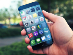
The colors and icons on that concept are very nice. I would love to have them. I would love that phone also.
 
Register on MacRumors! This sidebar will go away, and you'll see fewer ads.