Become a MacRumors Supporter for $50/year with no ads, ability to filter front page stories, and private forums.
iTunes Radio

I was excited for this and dumped Pandora a few weeks in anticipation.
But, it is not even close to being a polished app.

Keeps playing the same songs, even ones I've marked not to play again.
It keeps freezing/lagging.
Doesn't work well at all times. At first thought it was my internet connection, but I went back to Pandora and it works perfectly fine.

I just feel like this was a rushed product.

Not having spent a lot of time with Pandora, it's difficult for me to draw any comparisons; however I have had one occasion where iRadio played a song that I had just recently marked as "never play again". ALso, some of these "stations" have names that as far as I can tell have no real relation to the songs played on he station.

----------

I'm glad I found this discussion here. I thought I was losing my mind and not tapping right. I really hate these delays! It happens in most apps too.

Just tested it a second ago, and you can definately active apps while the animations is still in process. Not sure it it has been like this since the 18th or was changed in the recent updated.
 
The overall impression is satisfactory (let's say a B) on my iPhone 5; however, the following items are starting to annoy me:

1. There's too much white and brightness, even when the brightness slider is set nearly to the left.
2. When sending or receiving text messages, the white font is too thin and the bubble color is electric green. I wish I had an option to choose a more opaque color.
3. There is a slight keyboard delay when flipping the phone from vertical to horizontal.
4. Maybe I'm becoming deaf, but I find the new ringtones to be low. Not extremely, but hard to listen to them when I'm outdoors.
5. I wish AirDrop would be able to sync with my Mac.

Cheers from Argentina!

I thought i was becoming deaf as welL!!! I swear no matter how loud i have one of the new tones I can barely hear it. I miss a lot more msgs now because of this. Nothing major, but it strikes me as odd that the tones are so quiet.
 
This is my first iPhone (iPhone 5) and I am very satisfied by iOS except for mails management. There is no push for Gmail and I can't correctly sync Gmail with iCloud (so to send and receive using iCloud through Gmail servers, so I can keep a copy of all activities in both mail boxes and have push notifications for what's happening on Gmail through iCloud), and if you install the Gmail app you can't change the default mail app on the iPhone! I wonder if this is apple or google's fault. :mad:
 
I still find the contrast between the sparse, stark, whitewashed look of the core apps and the eye-rapingly neon colours of the core app icons bizarre.
 
This is my first iPhone (iPhone 5) and I am very satisfied by iOS except for mails management. There is no push for Gmail and I can't correctly sync Gmail with iCloud (so to send and receive using iCloud through Gmail servers, so I can keep a copy of all activities in both mail boxes and have push notifications for what's happening on Gmail through iCloud), and if you install the Gmail app you can't change the default mail app on the iPhone! I wonder if this is apple or google's fault. :mad:

I get push notifications for my gmail but i set it up using "exchange" and for the server name I used m.google.com.
 
Enjoying iOS 7 for the most part, but Calendar took a turn for the worse. What a mess! :(. This is the most miserable change in iOS 7 that I've found so far.
 
Last edited:
I do not like the fact that it drags everyone down to Apple's newly set bar. It is an example of what I'm calling "accessible design"- design purposefully made stupid so that everyone can replicate it.

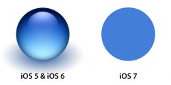
Since everyone likes pictures, I'll let the graphics do the talking.

The blue orb on the left is from a set of Aqua inspired orbs that I personally designed in 10 different colours at varying sizes. I literally spent days perfecting the look and colours (around 4 days in total), and I've been using them in all my application user interfaces ever since.

I recently redesigned these orbs for iOS 7, which you can clearly see on the right. I drew a circle in Photoshop and it took 5 seconds.

So it no longer matters how much time or effort I want to invest into my application user interfaces. If I want to fit in with the rest of the iOS 7 user interface, I have no choice as a developer but to adopt Apple's lowered standards.

PS: I am fully aware I can be "defiant" and design my entire application user interface(s) from scratch, and theme every single little widget. That is precisely what I'm doing, and so are a lot of other heavyweight players who make a living off producing quality products that really make the Retina displays shine.

-SC
 

Attachments

  • orb_transition.jpg
    orb_transition.jpg
    30.8 KB · Views: 315
PS: I am fully aware I can be "defiant" and design my entire application user interface(s) from scratch, and theme every single little widget. That is precisely what I'm doing, and so are a lot of other heavyweight players who make a living off producing quality products that really make the Retina displays shine.

-SC

I'm not a developer and don't know how much control Apple has over developers so please excuse my question, I just want to make sure I understand.

Are you saying that apple at this time is not requiring you use the image on the right? I hope that's correct because I much prefer the nicer looking image (Orb) on the left.

If I'm correct in my assumption then if developers, like yourself, refuse to change to the new flatter design then hopefully that will send a powerful message to Apple.

Jon...
 
I get push notifications for my gmail but i set it up using "exchange" and for the server name I used m.google.com.

The exchange method doesn't work on new devices since january 2013 (google dropped exchange sync), there is a whole thread about how to circumvent the lack of gmail push. None of the proposed solutions is satisfying (iCloud is not reliable, Outlook keeps adding hotmail_...@live.com to all emails with gmail sender address).

So I ended up accepting the lack of push, which I think is shocking since that's the main use I have of a smartphone. If it weren't for my MacBook air that I want synced with my mobile devices (specially iTunes) I would have changed to Android (since my gmail account is my user account in an infinite number of places I don't want to change my main email adress). :mad:
 
I'm not a developer and don't know how much control Apple has over developers so please excuse my question, I just want to make sure I understand.

Are you saying that apple at this time is not requiring you use the image on the right? I hope that's correct because I much prefer the nicer looking image (Orb) on the left.

If I'm correct in my assumption then if developers, like yourself, refuse to change to the new flatter design then hopefully that will send a powerful message to Apple.

Jon...

Apple does not require you to use the image on the right.

However, this leaves us developers in a tough spot. Non-flat UI widgets and graphics (such as the orb on the left) do NOT mesh in with the widgets that Apple provides as-is on iOS 7.

Which leaves the majority of us with a choice:

A) Embrace the iOS 7 design, and re-do all your graphics in the style of the orb on the right (I don't like this because I feel like I'm throwing out 5 years of my life spent investing time and effort into my own skill set)

B) Don't use Apple's code. Roll your own UI widgets from scratch. Implement everything yourself, skin ALL the user interface elements. Do it all by yourself.

This essentially boils down to:

A) Make apps that are literally cheaper and easier to make

B) Make apps that are literally more expensive and harder to make

Myself and many others have opted for plan B. We're doing that because we love to do what we do, and we love making great apps. Unfortunately, what I'm worried about is the 90% who go with plan A, and because of this the quality of the iOS ecosystem as a whole will be degraded.

-SC
 
I do not like the fact that it drags everyone down to Apple's newly set bar. It is an example of what I'm calling "accessible design"- design purposefully made stupid so that everyone can replicate it.

Since everyone likes pictures, I'll let the graphics do the talking.

The blue orb on the left is from a set of Aqua inspired orbs that I personally designed in 10 different colours at varying sizes. I literally spent days perfecting the look and colours (around 4 days in total), and I've been using them in all my application user interfaces ever since.

I recently redesigned these orbs for iOS 7, which you can clearly see on the right. I drew a circle in Photoshop and it took 5 seconds.

So it no longer matters how much time or effort I want to invest into my application user interfaces. If I want to fit in with the rest of the iOS 7 user interface, I have no choice as a developer but to adopt Apple's lowered standards.

PS: I am fully aware I can be "defiant" and design my entire application user interface(s) from scratch, and theme every single little widget. That is precisely what I'm doing, and so are a lot of other heavyweight players who make a living off producing quality products that really make the Retina displays shine.

-SC

I call shenanigans on your entire premise, because the left hand image looks more iOS7.

I'm not a developer and don't know how much control Apple has over developers so please excuse my question, I just want to make sure I understand.

Are you saying that apple at this time is not requiring you use the image on the right? I hope that's correct because I much prefer the nicer looking image (Orb) on the left.

If I'm correct in my assumption then if developers, like yourself, refuse to change to the new flatter design then hopefully that will send a powerful message to Apple.

Jon...
Apple does prefer his example on the left.

yjudesy4.jpg
 
Reduced functionality: storing all my mail on the device instead of syncing X messages, for no apparent reason, and without a way to turn this off.

I've posted this into 2 other threads already, do some research:

Settings > Mail, Contacts, Calendars > Accounts

Select the email-account associated with the large amount of "new" e-mails.

At the bottom it should say: Mail Days to Sync

Set it too 3 days.
 
ScottishCaptain,

Thanks for the detailed reply. I completely agree that you should make the apps look they way 'you' want them to look. In the end the consumers who buy the products will be the final judges and drive the market direction. And from the reviews I've read in the app store folks are not shy about voicing their opinions. So you will know pretty quickly if they do not like the visuals.

My apologies to the forum for getting off topic but I was curious and posted my question here in case anyone else was also wondering how much control Apple had regarding the appearance of apps.

Back on topic....

I'm starting to get used to the visual changes in iOS 7 on my iPad. But with all the complaints about it on the iPhone, as tempting as it is to try it, I'm still hesitant to update to iOS 7 at this time since I rely on it for my job.

Jon...
 
The piss poor battery life, I like iOS 7 but the battery life is beyond awful. Would go back to iOS 6 just for this very reason if I could.
 
The piss poor battery life, I like iOS 7 but the battery life is beyond awful. Would go back to iOS 6 just for this very reason if I could.

Same here. I have a few issues here and there with iOS7 but none of them come anywhere near the battery life issue. It is the no.1 reason I would go back to iOS6 in a heartbeat.
 
Too much white.

Agreed. A big example of this is Clock in timer mode, there are no indicators as to where the gadgets to change the time end. Of course the answer is that you HAVE to put your finger on the numbers, but in iOS 6 you could put your finger beside the numbers so that you could still see the numbers while you change them. In fact, you could put your finger all the way to the edge of the VISIBLE roller. Little is visible in iOS 7.

Apps like Clock, Calendar, and Notes just look bland. Overall, iOS 6 looked much better to me.

Also, I have a problem bringing up Control Center. While Notification Center comes up almost too easily, it usually take a few tries to get Control Center to come up. It seems that you have to swipe up at just the right speed. Too slow or too fast and it doesn't show.
 
The little things that are clearly wrong. Overlapping buttons, inconsistent text. It isn't a problem while using it, I just don't like it. They're all minor issues that should have been sorted out in a longer beta period.
 
i liked the old calendar better

also, i used to just have the 50 most recent emails for every email account i have on the phone but now that option isnt there anymore so i have all my emails
 
I don't know if this has been previously mentioned or not, but the 3 icons at the bottom on the Facetime app in landscape mode are ridiculously LARGE! So much so, that it blocks 1/3 of the screen!
That is just unacceptable and should be changed. Is it for blind people or what? And the RED "END" icon is so distracting!
What were they thinking?
 
Please Apple just give us an option to turn off all animations and allow us to click on things when they are seen on the screen BEFORE the animation stops motion.

Thanks!

I don't really care too much about the look of the graphics, but I do agree that it's a step in the wrong direction. I'm no graphics designer by any means, but I can easily make most of these icons in Photoshop.

First Apple Maps and now this!

----------

i liked the old calendar better

X2 - I am having a very hard time scanning my upcoming weeks to see what events I have. I only use it to schedule major events like Dr. appointments, concerts, trips, birthdays, etc, so now it's 100x more tedious to do a quick scan to tell a friend I can do dinner on a certain day.

Yeah, you can click on the magnifying glass, but having the numbers of the month doesn't help me visualize the big picture. I have to then go back and memorize when you had a particular event scheduled and then look at the month view with the gray dots. This is way worse than my old blackberry from 2008!
 
Register on MacRumors! This sidebar will go away, and you'll see fewer ads.