Become a MacRumors Supporter for $50/year with no ads, ability to filter front page stories, and private forums.
Battery life on my 4.
It totally stinks after upgrading to IOS7.
It also takes a ridiculously long amount of time to charge now!

I did a hard reset and re-install but battery life is still pathetic.
Planned obsolescence in a software update?

After a hard reset, my battery life is good (maybe better that IOS6), but my phone will only be a 95% after charging ALL NIGHT.
 
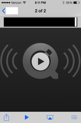
It's incomplete. Lots of little bugs, inconsistencies. It should have been in beta for a while longer. See the example attached.

I sent my friend an audio file from Messages on my iMac. I opened it up on my iPhone 4S to see what it looks like. Terrible is the answer.
The time indicator bar (wide black bar with the white on the right) looks out of place, the indicator itself isn't centered on anything. It looks a few pixels too high. The QT background looks like iOS6 as well.

It's a lot of little things like that. Functionality is great. The look isn't finished.
 

Attachments

  • IMG_1522.PNG
    IMG_1522.PNG
    117.8 KB · Views: 96
I love iOS7 honestly, aside from the few bugs here and there. My main disappointment is the colour schemes. It reminds me of some sort of pixie land.
 
Lmao@ no need for flashlight app.
Agree with you Jon about the whiteness.
Notepad App is one of the apps that I can't stomach. Luckily AwesomeNote just did an iOS7 update and I'll be using that as my go to notepad.
I also keep the brightness way down most of the time, otherwise I feel like the White is burning through my retina.

Thanks for mentioning Awesome Note. I used the old calendar app for personal use only, and the notes app a lot. Awesome note is a very decent substitute for both, and it's now on my dock. It's a bit quirky, and not as simple as I'd like, but once you learn its idiosyncrasies, using it can be pretty efficient.
 
•I don't like that my text messages were no longer going through.
•I don't like calls going straight to voicemail 10% of the time and not hearing the phone ring.
•I Don't like having to hard reset my iPhone because someone didn't write the code properly.
• I don't like that it reminds me of an Android iOS, and almost looks like they were trying to copy that look.
• I don't like the fact that when I'm driving and I hit the forward button on the Music app on the lock screen, that I sometimes have to tap it 3 or more times to get it to change songs.
 
Lag and no smoothness. It's a bit ridiculous that when you double tap on the home button and scroll through apps, it's as choppy as the ocean when a hurricane is coming in. Really this need to be fixed.
 
Ios7 is blocking a lot of non apple charging cables. Sucks.

The percentage is going down as I am using the phone with the cable plugged and the lightening symbol next to the battery.
 
Last edited:
I got a 5s and am very, very glad that I didn't give in to my curiosity and update my iPad 2 and 4s which I'm keeping as an iPod. The only thing I've been surprised by not being bothered by is the brightness which everyone has been mentioning as I've found the automatic brightness adjuster to actually work and consistently so for the first time on an iOS device. I find the fonts and color palette completely hideous and really wish there were alternate apps available which could fully sync acoss all devices and my Macs. Most of all I'd love to be able to replace both the Mail app and the actual Phone app which I'm finding to be the two ugliest 'upgrades' and, unfortunately, the apps I need to use most frequently on my phone. I agree that many of the new design elements lack anything resembling intuitiveness. I was considering upgrading to the new iPad when it drops, but have decided now that I'll go for a MacBook Air -- unless Mavericks looks and works like iOS 7, too.
 
One thing I don't see mentioned on this thread, which is my MAJOR problem with iOS 7, is that the Camera Roll always freezes if I try to scroll through more than six or seven photos. I have to kill it from the app switcher before I can use it again. This happens almost every time I use it.

Does this really not happen to anyone else?
 
Yesterday while on the road I had to map a route first time using iOS7.
In the compose field white text on a light grey background? REALLY? I mean REALLY??? it's hard enough to see inside but outside in sunlight it's next to impossible. What the heck were they thinking???:mad::eek::mad::eek:
 
They made things worse on many parts of iOS. Fixing them back to how things were is not considered making improvements.

I want the time and battery life shown on top on safari in landscape view all the time.

What you want may be different than what Apple has planned. Either go with the flow or look elsewhere. It's simple.

----------

One thing I don't see mentioned on this thread, which is my MAJOR problem with iOS 7, is that the Camera Roll always freezes if I try to scroll through more than six or seven photos. I have to kill it from the app switcher before I can use it again. This happens almost every time I use it.

Does this really not happen to anyone else?

I've experienced it, but it's too early in Apple's development cycle to expect it to be trouble free. Once you get used to how Apple does things you'll understand.
 
iOS 7 keyboard shift key color & capitals / upper & lower case typing issue.

Hi,

Colour is a big part of Ease of Use on the iPhone.

Wondering why the blue colour shift lock key on the pop up keyboard has been replaced with grey colour changes when in other apps like, Maps, Mail, Phone, Calculator, Clock, Photos, Camera, ....(almost all native apps) use colour to highlight certain functions?

The removal of the blue colour when activating upper case typing has now slowed my overall typing down, both in landscape & portrait modes, making me less efficient at work & at home.

The reason for this is that I use both thumbs for typing in landscape & I use both right & left thumbs for typing in portrait. While typing, my left hand is usually hovering over that area of the keyboard in both modes where the shift key is located.

In previous iOS I could easily & quickly identify with my peripheral vision if the shift button was on, (be it locked or not) without consciously looking at it because my brain made a subconscious note of the colour blue in the bottom left hand corner.

Now I have to pause, move my hand/thumb aside and concentrate (albeit for a split second) to check that the shift button is on. This is happening almost every Paragraph & most sentences that I type.

I also type an upper case letter or two and have to continuously backtrack to correct it on most occasions. This simple omission/change has slowed me right down, waisting my precious time & to a lesser extent, energy.

Like all upgrades, I give myself several weeks to see if I'll acclimatise to the new changes, and 99% of the time I do. This time however my brain can not adjust & I'm not getting any faster with out the colour shift key.

If Johnny Ives & the Apple Engineers could bring themselves to surreptitiously put back the colour into the shift key function, I would have no thoughts about considering Samsung & would be a satisfied Apple Fan again.

I would be very surprised if I'm the only customer who has noticed this change.

A suggestion for consideration for the Apple Design Engineers, if not change the keyboard to upper case as suggested by others in this thread, then at the very least put the colour back into the shift key and maybe a small shift key (color) icon on the high side of the iPhone & iPad screen so we don't have to make a conscious note when we're typing. Our eyes would be able to clearly see that the shift key is on & adjust subconsciously with out slowing us down.

Yours sincerely,

Apple Customer :(:confused:
 
They removed the .COM key(s) on the keyboard for quick access of auto complete URL's :(

Now i have do type 3 dang characters :p plus a period.

oh yeah, and the fade out/fade in of "everything"

I dunno what drives me nuts more.
 
Two things that drive me nuts. When i go to use an app to send a picture i just took, it brings up photos but starts me at the top of the "collections" not the most recent. Second is when i swipe up for the alarm, it goes straight to the Timer, not the alarm. I mean, i hate to bitch about something so small, but you asked!
 
The zooming when opening/closing a app. I know its crazy and I've never had the problem before but I'm one of the few that gets the dizziness from the effect :eek:. Hopefully they can enable a option to disable it, it's the only thing preventing me from upgrading.
 
They removed the .COM key(s) on the keyboard for quick access of auto complete URL's :(

Now i have do type 3 dang characters :p plus a period.
They didnt remove it....press and hold the "." key and you get a number of url endings including .com
 
for those who hate it, why not try something else ?

Im not saying that to be a dick, the only way companies learn is when they lose customers. I myself went to a Nexus 4 since i wanted a bigger screen.

I use ios7 on my ipad and its a little funky but i dont mind it. I could do without some of the icons which are hideous and I think the usability aspects have taken a knock in the the name of 'coolness', but on the whole its not too bad.
 
It's incomplete. Lots of little bugs, inconsistencies. It should have been in beta for a while longer. See the example attached.

I sent my friend an audio file from Messages on my iMac. I opened it up on my iPhone 4S to see what it looks like. Terrible is the answer.
The time indicator bar (wide black bar with the white on the right) looks out of place, the indicator itself isn't centered on anything. It looks a few pixels too high. The QT background looks like iOS6 as well.

It's a lot of little things like that. Functionality is great. The look isn't finished.

Actually,

Apple should open up the beta to a wide audience. Obviously the current test group is neither big enough or diverse enough.

----------

I love iOS7 honestly, aside from the few bugs here and there. My main disappointment is the colour schemes. It reminds me of some sort of pixie land.

I'm sorry do you love it or hate it...cause your disappointment seems significant to me.
 
Biggest pet peeve: the task switcher is slower than it was before in selecting the app you're looking before it doesn't page. It just scrolls.
 
One thing I don't see mentioned on this thread, which is my MAJOR problem with iOS 7, is that the Camera Roll always freezes if I try to scroll through more than six or seven photos. I have to kill it from the app switcher before I can use it again. This happens almost every time I use it.

Does this really not happen to anyone else?

Just scrolled through about 50 images from my camera roll and no such issues on my iPhone 5
 
You're taking the long way around. Simply tap on the song title/artist in the main view, the rating toggle displays. It's a single tap exercise. Much easier than ios 6.

OMG, thanks so much for that tip... that is so much more handy now! I thought that I was missing something as I couldn't understand why they would make it that complicated to see the rating!

I've also been struggling to figure out how to display the lyrics. For some reason they weren't displaying when I tried tapping on the cover, but when I went to system settings, Music App preferences and turn the "Podcast and Lyrics info" off and on again and they now finally show up.

I think I'm going to start tapping on everything to see if something happens now! Some of these features aren't always very obvious!
 
I love iOS7 honestly, aside from the few bugs here and there. My main disappointment is the colour schemes. It reminds me of some sort of pixie land.

Thats it for me too - Im like 90% satisfied with it and feel its a nice refresh versus iOS 6. Just wich the base color schemes were more adjustable or whatever. Nothing big though.
 
Register on MacRumors! This sidebar will go away, and you'll see fewer ads.