Become a MacRumors Supporter for $50/year with no ads, ability to filter front page stories, and private forums.
Disliking style is one thing. Feeling wrist fatigue from a trackpad scroll after 1/3 of a page (which can be achieved in as little as 3 swipes) and an inability to concentrate, however, as medical conditions.

Disliking is one thing. Claiming this website makes you physically unable to navigate it is another thing entirely. However, we have things to combat this called accessibility features. Which, ironically, this thread has often chosen sites that ignore accessibility features entirely.

Feels like you're getting buried in the weeds here

At times, this kind of website design can indeed make it physically impossible to navigate...especially if care isn't given to the implementation.

I won't speak for others, but I will say I just find this type of forced and choppy navigation, in pursuit of a presentation style, to be annoying and it adds nothing to the experience that makes me more interested in or excited about the product.

In fact -- they actually distract me from why I came to the page and start to make me irritated.
A strange marketing move indeed :D
 
I'm not buried in the weeds.

When you have 31 pages of someone complaining about something, often using incorrect terminology for what is wrong, and even saying that "disability/accessibility laws are made to be broken" (a staggering statement given the supposed desire for function over form), I feel it's important to know exactly why someone dislikes something.

If you (turbine) dislike something, then cool. You have stated reason you dislike it (choppy navigation is a good one). However, if your dislike of a website is that you don't have the inability to concentrate and you feel physical weakness navigating it, then I feel (and fear) there is something more going on than a dislike of. This is especially concerning for someone who has such stark disregard for people with disabilities/protected by disability laws.

So we should be clear here. If you feel physical discomfort from 3 scrolls on a mac trackpad - you should see someone about that. If you feel you can't concentrate for the same amount of time - you should see someone about that. If you feel it's ugly and over presented and choppy then you shouldn't see someone about that. Well, maybe you should see a designer to chat to them about your dislike of the site - but not a medical professional.

I would just not worry about it
There is no need to suggest someone seek medical advice based upon forum posts
 
Last edited:
There's no need to say that disability laws are made to be broken either - but why derail a good thread whilst we're at it.

Some of us have made a genuine effort to bring some details to this thread - clarifying the difference between UX and UI, talking about A/B/X testing, explaining accessibility features, guidelines and laws - even providing specific examples of where websites fall down with code snippets. But I draw the line at utter mess of a post claiming physical discomfort - especially after laying insults at the feat of those less fortunate by claiming disability laws don't matter.

Or as we say here - dinna talk pish.
 
  • Like
Reactions: decafjava
I for one agree with @Tozovac and I have no medical conditions or any form of ADHD

The "forced presentation" style of these interactive brochure websites are dreadful and user hostile

I’m glad you recognized my irony that was not without a dose of earnestness; the biggest pain I felt was not in my wrist from swiping but the pain felt in my a** from annoyance. Nothing about the animations provided useful info about the new MBA’s and instead just increased the time and effort it took to let me see the tech details I was looking for. A classic case of technology getting in the way.

Hmm I wonder how much of an accessibility aid all those animations are that must be swept past, say for someone with a real handicap in their hand or vision?
 
. But I draw the line at utter mess of a post claiming physical discomfort - especially after laying insults at the feat of those less fortunate by claiming disability laws don't matter.

Who claimed that in that direct context. Not I.
 
Nothing about the animations provided useful info about the new MBA’s and instead just increased the time and effort it took to let me see the tech details I was looking for. A classic case of technology getting in the way.

This is exactly it.
It's adding nothing but forced delay and pacing and just gets in the way of getting at the information.

It's a lot of the things I hated about "flash websites" way way way back in the day.
 
Who claimed that in that direct context. Not I.
lol. I like that you added the qualifier to get out of the fact you said that laws are meant to be broken when we discussed disability laws. For the record - you said these laws are meant to be broken.

Whatever helps you feel better about your lack of knowledge and appreciation on how accessibility laws work. Speaking of which...
Hmm I wonder how much of an accessibility aid all those animations are that must be swept past, say for someone with a real handicap in their hand or vision?
You don't need to wonder. All modern web browsers can audit this for you. The page you linked to scores 90% on accessibility. This puts if firmly into top few percent of web pages. It supports screen readers perfectly, and obeys text sizing and low animation modes in browsers. Everything has descriptions and alt text where you'd hope.

The items it fails on are
- attributes do not match their tole
- text contrast (you'll appreciate this one)
- active and focus elements are not unique
- Heading elements are not in correct order (this appeared on many of the sites you linked to as well)

This is an exceptionally high score for accessibility.
 
lol. I like that you added the qualifier to get out of the fact you said that laws are meant to be broken when we discussed disability laws. For the record - you said these laws are meant to be broken.


I said? Or you interpret?

Whatever helps you feel better about your lack of knowledge and appreciation on how accessibility laws work. Speaking of which...

You don't need to wonder. All modern web browsers can audit this for you. The page you linked to scores 90% on accessibility. This puts if firmly into top few percent of web pages. It supports screen readers perfectly, and obeys text sizing and low animation modes in browsers. Everything has descriptions and alt text where you'd hope.

The items it fails on are
- attributes do not match their tole
- text contrast (you'll appreciate this one)
- active and focus elements are not unique
- Heading elements are not in correct order (this appeared on many of the sites you linked to as well)

This is an exceptionally high score for accessibility.

This is reeks of the age old issue of booksmarts vs. common sense / real world / practicality smarts. If you can’t recognize the potential mechanical issues of navigating that site for somebody for whom less scrolling/manipulation might be a big help to them, then let’s just agree to disagree.

Or are you saying that accessibility laws only matter for some? :)

Funny, when I first viewed that page, it was on my iPhone 12 mini. Lifetime Accessibility Award or not, the experience was pretty bad. The screen jumped around as animations unfolded, and the screen couldn’t contain enough information/view to make the experience coherent/useful/understandable without a good bit of back-and-forth scrolling. How valuable was that accessibility score ?

This argument is like someone trying to convince me that a good window design should offer the same ease of ingress and egress as doors. Then when it does, it’s no guarantee that it’ll still be a great window.
 
Last edited:
Yes people who build websites to work with screen readers, dynamic text sizing and other accessibility features are not using common sense. They're just booksmart. Whatever that means. Fortunately, these booksmart people understand what it means to be able to deliver a website to those less fortunate. And fortunately these booksmart people have built those tools in every browser we use today (unless anyone is on IE or Netscape, in which case, that's impressive!), and fortunately these booksmart people have made it exceptionally easy for us to access (ha) these tools to see for ourselves. All we need to do is put in a tiny bit of effort to click the buttons they made.

A page being ugly (either via static or dynamic images) is not an accessibility failure by the way. That's just an ugly website.

Fortunately we do have laws on accessibility which it appears Apple has obeyed when building this webpage. This is something those using accessibility features will greatly appreciate, despite your lack of understanding of what these features are, or how they work.

Btw your exact quote when discussing accessibility laws was "some laws were made to be broken". Given we were discussing those laws, it's hard to read this this any other way. If you were discussing other laws that we hadn't mentioned, then let me know.
 
  • Like
Reactions: decafjava
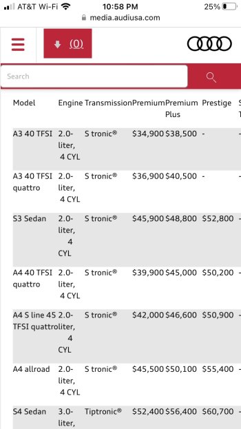
More and more I'm encountering websites that are simply unusable on my phone. Here's an example. I wasn't able to find a way to scroll to the right to see the information in the table.
 

Attachments

  • Audi Newsroom.jpg
    Audi Newsroom.jpg
    147.4 KB · Views: 123
More and more I'm encountering websites that are simply unusable on my phone. Here's an example. I wasn't able to find a way to scroll to the right to see the information in the table.

What phone are you using?

I've also been encountering what you're describing, but I've always assumed it's because I'm a 4" SE1 (2016 model) user -- will be until I literally can't anymore (I love the small physical size)
 
What phone are you using?

I've also been encountering what you're describing, but I've always assumed it's because I'm a 4" SE1 (2016 model) user -- will be until I literally can't anymore (I love the small physical size)
SE 2022. It replaced my SE 2016. My guess is the table is so wide, you'd encounter the issue regardless of phone size.

Here is the URL of this site. Let me know if you have the same issue.
 
  • Love
Reactions: turbineseaplane
Same issue on an iPhone 13 Pro. also, the wall of text above it is dreadful. They need to learn what a paragraph is.
 
What is with this recent trend of "for more information, scan this QR code"? What's wrong with a hyperlink? I'm supposed to stop reading, leave the room, get my phone, come back, scan the code, then finally read the extra info on the tiny phone screen? What about if I'm on a phone in the first place? What's the process there? Screenshot the code, print it, then scan it?

Where did this idiocy even come from?!
 
The "organized" sites of old with their logical structures and navigation were terrible at selling things.

For a website to effectively sell something, it needs to be solving problems and ticking boxes that are on the tip of people's minds, with bullet points accompanied by supporting graphics.
 
What is with this recent trend of "for more information, scan this QR code"? What's wrong with a hyperlink? I'm supposed to stop reading, leave the room, get my phone, come back, scan the code, then finally read the extra info on the tiny phone screen? What about if I'm on a phone in the first place? What's the process there? Screenshot the code, print it, then scan it?

Where did this idiocy even come from?!

I've seen QR codes in the real world on signs, posters, etc.

But are you seeing QR codes on websites instead of a link?

Yeah that would be weird...

🤣
 
Yep, I've seen at least three sites now where they've put a non-clickable QR code on the page instead of using a link.
 
The "organized" sites of old with their logical structures and navigation were terrible at selling things.

For a website to effectively sell something, it needs to be solving problems and ticking boxes that are on the tip of people's minds, with bullet points accompanied by supporting graphics.

Without an example it’s hard for me to be sure, but it sounds like you’re mixing reasonable improvements which address some shortcoming and are based on logic and evolution (good) with a chief complaint in this thread, namely interface changes having not fixed anything that was blatantly broken or *needing* improving (bad), usually coupled with some of the change being rather radically different than before.

For case #2, the questions to ask are: what was so broken before, how was it fixed by what’s new, and why weren’t these shortcomings fixed via refinement over time, like before? In my experience of certain “awful new website or app or OS design trends,” very few instances could be fairly identified as being broken before, wow most changes seeming to be changes for something new either based upon the whim of the designer in charge at the moment, or from pure marketing push for something new rather than solid engineering and design.
 
Last edited:
What is with this recent trend of "for more information, scan this QR code"? What's wrong with a hyperlink? I'm supposed to stop reading, leave the room, get my phone, come back, scan the code, then finally read the extra info on the tiny phone screen? What about if I'm on a phone in the first place? What's the process there? Screenshot the code, print it, then scan it?

Where did this idiocy even come from?!

I have learned that corporates suits have no idea about web design and tech. I do not blame them , I have no idea about fixing cars either. On the web designer side of things, the corporate want a website for the cheapest price. Yeah, you get what you pay for.
 
It's gonna be real interesting in the future, since I'm now using a flip phone!

From my experience, all the 'modern' ways are just doing the same thing the old ways were, but in a far more frustrating way. It's a newer, worse way of doing the same thing we all did in 2010.

I mean, just look at IoT stuff. Why does a refrigerator need internet? It's designed to do one thing. Same with a dishwasher. I mean why make something simple into something way more complicated than it needs to be? Clearly our tech overlords have run out of ideas. So they now use forced upgrades (such as the 3G shutdown) to coax us into their idea of the future I want no part in.

I'm sure the TikTok generation is just loving it though.
 
This is exactly it.
It's adding nothing but forced delay and pacing and just gets in the way of getting at the information.

It's a lot of the things I hated about "flash websites" way way way back in the day.
Google - “m2 MacBook Air tech specs”

First result is a direct link to the technical specification.

There’s no need to to go through all the marketing and fancy stuff. Just use a suitable Google search.
 
Yep, I've seen at least three sites now where they've put a non-clickable QR code on the page instead of using a link.
Which suggests they want to force you to use your phone to access the QR and thereby try to link the you on the phone with the you on whatever other device you are using.
 
It wouldn't surprise me that some 'research team' decided a large chunk of people today can't remember an URL and a QR code is faster. That's a scary concept and endemic to our shorter attention span over time which greatly concerns me.

But then there's this:
dz-oeepx4aa8h0e_800jpg_800.jpeg


A QR code on a Billboard? What happened to putting your phone AWAY when driving?

Long ago, I sort of had hopes that QR codes would EOL as quickly as the infamous Cue-Cat did.

maxresdefault.jpg
 
Register on MacRumors! This sidebar will go away, and you'll see fewer ads.