Become a MacRumors Supporter for $50/year with no ads, ability to filter front page stories, and private forums.
I think you misunderstood what I said. I absolutely love Coverflow, but only for documents, movies, and images. But the way it skews application icons is just hideous.

I'd agree with you. CoverFlow is (to me) something akin to a nice slideshow feature for media (images & movies) etc. The only problem is if you have several similar images it's of lesser usefulness than something like Windows' thumbnail view which shows more files at once, with filenames. That's a lot less sexy, but much more practical.

As a general file browser it seems pretty odd. For someone like me who works mostly with text documents, it's about as useful as a Finder Shuffle feature! :p
 
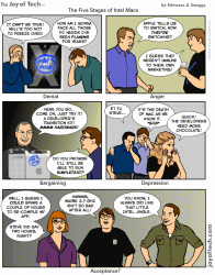
Denial....Anger...Acceptance.. ;)

Ahahah, that certainly hits the point!

It's a perfect analysis:

1st - Denial - It looks strange when looked for the first time, you can't believe it's the real deal (ex: people giggling when Steve Jobs showed the Leopard desktop for the first time), subconsciously we're all "waiting for October", yeah, Apple will show us the TRUE LEOPARD GUI there (right...), classic denial.

2nd - Anger - You start getting a lot of information that confirms that this is how it's gonna look like in October so... you turn your anger to Apple (ex: MacRumors fills up with disappointed and angry people blaming the iPhone for this) and say things like "I'm gonna switch to Ubuntu".

3rd - Acceptance - We're not there yet, still, you see some early-bloomers already fitting into this category (for ex: people start to "grow fond" of the transparent Menu Bar) and accepting that Leopard's UI is not "that bad at all". In December 2007 I predict almost everyone who was complaining will be: "Leopard rules, I love you Apple!".

Now read this with an Australian accent, National Geographic style :D
 
I think the folder icons looks awesome by themselves, simple yet detailed. But I don't think they integrate very well with the rest of the desktop.

To true, it's almost like they were for a new GUI that was designed, not quite finished and pulled from Leopard.

They're very nice, but not Aqua.
 
3rd - Acceptance - We're not there yet, still, you see some early-bloomers already fitting into this category (for ex: people start to "grow fond" of the transparent Menu Bar) and accepting that Leopard's UI is not "that bad at all". In December 2007 I predict almost everyone who was complaining will be: "Leopard rules, I love you Apple!".

Of course you include everyone who isn't extremely picky or sensitive in this group as the "early-bloomers," because obviously(!) nobody can possibly like the current iteration.

The vast majority of you haven't even had a chance to use it personally, in all likeliness, and the only place you've seen it is in carefully selected demos and screens from WWDC and in the screenshots that so far have been "leaked." I'm not sure about yall, but I like to reserve judgment until I can actually try something myself rather that damning something before its even out of an NDA-protected beta.

Yeesh...

RIGHT ON with that point!
 
ROFL - well said :)

I'm a bit concerned how it will look small and on the left, with a bit of magnification, like I use now (with autohide)...I would love a quick video of it like that, just to calm my fears. Of course I could use a haxie to bring it back, but I don't wanna!
 
Of course you include everyone who isn't extremely picky or sensitive in this group as the "early-bloomers," because obviously(!) nobody can possibly like the current iteration.

The vast majority of you haven't even had a chance to use it personally, in all likeliness, and the only place you've seen it is in carefully selected demos and screens from WWDC and in the screenshots that so far have been "leaked." I'm not sure about yall, but I like to reserve judgment until I can actually try something myself rather that damning something before its even out of an NDA-protected beta.

Yeesh...

That was my point :) Disguised with sarcasm.

the problem is that Mac Users (generally speaking) have been spoiled by Apple, they always expect not the best, not the reasonable, but the unthinkable and even the unlikely to happen.

I for one love how Leopard is shaping up to be, even the transparent menu bar, I'm willing to give it a shot before I discard it. The only ackwardness that I can find there is the Aqua scrollbars into the new gray GUI, but I believe that those will change until October for a full consistent UI.

I always liked the iTunes 7 look, simple, inobtrusive, uses "dead" colors to focus on what's really important, in this case, your Music.

EDIT:

If only there were some form of "Dock Resize" or even "Dock Hiding"!

OUCH! LMAO!
 
Nym said:
That was my point :) Disguised with sarcasm.

Hehe, well that was well-disguised. Hope that didn't sound like I was jumping down your throat; I can get awfully abrasive with my posts. :eek: :p
 
If only there were some form of "Dock Resize" or even "Dock Hiding"!
So what your saying is that when I scale down the dock it will remove the reflection and the empty space beneth the icons in the dock? There's almost room for half a dock between the icons and the bottom of the screen.

What good does it make to hide it? When you show it it will still take up alot of space. I don't really see the point in bloating up the dock like this!

The glowing thing instead of the triangle is just stupid.. i guess they'll change this in the final version.

What good does it do to hide it? Are you serious? Um, well lets see....so you can't see it when you're not using it and as such it won't be taking up screen space the majority of the time.

And a black triangle doesn't match the new dock. Yes, I do think something a bit more visible would be nice, but you can't just cut and paste the old indicator onto the new dock.
 

Attachments

  • 693.gif
    693.gif
    121.8 KB · Views: 389
That was my point :) ...the problem is that Mac Users (generally speaking) have been spoiled by Apple, they always expect not the best, not the reasonable, but the unthinkable and even the unlikely to happen.

Exactly. I keep waiting to see someone complain that Leopard can't cook dinner, or wash their car, or "why can't it be multi-touch and print money!?". lol People are so fickle.
 
The new folder icons are growing on me - particularly if they can change colour when labelled, like in OS9 ! Can anybody test this out?

However, they seem severely out of step with the rest of the icons.

In this screen shot:

http://www.thinksecret.com/archives/leopard9a466/source/picture01.html

the contrast in the folder icons is so soft compared to the other application icons in the doc (and the trashcan), that it just doesn't look like the icons are finalised yet.
 
Register on MacRumors! This sidebar will go away, and you'll see fewer ads.