Become a MacRumors Supporter for $50/year with no ads, ability to filter front page stories, and private forums.
Like many things...its hard to imagine until you do it. I guess its a left brain/right brain thing. I remember what i "did" or what I "saw" moreso than "what i called it" and it seems besides the "Ooo-Ahh" effect, CFlow and QLook really target that part of the brain...at least for me.

When you have a folder with 100+ documents in it, seeing whats on the page is a different sort of thing.

Again, you'll see :)

I know what you mean but I still don't like them :)
There's just something too plain about them. I agree that they look ok in coverflow mode, but the changes to each of them are just too discrete at smaller sizes for my taste. But maybe my taste will change. Guess I won't have a choice.
 
You don't NEED to use coverflow. Its an extra option.

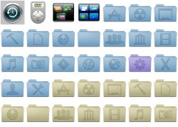
I think what some of us are saying is that the only way those folder icons would be noticeably different is in Coverflow mode. In list or icon view [again assuming nobody actually uses a folder with 128px icons in the real world], they are way too similar. At least that's what I am thinking.
 
Thank you! Finally someone who gets it. Just because Apple released a "feature complete" version to developers....doesn't mean it's done.

It's a BETA.

As for the new icons....How do we know that they aren't working on a whole new icon set to release with the final version?

Apple gets to sit back and let the comments/suggestions/bugs/etc pour in, and prioritize and address them as they see the need.

Let's cut Apple a little slack for now. If the final shipping version doesn't impress, then you can go crazy.....but until then, enjoy the new features.

-Kevin

I don't think the icons look that bad, though I do think they could do a bit better. Those icons are relatively huge, and something with a more dynamic and interesting appearance would look better in Cover Flow.

As for Leopard's completeness, I think mostly we'll just see polishing between this release and the final release. A few tweaks in UI (perhaps the highlight color for menus on the menu bar), perhaps some other minor tweaks, but not much.

And for whoever said Vista was looking better than OS X - Tiger looks better than Vista. The core of Panther looks better to me than Vista's core (not the UI, though - the innards.) Leopard appears to blow Tiger away in under-the-hood advancements, and really looks great from a UI standpoint. So, if Vista is equal to or less than Tiger in UI and less than Panther in OS core, Vista vs. Leopard...
 
I couldn't agree more. Why didn't they get some third-party guys to design some new icons? Someone like the guys at InterfaceLIFT maybe? I don't know . . .theirs seems a WHOLE lot sexier and better designed to me . . .

If they can get Mike Matas from Delicious Monster to design interfaces, they sure as hell could of gotten someone ELSE to design these things!

icons.jpg


Mike Matas has been at Apple for what, 2 years now? He is part of the iPhone team.

edit: I think I misread you. Apologies.
 
Thank you! Finally someone who gets it. Just because Apple released a "feature complete" version to developers....doesn't mean it's done.

It's a BETA.

As for the new icons....How do we know that they aren't working on a whole new icon set to release with the final version?

MacRumors (or MacBytes) posted a story about Apple hiring folks to develop new icons (6+ months ago). I presumed it was for Leopard of course, but it turns out it was also for iPhone (ATN :) ) and even Apple TV.

Rocketman
 
ichat sms?

After reading the Wired article about the beta, I thought this was interesting:
"IChat is also improved. In addition to all the visual effects and animated backgrounds that Jobs showed in his Worldwide Developers Conference keynote demonstration, the app has the ability to send SMS messages to your contacts instead of IMs"

I don't remember hearing that before? I guess that's where the iphone's cheap ichat wannabe client will be in the meantime until they get a real IM app? Was this announced in the keynote?
 
As for Leopard's completeness, I think mostly we'll just see polishing between this release and the final release. A few tweaks in UI (perhaps the highlight color for menus on the menu bar), perhaps some other minor tweaks, but not much.

I agree. We won't be seeing anymore major new features by the time Leopard is released. Apple engineers are hard at work tweaking everything and getting all the UI to be consistent.

-Kevin
 
I couldn't agree more. Why didn't they get some third-party guys to design some new icons? Someone like the guys at InterfaceLIFT maybe? I don't know . . .theirs seems a WHOLE lot sexier and better designed to me . . .

If they can get Mike Matas from Delicious Monster to design interfaces, they sure as hell could of gotten someone ELSE to design these things!

icons.jpg

Ok, no offense but THOSE icons you posted were god awful. Too much going on, my eyes hurt. Apple prides itself on simplicity; in design, ergonomics, integration, etc. I believe Leopard achieves simplicity and uniformity much more so than Tiger (and certainly much more so than Vista). Besides, more importantly, none of you have even used Leopard yet so why not save all the critiquing for October, when first hand accounts may be made. :rolleyes:
 
Below are some higher quality images of Leopard's folders...

I really like the new folder icons. They remind me of the folder icons in Mac OS 7. Ahh the nostalgia... :eek:

FI-S-07.jpg
 

Attachments

  • 1.jpg
    1.jpg
    143.4 KB · Views: 1,914
ThinkSecret site is down here, I tried many times yet still it timed out.

Is there any cache or mirror? Thanks a million.
 
Whats more, who is to say this wasn't the idea for Leopard that they simply through into iTunes to give it a fresh look? You can't assume all this came from iTunes. When it could just be that iTunes took some cues from Leopard.
D

To expand on that statement. I believe Apple uses iTunes as a tool to prepare the world for what they are going to release in the future. They do this because iTunes is so widely used, they can get a lot of good feedback on what people like to see. I think for the most part, people really liked the newer look of iTunes 7...I love it!
 
1- You can set the menu bar to be solid.

2- The blue background is still available, if not you can copy it from Tiger to Leopard.

3- I don't understand your 3 question.:eek:

I use a virtual desktop application called Desktops. It's very similar to Spaces. If I launch iPhoto for example, and go into full screen mode and then I switch to another desktop, when I come back to the one with iPhoto, iPhoto has gone back to it's normal interface and I have to enable full screen again. I want it to remain persistent, so when I come back to the desktop with iPhoto it is still in full screen the way I left it. Does that make sense?

None of Apple's applications that have a full screen mode remain persistent when used with a virtual desktop application. They all default back to their original interface mode. If they remained persistent then I could set up a desktop in Spaces for each application and leave it in full screen mode, the simply switch between them. The next logical thing for Apple to do would be to add CoverFlow for the Spaces desktops. Then you could scroll through them in all their Core Animation glory. It would be wicked.
 
Actually, that's a nice idea for Expose in general. It'd be nice to have a mode where Expose displays like Coverflow instead of the way it is now. I guess that's almost a hybrid between what Vista does (from the screenshots I've seen; never used it in person) and what OS X currently does. Somebody suggest this to Apple. ;)

I already have. I emailed them about it. I wonder if anyone actually reads those emails.

You're right though, it would effectively replace Expose, or at least give Expose an alternative display mode. Maybe you could set it in your Preferences to enable CoverFlow mode for Expose or leave it the original way. The user could decide. The other thing I hope Apple does is give full screen interfaces more functionality. For example, iTunes has full screen mode, but it is very limited. I want it to behaive more like it does on the iPhone. So, when I'm in full screen CoverFlow mode, I can click an album cover and it will flip around so I can see the tracks.

I really like full screen mode. If it were more feature rich it could be a whole different way of interacting with your system. Spaces has so much incredible potential. I can see a whole new UI emerging from it.

I also wish Apple would enable a full screen mode for Safari. Right now only Opera can do this, and their implementation is a bit buggy and cumbersome. It needs on screen controls like Quicktime that just appear and disappear with a mouse gesture. It's really an interesting way to interact with web sites.
 
I'm sure the Spaces icon will change: It uses the default Tiger background, not the Leopard one!

And the Expose icon is just plain hideous...
 
And they are f*****g ugly as sh**. And all this iTunes 7 UI look better be a standin for the "real" look.


I think what some of us are saying is that the only way those folder icons would be noticeably different is in Coverflow mode. In list or icon view [again assuming nobody actually uses a folder with 128px icons in the real world], they are way too similar. At least that's what I am thinking.
 
I'll wait until October to see what's going on with Leopard, it looks very cool in my point of view, the icons...well...it can be better from Apple anything can be more than better
 
Register on MacRumors! This sidebar will go away, and you'll see fewer ads.