Become a MacRumors Supporter for $50/year with no ads, ability to filter front page stories, and private forums.
I am going to assume, for my sanity's sake, that these icons are a cruel joke by apple...the real nice ones will appear in october...perhaps when they find the time to design them. Right now I think they have summer interns working on stuff to put in as placeholders while the real designers and developers at apple have been working on the iphone.

If they actually look like this in october...no, not going to think like that.

And I'm not trolling. I'm an apple fanboy and have always loved their design. This is not Apple.


Why are there duplicate icons in beige? That seems very odd to me.
 
1- You can set the menu bar to be solid.

As of 9A466, no, you cannot set the menu bar to be solid. Unless it is hidden in a plist somewhere under an arcane identifier to be purposefully spiteful, then the feature has not yet been added. The outdated Appearances panel in System Preferences hasn't been updated either, however, which could indicate that the feature is coming in the following months of development.

But I can tell you with all surety that, as of right now, changing the top menu bar to solid is not yet a built-in option.


And what's with all the complaining about the new icons? I think they look nice in a minimalistic kind of way. Of course there's always the option to customize your system icons using 3rd party software (or, God forbid, copy-and-pasting the icons onto each item). No one icon set is going to satisfy everyone. Then again, they could change; who knows?
 
As of 9A466, no, you cannot set the menu bar to be solid. Unless it is hidden in a plist somewhere under an arcane identifier to be purposefully spiteful, then the feature has not yet been added. The outdated Appearances panel in System Preferences hasn't been updated either, however, which could indicate that the feature is coming in the following months of development.

But I can tell you with all surety that, as of right now, changing the top menu bar to solid is not yet a built-in option.

If apple doesn't build it in, it'll be 6 hours until a third party gives you that option. As it stands, it looks horrible (not just the bar, but the dock, folders, the whole lot) :(
 
If apple doesn't build it in, it'll be 6 hours until a third party gives you that option. As it stands, it looks horrible (not just the bar, but the dock, folders, the whole lot) :(

See, the first time I fired up Leopard I thought the same thing. "This menu bar is kind of cheesy...", I thought. But I think you'll find that the more you use Leopard, the more you'll grow to like it and see that it really does make a good difference in the desktop. Plus it looks much better with a darker colored background, like something with a good deal of black or blue. The light-colored grass theme was poorly chosen to match the transparent menu bar.

Of course, you're right. There will be a 3rd party app in no time at all for those people that refuse to adapt to the menu changes. To each his own, I gues.
 
.

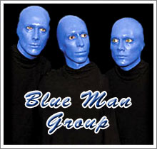
One of the blue folder icons looks like it has the Blue Man Group on it.

Maybe those guys really are Inside.
 

Attachments

  • blue-man-group_blue-man-group_theatre_tickets_029889.jpg
    blue-man-group_blue-man-group_theatre_tickets_029889.jpg
    13 KB · Views: 1,710
Instead of a half baked new interface along with a half baked aqua, why not replace the aqua scroll bars with the ones you have in iTunes 7 and finally get rid of the red/yellow/green close buttons or atleast make it a preference and give the new option the same chiseled look as the iTunes 7 scroll bars. The new pull down menu on Apple's new web site should be the look of them in Leopard as well. What do you all think of these ideas.
 
Has anybody saved the screenshots and could send them to me – or a link to a mirror? Would much appreciate that...

bensch∆macnews.de

Thanks a lot,
Bensch
 
I think the folder icons looks awesome by themselves, simple yet detailed. But I don't think they integrate very well with the rest of the desktop.
 
personally, i feel like their design skills downgraded with leopard.

and i miss the blue abstract default wallpaper! i always looked forward to a new one with each update

Well, from what I've heard (outside of WWDC) is that these decisions were made very late in the process before wwdc, especially the transparent menu bar...

I'm almost pining for those ever so subtle pin stripes........ or something, just don't keep it so bland!!!!
 
I guess is beyond anyone outside of the folks at Candybar these days to come up with a decent, modern-looking, useful folder icon.
Interesting, because Iconfactory (who works with Panic, who made CandyBar) actually made all of Vista's icons, as well as XP's.

The Leopard folder icons that Wayfarer posted, I like those. They probably ARE a bit lacking in contrast, they could use a little color. Reminds me of David Lanham's Agua icons, which IMHO are perfect. Apple should hire him to do their icons.

Vista is looking a whole lot sexier now than OS X.
Your attached screenshots... that's not even Vista. :p Vista isn't quite THAT bad looking. :) People are suckers for shiny black things. I am too, but that doesn't mean I need to look at it all day long (when restricted to, say, Time Machine, it works well). I like Leopard's refined gray, personally. I feel as if they've almost come full-cricle, starting with OS 8's Platinum theme. Maybe they'll give us a System 6 inspired theme in 10.6. :cool: I can just imagine it now: "Black and white is the new black."

I gave the Thinksecret screenshots a close look earlier (cause I just knew the site would go down) and noticed that the pinstripes that were so prevalent in OS X 10.0 and that have slowly faded up through 10.4, now appear to be 100% totally gone. There were actually some very nice refinements in the overall theme that aren't noticeable (or aren't show at all) from the screenshots on Apple's Leopard page.
 
I hate the Cover flow, Making icons looks like paper
Especially the shot in the App Folder, it just look stupid. What a mess! :(

Cover Flow is just a "Quicker Look" Function, if the icons simply line up without perspective, it looks better than now.

And the HUGE shadow doesn't look so good now, making windows look like papers too. I am waiting Apple to refine the current UI.

The folder looks worse than I expected. They are not distinguishable.
 
I kind of like the buttons in System Preferences etc that take a cue from the Play/Back/Forward buttons in iTunes 7. Very clean and refined look overall. People expected revolution but got evolution. I guess this is a reason for the contempt I see on the board. If people loved the overall OSX interace, I fail to see why Leopard is so bad to you guys. Grey isnt the most aesthetically pleasing colour, but it is probably the most sensible to go with so that it isnt too distracting. The use of the smoked HUD black effects throughout the OS compliment it nicely IMO.

What im not sure about is the scroll bars. I personally like the bubblegum blue effect, but more so the graphite bars in Tiger. Can anybody confirm that graphite is still an option?
 
I really DO NOT LIKE IT... a Uno interface is much better... the whole OS looks like iTunes, and i really don't like the UI from iTunes....

Bad move apple..
 
So... didn't I hear a rumor that there would be simultaneous booting of OS X & Windows on the same machine? (That is, boot OS X, log in, tell BootCamp to switch to Windows and it puts OS X to sleep and boots Windows.)

Anyone know if that's in this build of Leopard? Sadly I see no mention in the article...

Sadly, this feature seems to have been removed from Leopard... It was up at Apple's site under Leopard/Bootcamp until recently. Now this feature has been removed from the description. Sheesh.
 
I like thew folders. Is the new resolution of these folders at 256x256, which would be twice the resolution of the current 128x128? The look huge, and it would be more attractive for people with seeing disabilities.
 
I really DO NOT LIKE IT... a Uno interface is much better... the whole OS looks like iTunes, and i really don't like the UI from iTunes....

Bad move apple..

Bizarre.

"UNO is a theme that brings the sunken unified toolbar/titlebar look&feel to every single window on your system (cocoa or carbon, metal or aqua and already unified windows as well)."

Last time I checked, iTunes IS the unified toolbar theme. So how can Uno be 'much better' than the Leopard theme.
 
Below are some higher quality images of Leopard's folders...

I really like the new folder icons. They remind me of the folder icons in Mac OS 7. Ahh the nostalgia... :eek:

attachment.php

wow....i havent seen the leopard folders up close...they are awesome, i love their simplicity.....i cant believe how many people hate all these news things, i think everyone just can't handle change....the only thing i don't like is cover-flow which, i must admit, is a pretty stupid ad-on......everything else i love.......i;m looking forward to october...but seriously those folder icons are awesome, the ones in tiger at the moment are so boring!!!!
 
The dock looks like a SpaceWaster! :(
What a waste...

Seems like the Open/Save dialogs finaly got iconview. About time!
 
Register on MacRumors! This sidebar will go away, and you'll see fewer ads.