Become a MacRumors Supporter for $50/year with no ads, ability to filter front page stories, and private forums.
As for GUI I dig apples apps. (i.e. Final Cut Pro, etc.)

Peace

dAlen

Yeah FCP is pretty damn good. Motion is ok; but I've been a After Effects user for so long that Motion just rubs the way I like to work the wrong way.

Aperture is nice also. Now Lightwave 3D is great; all the buttons just tell you what they do; although that app is so different than all the others that to me it just makes sense for it to be that way. I guess that is why I hate Maya and Cinema 4D... you have to guess WTF those icons mean and do; and 3D apps have LOTS of options...millions in fact.

-mark
 
I think it's good that Adobe is trying to do something with its Photoshop interface, but they're doing it wrong. I am personally very satisfied (and surprised) by the UI of a graphical underdog - the new Iris from Nolobe. Photoshop's new interface might be more practical than the old one but definitely is a lot uglier. Probably both Apple and Adobe should show each other a bit of respect, maybe than Adobe would at least try to merge their app's UI to OS X's UI.
 
I like the UI much better, but they need to work harder improving their programs instead of making incremental improvements. You know and maybe throw some shapes in there that normal human beings actually use on a regular basis.

Pride comes before the fall, Adobe.
:cool:
 
Hey, I'm all for progress... but could you please fix CS3 first? :confused:

CS3 is still unstable, doesn't work w/ FontBook, and if you use Spaces... forget it. Etc, etc.

Seriously Adobe: take a deep breath, take a little more time, and put a little more quality in your version upgrades.
 
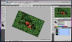
I found a screenshot displaying what happens when you zoom into pixel level. You can also see a few more of the UI elements. (Top right of the menu bar is blacked out on purpose).

 
You beat me to it. :) It's funny how people are talking about how aqua should be brought back more. I personally like the new Leopard UI, I wish they would switch to the scroll bars used in iTunes already. <SNIP>
This can be done, just by replacing one file in the system... get googling! EDIT to save you time http://macthemes2.net/forum/viewtopic.php?id=16782387

I like the one-window interface, but that top toolbar is dreadful. Cant adobe just even try to match other mac interfaces, have one row with the 3 buttons and the windows title, then one (larger) row with all the control buttons. A very very quick photoshop to demonstrate how it could look...
 

Attachments

  • 173615-macstonecs4.jpg
    173615-macstonecs4.jpg
    81.5 KB · Views: 267
Really? I always found ye olde Macromedia software to be the biggest pain in the ass ever.

I think you all are jumping the gun on this one. After Effects has a unified GUI like this and once you get used to it (and it is highly customizable on where stuff is btw) you'll learn to like it a lot better.

-mark

Have never enjoyed adobe UI's since way over a decade, illogical, unintuitive and annoying.
Macromedia on the other hand followed proper guidelines and were intuitive for it.
 
I'm not really sure about a systemwide option but Aperture is the only program I have that does this.

All of Apple's Pro Apps do this (greyed out window traffic light buttons): Aperture, Final Cut Pro, Motion, DVD Studio Pro, Logic Pro, Soundtrack Pro, Compressor. Plus, they all turn the menu bar greyscale, even if you'd normally have a colorful desktop showing through (in Leopard)

Edit: Actually one Pro App doesn't behave this way - Shake. But seeing as it hasn't been updated since April 2006, that should really come as no surprise, and I fully expect the next release of Shake (aka Phenomenon) to fall in line with the rest of the Pro Apps.
 
Have never enjoyed adobe UI's since way over a decade, illogical, unintuitive and annoying.
Macromedia on the other hand followed proper guidelines and were intuitive for it.

Hmmm... must be a when we first used the app issue then. I started with Adobe software and then tested the waters on Macromedia. (of course the only Macromedia apps I would even consider are Flash and Director; and I have to tell you the way their timeline & moving assets works is a bat to the head compared to After Effects.)

I find After Effects very intuitive. :cool:

-mark
 
This can be done, just by replacing one file in the system... get googling! EDIT to save you time http://macthemes2.net/forum/viewtopic.php?id=16782387

I like the one-window interface, but that top toolbar is dreadful. Cant adobe just even try to match other mac interfaces, have one row with the 3 buttons and the windows title, then one (larger) row with all the control buttons. A very very quick photoshop to demonstrate how it could look...

Yes, I had that mod before on my machine, but it doesn't always display correctly in certain apps. And that is not a real solution, since the average customer would never find that. Then again, the average customer doesn't really care or know much about the design of UI's. It just seems like one of those last inconsistencies that is blatantly obvious.

Edit: I tried that mod again, it didn't work. I followed the instructions the original poster gave and used the extras file. I logged out and logged back in, the scroll bars are still aqua. I'm on PPC BTW.
 
Apparently you people don't a) keep up with Apple and Adobe news b) understand very little about the software development process.

Adobe was full set to have CS4 have 64-bit support in OS X however about a year ago at WWDC '07 Apple told developers that they were pulling the plug on Carbon 64-bit support, responding to cries that Carbon is officially DEAD as a future development platform by telling them Cocoa is the way to go. Now, Apple's been making it pretty clear that Cococa was the future and Carbon was a stop-gap solution but even Apple themselves taut Carbon as better for cross-platform development.

Since Carbon won't ever be 64-bit, rewriting the entire suite of CS tools would take more than a usual update cycle to switch from Carbon to Cocoa AND make the app 64-bit compatible. That's just a ******** of bug testing and not enough time to do it while releasing the Mac version at the same time as the Windows version. So instead Adobe is going to work on porting their Carbon code to Cocoa (which means a rewrite of C++ code to Objective C) in CS4 and then add 64-bit support in CS5.

Though you might want some proof, so here's Adobe's blog annoucement: http://blogs.adobe.com/jnack/2008/04/photoshop_lr_64.html


No proof need, I believe you. Thank you for explaining this, as I was unaware that it was partially Apple's "fault".
 
The new Logic 8 has no color for the traffic lights. It was specifically stated at MWSF that the colors are going bye bye. They will be grey until you hover the mouse over them and then they will be colored.
Wasn't the point of having the red/yellow/green buttons so you could tell which window was active?
 
I've ALWAYS HATED, that the PC version of Photoshop is in a Window. Now they do this to the Mac version. :rolleyes: :mad:

FC KING WAIST!! Now there's more crap on the top! :mad:

HURRAY. IT'S OPTIONAL!!! :D

I just had to read.
 
Yes, I had that mod before on my machine, but it doesn't always display correctly in certain apps. And that is not a real solution, since the average customer would never find that. Then again, the average customer doesn't really care or know much about the design of UI's. It just seems like one of those last inconsistencies that is blatantly obvious.

Edit: I tried that mod again, it didn't work. I followed the instructions the original poster gave and used the extras file. I logged out and logged back in, the scroll bars are still aqua. I'm on PPC BTW.

seeing some other threads on that forum, it looks like PPC and Intel use different resource files, and you have to convert them or something. I dont really follow themes that much, but the aqua bars really annoyed me, so I had to change them.

As for the average consumer not caring about UI, thats not true. They may not realize they care, but they do. iPhone is a great example, as it's feature set is not as good as some of its competitors, but the UI really sells the phone. And the majority of users will upgrade their OS for the new interface.
 
I am just wondering is CS4 going to be the Windows Vista to Microsoft? I mean its just UI that seems to be main area of this. Either way I feel CS4 is waste of work if its not optimal to current Apple computers. They can release CS4 for windows and later release cs4 for apple taking advantage of 64bit. Anyone sees similar comparison?
 
It blocks out the contents of the desktop, minimizing visual clutter.

That's the main reason I stayed with CS2! I do not like windows and this forces us into a one app window interface WHICH I HATE! I need to be able to my desktop, my email, and browser while I'm working. PC CS3 is worse so I don't use that at work either, still on CS2. If CS4 still forces that type of blockage, I'll stay with CS2 at home on my mac and at work on a PC.

Simply retarded to force that on users. They are forcing a PC fullscreen type app and I will not fall for it or pay for it. CS2 is very usable and hopefully will last for a bit.
 
Adobe is one of the worst offenders when it comes to UI consistency for OS X.

Seriously, can Adobe and Microsoft stop coming out with stupid, ill-conceived UIs and just follow the guidelines?

And Apple with their Windows Apps.
 
I've ALWAYS HATED, that the PC version of Photoshop is in a Window. Now they do this to the Mac version. :rolleyes: :mad:

FC KING WAIST!! Now there's more crap on the top! :mad:

HURRAY. IT'S OPTIONAL!!! :D

I just had to read.

Yea but it still looks like it palettes out under the toolbar and side palettes. CS3 had no work around on the PC side and I don't think I liked the beta of CS3 for mac. I'd have to see some of these 'optional' screen shots ti verify there isn't flat grey EVERYWHERE blocking the desktop.
 
This can be done, just by replacing one file in the system... get googling! EDIT to save you time http://macthemes2.net/forum/viewtopic.php?id=16782387

I like the one-window interface, but that top toolbar is dreadful. Cant adobe just even try to match other mac interfaces, have one row with the 3 buttons and the windows title, then one (larger) row with all the control buttons. A very very quick photoshop to demonstrate how it could look...

I detest one-window interface, I'm very disappointed they are keeping it.
 
Register on MacRumors! This sidebar will go away, and you'll see fewer ads.