I'm new! Please don't be too harsh! I'm a website designer so have a keen eye for little things.
These are definitely fakes.
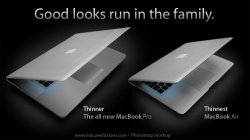
RE First image of the two laptops:
• Obviously the Tiger desktops
• Grammar on MP ad is all wrong, Apple wouldn't say 'Now in Aluminum + Mulit-Touch (They'd use a '&' or 'and')
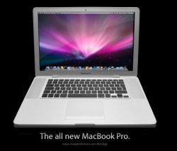
• Typography on both ads is all wrong, espesially the rubbish Photoshopping on the MBP ad.
• If Apple were planning to use these ads together, I'm sure they'd photograph the laptops at the same angle, which these aren't
iTunes 8 Ad:
• Apple wouldn't reuse old artwork from the iPhone launch
Support Page (ft iPhone ad)
• Old image which doesn't include the WebApps Icon
• Text at the bottom is squashed when you zoom in
• *Really Geeky* the mock Apple Navigation bar at the top of the page is wrong. The Support button (highlighted) would include the right hand edge, like the Apple logo includes the left hand image. Also the drop shadow is much heavier than the original Apple navigation bar.
Sorry to bore...
...right, look, even though i think these may be fakes a lot of your points are completely wrong. I have a certain penchant for typography and design and my brain is automatically incredibly observant, some people may find this sad, whatever. Lets starts from the top....
1. You're right, its a bit odd.
2. Take a look at the homepage of Apple.com, did you see '2.6GHz Intel Core 2 Duo + Multi-Touch'? Yeah, thought so.
3. I work with Myriad Set (the specific variant of Myriad specially for Apple) everyday, constantly. The typography is correct, its Myriad Set. What does surprise me however is that the header text like 'The new MacBook' (which already sounds characteristically un-Apple) is grey instead of black.
4. You are correct, they are shot at different levels, this just makes the MacBook promo look more real to me however.
5. This did come into my mind for a moment but then i remembered Apple actually have used this old artwork for something else, cant quite remember what it was, MacWorld this year?
6. WebApps Icon? The icons are only put there if the user puts them there, what does not appear though are the two dots, however they could just be so small that we dont see them.
7. No comment, lol.
8. Again if we look at Apple.com/support you will see that when highlighted there is no edge to the box, next to it is the search bar and then there is a rounded edge and as the mockup doesn't have a search bar in it we cant really compare. However, when we zoom into the nav bar we see there is a small gray line underneath the 'Support' box, there is no line on Apple.com of course.
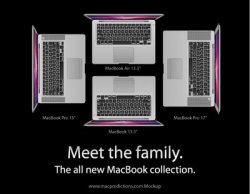
The MacBook promo is done well, very well, but the MacBook Pro is really quite bad, it is just the screen of the iMac with a relatively crummy line. And the iPhone promo could be real, but it would also be very easy to fake.


