Become a MacRumors Supporter for $50/year with no ads, ability to filter front page stories, and private forums.
It was not broken in IOS6. Why change it? Anybody could look at the phone and unlock it. Now it becomes a icon guessing game jeeeeeeees!! I hate icons all they do is help reduce the number of languages a model supports.

I can't imagine how many accidents have occurred while somebody tries to figure out how to turn on windshield wipers in a rental car. Put words on the darn stuff. I hate icons! Did I already say that? :confused:
 
What about letting the user swipe to both sides?

Swiping to the left does nothing, so why not use it. I really don't understand why Apple is so hesitant to allow swiping to both sides; unless swiping to the left is going to be used for widgets* in the near future. ;)
 
What about :

'Slide to the right to unlock'

Too long (especially in other languages). Only iPad screen could accommodate it.

----------

What about letting the user swipe to both sides?

Swiping to the left does nothing, so why not use it. I really don't understand why Apple is so hesitant to allow swiping to both sides; unless swiping to the left is going to be used for widgets* in the near future. ;)

This was supposed earlier by several people (including me). But if Apple really plans use left swipe for something (I don`t think so though), then making so is unacceptable.
 
Last edited:
It was added because so many people complained. Why people were swiping the other direction is beyond me!

If the iPhone is in my left hand I can naturally see myself swiping the wrong way.

----------

This whole discussion will be moot with the iPhone 5S. Roll on fingerprint unlock.

:apple:

Doubtful. I think you'll still have it because you can likely turn off the fingerprint scanner feature. You should be able to if you don't want to use it. Just like not everyone has a passcode.
 
I'm not a big fan of the arrow too. I mean, users can just do trial and error. If they swipe down or up, NC/CC/Camera will show. Can't swipe to the left. So to unlock, must swipe right. This way, new users will now know where NC and CC in addition to unlocking.
 
Same could be said about needing an arrow.

So iPhone 1-6 was confusing?

----------

I'm not a big fan of the arrow too. I mean, users can just do trial and error. If they swipe down or up, NC/CC/Camera will show. Can't swipe to the left. So to unlock, must swipe right. This way, new users will now know where NC and CC in addition to unlocking.

Yeah that's what people want, having to do trial and error on their phone.
 
So iPhone 1-6 was confusing?

----------


Yeah that's what people want, having to do trial and error on their phone.

Well theres only 3 things to do on an iPhone lockscreen (not counting camera because it's self explanatory).
The average person will probably figure it out in less than 30 seconds if they're completely new to iPhone and iOS in general. It's not rocket science. Apple is just further enforcing the stereotype that iOS users aren't very smart lol

My point is the little caret is small and unobtrusive so I don't see what the big deal is. I don't remember all these complaints about the big arrow in iOS 1-6. Why is a little caret a big deal now?
 
Hello there.

I think this little arrow is most conspicuous element in beta 4.

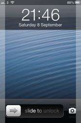
I don`t like the little arrow afore "slide to unlock". Home screen became asymmetrical.

View attachment 425508
For the new users Apple should implement some kind of "tutorial mode" like it done in the "Cut the rope" game.

Once user does the action right, the tutorial tips stops showing. I think it would be nice and cool.

What you think?

I totally agree with you!

"Welcome to iPhone.
To start using iPhone, slide to unlock"
*shows animation*


That would be great! It's amazing how the Apple community have better approaches than Apple themselves.
 
Last edited:
My point is the little caret is small and unobtrusive so I don't see what the big deal is. I don't remember all these complaints about the big arrow in iOS 1-6. Why is a little caret a big deal now?

Now that they made the lockscreen less... obnoxious we would prefer to have kept it that way. I also like the arrow better than the bars for notification and control center but we can't have everything. I would have also preferred the older helvetica font too.
 
In previous betas, I was able to demonstrate through end user sampling (not technical people, some android, some iphone users) that the lock screen was, indeed, confusing for them. Most grabbed the Control center arrow and swiped up.

I turned over my results to Apple in bug reporter as a UX problem and it was attached as a duplicate to issue 13768141. That told me Apple had defined the issue as legitimate and was going to be addressed.

The arrow being slapped to the left of the Slide to Unlock is a welcome change to those who I previously sampled. They looked at the lock screen and immediately understood how to unlock the device. Which is the goal in terms of UX, not OCD symmetry.

As far as the arrow causing the lock screen to be asymmetrical, well, the previous slide to unlock was if you were to look at the unlock control by itself when the camera control was added. So Apple's not too OCD about the imbalance.
 
Last edited by a moderator:
so iphone 1-6 was confusing?


iPhone 1 (let`s call it like this) was one of the first (or even the first) phone with such unlock "mechanism". It was really needed to be obvious. And it has become a distinctive feature of iPhone.

"Slide to unlock" in iOS7 it is rather a tribute to traditions.
 
iPhone 1 (let`s call it like this) was one of the first (or even the first) phone with such unlock "mechanism". It was really needed to be obvious. And it has become a distinctive feature of iPhone.

"Slide to unlock" in iOS7 it is rather a tribute to traditions.

It is? I think it's the call to action without using an ugly slider control in the spirit of flat UI design.
 
As far as the arrow causing the lock screen to be asymmetrical, well, the previous slide to unlock was if you were to look at the unlock control by itself when the camera control was added. So Apple's not too OCD about the imbalance.

Disagree with you. There was symmetry in the gapes between slider+camera and screen edges. Now with arrow that symmetry is gone.

EzmCVDO.png AIhpUkm.png

The arrow being slapped to the left of the Slide to Unlock is a welcome change to those who I previously sampled. They looked at the lock screen and immediately understood how to unlock the device. Which is the goal in terms of UX, not OCD symmetry.

Agree if it would appears just once before first successful unlock. It even could move to the right side in a loop.
 
Last edited:
Disagree with you. There was symmetry in the gapes between slider+camera and screen edges.

View attachment 425746

Now with that arrow symmetry is gone.

View attachment 425747


Agree if it would appears just once before first successful unlock.


Sure, it's symmetrical when you throw on vertical lines in your screenshot but remove them and it appears extremely left heavy with the slider control. More so than the little arrow you're so adamantly against.

I'm guessing they didnt balance the arrow and text more because it pulsates in a way that the text could be conceived as off center when it's in it's off cycle of the pulsing. But who knows.
 
I don't know why Apple just makes it possible to slide left or right in order to unlock the phone or answer a call? It makes it much more useful, especially if you use the phone in your left hand.
 
I don't know why Apple just makes it possible to slide left or right in order to unlock the phone or answer a call? It makes it much more useful, especially if you use the phone in your left hand.

It seems such a natural solution that I'm positive they can't for Patent reasons.
 
Now that they made the lockscreen less... obnoxious we would prefer to have kept it that way. I also like the arrow better than the bars for notification and control center but we can't have everything. I would have also preferred the older helvetica font too.

So basically you want it back to the way it was when people complained it was confusing. OK.
 
Register on MacRumors! This sidebar will go away, and you'll see fewer ads.